Ultimate UX Design Audit Guide to Improve User Experience
Discover how our UX design audit can boost engagement. Learn proven methods to optimize your user experience and increase conversions.A UX design audit is essentially a deep-dive into your product's user experience. It's a systematic way to pinpoint exactly where your design is succeeding and, more importantly, where it's falling short.
We're moving beyond gut feelings here. An audit uses data, established usability principles, and real user feedback to uncover what frustrates people, causes them to leave, and ultimately kills your conversions. The end goal isn't just a report; it's a clear, evidence-backed roadmap for making smart improvements that line up with your business goals.
Why a UX Audit Is Your Secret Growth Engine
Let’s be real. A UX audit is much more than a simple technical check-up. It’s an immersion into your user’s world to find the hidden friction that keeps them from coming back. Think of it as a diagnostic scan for your product, revealing precisely where you're leaking revenue and engagement.
Instead of just guessing why a new feature is flopping or why your conversion funnel has a major leak, an audit gives you concrete answers. It turns subjective office debates into objective, actionable insights you can actually work with.
Uncovering Hidden Revenue Opportunities
Every single point of friction in your user experience is a potential lost sale or a canceled subscription. A properly executed audit shines a bright light on these costly issues.
Some of the most common money-draining problems we uncover include:
- Confusing Navigation: If users can't easily find what they’re looking for, they simply can't convert. Actionable Insight: An audit might reveal that your "Solutions" menu item is too vague. A practical fix would be to rename it to "Features for Small Businesses" to instantly clarify its purpose.
- Complicated Checkout Processes: This is a classic. A major source of cart abandonment is a checkout that feels like a chore. Actionable Insight: Audits often highlight that forcing users to create an account before purchase causes a 40% drop-off. The actionable fix is to implement a "Guest Checkout" option.
- Poor Mobile Responsiveness: With so many people browsing and buying on their phones, a clunky mobile experience is a direct path to lost business. Actionable Insight: An audit might find that your form fields on mobile are too small to tap easily. The practical solution is to increase tap targets to at least 48x48 pixels.
When you identify and fix these kinds of problems, you aren't just tidying up the design—you're directly plugging leaks in your revenue stream. This is especially true for complex software, where our work in enterprise app development services has shown us that even small usability wins can lead to massive efficiency gains and cost savings.
A UX audit fundamentally shifts your team's perspective from "What new features should we build?" to "What real problems can we solve for our users?" This change in mindset is the key to building products people actually love and are happy to pay for.
Core Components of a Comprehensive UX Audit
To give you a clearer picture, here's a quick overview of the key areas a thorough UX design audit should cover. A good audit looks at the product from multiple angles to provide a holistic view of its health.
| Audit Component | What It Evaluates | Actionable Example |
|---|---|---|
| Heuristic Evaluation | Adherence to established usability principles (like Nielsen's 10 Heuristics). | "The system lacks clear status indicators. Action: Add a 'Saving...' message after a user clicks the save button." |
| Analytics Review | User behavior data from tools like Google Analytics (e.g., bounce rates, user flows). | "High drop-off on the pricing page. Action: A/B test a simplified pricing table with a clearer call-to-action." |
| User Testing | Direct observation of real users attempting to complete key tasks with your product. | "Five out of six users failed to find the 'export data' feature. Action: Move the feature from 'Settings' to the main dashboard." |
| Accessibility Analysis | Compliance with WCAG standards to ensure usability for people with disabilities. | "Color contrast on buttons is too low. Action: Change button text color from light gray to white to meet AA contrast standards." |
| Competitive Analysis | How your UX stacks up against key competitors' products. | "A competitor’s one-click checkout is much faster. Action: Implement payment integrations like Apple Pay to streamline our process." |
Each of these components provides a different piece of the puzzle, and together, they create a detailed and actionable picture of your user experience.
Building a Foundation for Sustainable Growth
The demand for better user experiences is not just a trend; it's exploding. The global UX services market, valued at $4.68 billion, is projected to rocket to an incredible $54.93 billion by 2032. This massive growth underscores how much businesses are waking up to UX as a critical competitive advantage.
You can read the full research on the UX services market to get the details, but the takeaway is clear: investing in UX is no longer optional.
Ultimately, a UX design audit delivers an evidence-backed roadmap. It replaces internal debates with hard data, making sure your team focuses its energy on improvements that truly matter to users. This process helps you invest your resources wisely, leading to higher retention, better conversion rates, and happier customers who become your most powerful advocates.
So, think of your next audit not as a cost, but as a direct investment in your company's future growth.
Laying the Groundwork for a Successful Audit
A great UX audit doesn’t just happen. It all starts with a solid plan. If you dive in without a clear direction, you'll end up busy but ineffective, like setting sail without a map. This prep phase is where you transform a vague idea like "make the UX better" into a sharp, focused investigation that delivers results stakeholders can't ignore.
Getting this foundation right makes the whole process more efficient and ties your work directly to real business outcomes. It’s the difference between a report that gathers dust and a roadmap that actually sparks change.
Define Clear and Measurable Goals
Before you even glance at a user flow, you have to answer the most important question: "What problem are we actually trying to solve?" Without a clear objective, your audit will be all over the place, and the findings will feel disconnected. Goals like "improve usability" are just too broad to be helpful.
The trick is to connect your audit to specific, measurable business metrics. This not only gives you a clear target but makes it much easier to show the value of your work when you're done.
Here are some practical examples of actionable goals:
Vague Goal: "Improve the onboarding experience."
Actionable Goal: "Identify and fix the friction points in our onboarding that cause a 30% drop-off between sign-up and creating the first project."
Vague Goal: "Make settings easier to use."
Actionable Goal: "Discover what’s confusing in the 'Account Settings' section to reduce the 50+ related support tickets we receive weekly."
Vague Goal: "Increase e-commerce sales."
Actionable Goal: "Pinpoint the specific steps in our checkout flow where 65% of carts are being abandoned."
When you frame your goals this way, you instantly give the audit a purpose. You’re not just nitpicking design flaws; you’re solving real business problems that hit the bottom line.
Determine a Realistic Scope
With your goals set, it's time to decide what you'll actually look at. Trust me, trying to analyze every corner of a complex product at once is a surefire way to get overwhelmed. A focused scope allows you to go deep on the areas that truly matter.
Think about which parts of the user journey are most critical for hitting your goals. Is it the signup process? The checkout flow? The one core feature people use every day? This is especially important for new products. For instance, an experienced MVP development company can help identify the absolute essential user flows that have to be flawless right from the start.
Here’s a practical example of scoping:
- Goal: Reduce cart abandonment.
- In Scope: The entire user journey from "Add to Cart" to the "Thank You" page, including product pages, cart view, and all checkout steps.
- Out of Scope: User account creation (unless it's forced during checkout), product discovery, and post-purchase emails.
By tightening your focus, you can deliver a far more thorough and impactful analysis. A well-defined scope keeps you from getting lost in the weeds and ensures the project stays on track.
Gather Your Essential Toolkit
Finally, let's talk tools. You don't need a huge budget to get powerful insights, but having the right resources ready will make collecting and analyzing data so much easier. A good toolkit combines both quantitative and qualitative data to give you the full story.
Here's a practical toolkit for most audits:
- Quantitative Analytics: Use Google Analytics or Mixpanel to find problem areas. Actionable Step: Set up a funnel visualization for your checkout process to see exactly which step has the highest drop-off rate.
- Qualitative Insights: Use session recording tools like Hotjar or FullStory. Actionable Step: Filter for sessions of users who dropped off during checkout and watch their recordings to see what they struggled with. You might see them "rage clicking" a button that doesn't work.
- Feedback & Surveys: Use platforms like SurveyMonkey to ask direct questions. Actionable Step: Add a one-question pop-up survey on the checkout page that asks, "Is there anything stopping you from completing your purchase today?"
Once you have your goals, scope, and tools locked in, you’ve built the foundation for a successful UX audit. Now, you’re ready to move on from planning and dive into the real investigation.
Digging into the Core Audit Process
Okay, you've got your plan locked down. Now for the fun part—rolling up your sleeves and getting into the investigative heart of the UX design audit. This is where we shift from high-level strategy to a hands-on teardown, methodically dissecting the user experience to find hard evidence of what’s working and what’s falling flat.
This whole process follows a logical flow, moving from broad expert reviews to a deep dive into data, all leading to a set of clear, actionable recommendations.
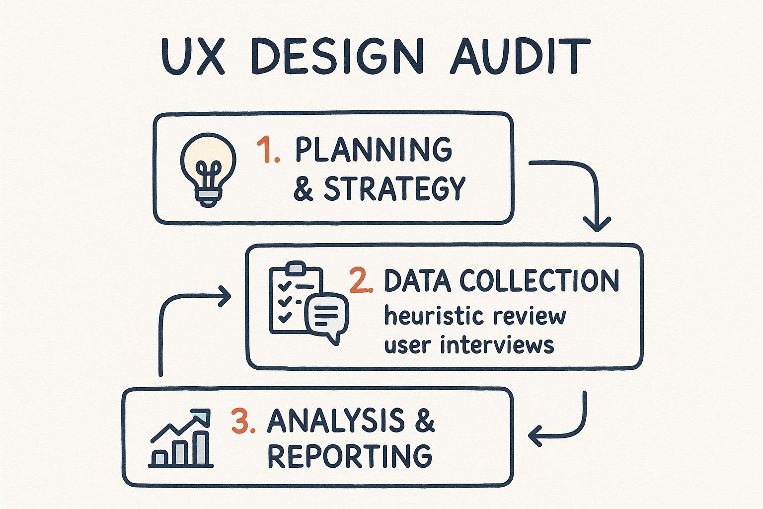
As you can see, it's a structured journey from planning and data gathering to analysis and reporting. Let's break down the key evaluation phases.
Unpacking the Heuristic Evaluation
Think of a heuristic evaluation as an expert inspection. You're essentially reviewing the interface against a time-tested set of usability principles—a professional checklist for spotting common design flaws. For decades, the gold standard has been Jakob Nielsen’s 10 usability heuristics. They provide a powerful lens for critiquing any digital product.
Let's look at a few with practical examples:
Visibility of System Status: Users need to know what’s happening. Practical Example: When a user uploads a file, don't just show a spinning icon. Show a progress bar with a percentage, like "Uploading... 75% complete." This provides clear, actionable feedback.
User Control and Freedom: People make mistakes. A good interface needs an "emergency exit." Practical Example: The "Undo" button after you accidentally delete an email in Gmail is a perfect safety net. It gives users the confidence to act without fear of irreversible errors.
Consistency and Standards: Users shouldn't have to wonder if different words or icons mean the same thing. Practical Example: If you use a gear icon for "Settings" on the desktop site, don't use a slider icon for "Settings" in the mobile app. Stick to one pattern.
This part of the audit is all about flagging violations of these core principles and documenting precisely why they create a frustrating user experience.
Walking in Your User’s Shoes
Next up is the cognitive walkthrough. This method is less about broad principles and more about putting yourself in the shoes of a first-time user trying to complete a specific, critical task. Think: signing up for a newsletter or adding that first item to their cart.
As you move through each step of the task, you have to ask yourself four critical questions:
- Will the user even try to do the right thing? Is the next logical step obvious to them?
- Will they see the button or link they need to click? Is it visible and clearly labeled?
- Will they understand that this action leads to their goal? Does "Continue" actually mean "Go to the next step"?
- Will they get feedback that it worked? After they click, is there a clear confirmation that they're making progress?
A classic failure point I see all the time is an ambiguous call-to-action. Imagine a SaaS pricing page with two plans, but the buttons just say "Select." A new user is left wondering, "Select for what? A free trial? A purchase?" Actionable Insight: Change the labels to "Start 14-Day Free Trial" and "Buy Now" to eliminate guesswork instantly.
Sizing Up the Competition
No product lives in a bubble. A competitive analysis is where you benchmark your user experience against others in your market. This helps you understand what users have come to expect and, more importantly, where you can innovate and pull ahead. This isn't about blindly copying features; it’s about learning from the entire ecosystem.
I usually start by identifying 3-5 direct and indirect competitors. Then, I’ll build a simple matrix to evaluate them on the most critical parts of their UX.
| Competitor | Onboarding Flow | Checkout Process | Mobile Experience |
|---|---|---|---|
| Competitor A | Fast, 3-step sign-up with social login | 2-step checkout, guest checkout available | Fully responsive, fast-loading pages |
| Competitor B | Lengthy form, requires email verification | 4 steps, forces account creation | Separate mobile app, website is not optimized |
| Your Product | 4-step process, no social login | 3 steps, guest checkout hidden | Responsive, but some elements are small |
A table like this makes gaps immediately obvious. Actionable Insight: The table shows your onboarding is slower than a key competitor's. A clear action item is to investigate implementing social login to reduce friction. For anyone building a complex product, this kind of analysis is a non-negotiable part of effective custom web application development, ensuring what you build can actually compete.
A competitive audit isn't just about finding flaws in other products. It's about spotting the clever solutions they've found for common user problems—solutions you might be able to adapt and improve upon.
The numbers back up why this level of detail is so vital. We know that 38% of users will stop engaging with a website if the layout is clunky or unattractive, and a staggering 80% of users find it easier to buy from a site that’s properly optimized for mobile.
By blending these three methods—heuristic evaluation, cognitive walkthroughs, and competitive analysis—you’ll develop a rich, multi-layered understanding of your product's UX. This systematic approach ensures your findings are grounded in both expert principles and real-world context, giving you the ammo you need to make meaningful improvements.
Uncovering the 'Why' with User Testing
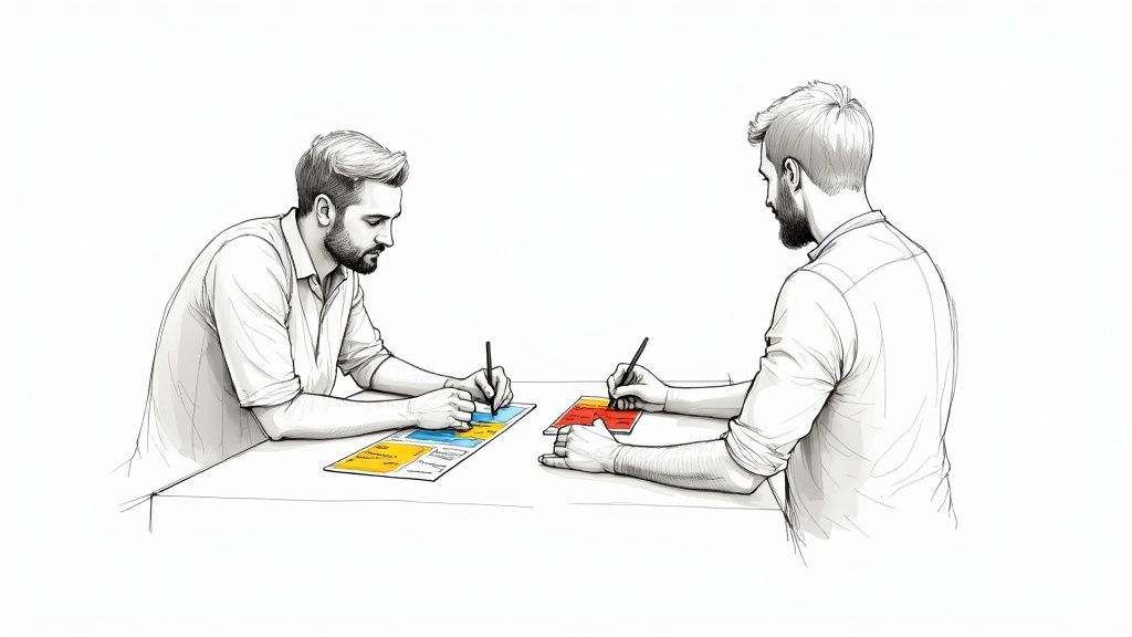
Analytics and heuristic reviews are great at telling you what is happening. You can see where users drop off, which pages have sky-high bounce rates, and where the design violates best practices. But to get to the real friction—the stuff that kills conversions—you need to understand the why.
This is where watching real people use your product becomes the most powerful tool in your ux design audit.
It’s one thing to stare at a report showing a 60% drop-off on your signup form. It’s a completely different thing to actually hear a user mumble, "I have no idea what 'enterprise-grade synergy' means, so I'm not signing up." Those raw, unfiltered moments provide context that data alone can never capture. They transform abstract numbers into undeniable evidence that's impossible for stakeholders to ignore.
Recruiting the Right Participants on a Budget
The idea of user testing often brings to mind expensive labs and complicated recruitment agencies. It doesn't have to be that way. You can get incredibly valuable insights without a massive budget. The secret is finding people who genuinely represent your target audience, not just whoever is available.
Here are a few practical, low-cost ways to find participants:
- Talk to Your Support Team: Your customer support folks are on the front lines every day. Actionable Step: Ask them, "Can you connect us with 3-5 customers who have recently reported confusion about our billing page?"
- Use Social Media Smartly: Don't just blast a generic message. Go to where your audience actually lives online. Practical Example: Post in a LinkedIn group for project managers: "We're looking for PMs to give 15 minutes of feedback on a new feature. We're offering a $25 Amazon gift card for your time."
- Try "Guerrilla" Testing: Need quick feedback on a simple task? Practical Example: Head to a local coffee shop and offer to buy a coffee for anyone willing to try completing a single task on your mobile app, like finding a specific product.
Remember, you're not aiming for statistical significance here. You'll be amazed at how quickly you start seeing the same issues pop up. Most major patterns and pain points reveal themselves after just five to seven participants.
The most powerful audit findings are rarely just numbers on a slide. They are direct quotes from users expressing their confusion, frustration, or delight. This human element is what gets stakeholders to listen and take action.
Crafting a Simple and Effective Test Script
Think of your test script as a guide, not a strict set of rules. Your main goal is to see how people behave naturally, not to lead them toward a specific answer. This means avoiding questions like, "Was it easy to find the checkout button?" That kind of question primes them to think about ease of use and taints their response.
Instead, frame your tasks around real-world scenarios.
Bad Prompt (Leading): "Can you find the button to upgrade your account?"
Good Prompt (Scenario-Based): "Imagine you've been using this tool for a month and want to access more features. Show me how you would do that."
This open-ended approach reveals their actual thought process. You get to see if they look for an "Upgrade" button, a "Billing" section, or something else entirely. Their journey—wrong turns and all—is the data you need. For complex products, knowing where to focus is critical; understanding the principles of outsourcing product development can help teams prioritize core functionalities that need the most rigorous testing.
Choosing the Right User Testing Method
There’s no one-size-fits-all approach to user testing. The best method depends entirely on your goals, timeline, and resources. Picking the right one will determine the kind of insights you get from your ux design audit.
Here’s a quick rundown of some common methods with practical use cases.
| Method | Best For | Pros | Cons | Practical Example |
|---|---|---|---|---|
| Moderated Remote Test | Deeply understanding complex tasks. | Allows for follow-up questions. | Time-consuming. | Use this to watch a new user go through your entire 10-step project setup process. |
| Unmoderated Test | Gathering feedback on specific tasks quickly. | Fast and cost-effective. | No ability to ask clarifying questions. | Send a task to 50 users asking them to find and download their last invoice. |
| Five-Second Test | Gauging a page's first impression. | Very quick; provides feedback on clarity. | Only measures initial perception. | Show your homepage for five seconds and ask, "What does this company do?" |
| Card Sorting | Evaluating your information architecture. | Helps you understand users' mental models. | Can be abstract. | Ask users to group 20 features into categories that make sense to them to define your main navigation. |
Ultimately, choosing a method comes down to what you need to learn. By integrating these observational techniques, your audit will evolve beyond a simple checklist of problems. You'll have the qualitative evidence—the human stories—to back up your data and create a powerful narrative for driving real, meaningful change.
Creating a Report That Inspires Action
https://www.youtube.com/embed/GXTkczM8nmY
Even the most thorough UX design audit is a waste of time if the findings end up buried in a folder on a shared drive. The final report is your bridge from analysis to action. Its whole purpose is to translate all that complex data and user feedback into a clear, persuasive story that makes stakeholders want to invest in change.
A report that just lists problems has already failed. A great report is a strategic tool—it’s a prioritized roadmap that helps product managers and developers see not just what’s broken, but where the opportunities are for real business growth. Your job is to deliver a document that empowers your team, not overwhelms them.
Start With the Business Impact
Let's be honest, decision-makers are busy. They need to see the bottom-line implications of your findings right away. That's why your report has to lead with a sharp, concise executive summary that connects UX friction directly to business metrics.
Vague Finding: "The checkout process is confusing."
Actionable, High-Impact Finding: "Our 4-step checkout process has a 68% abandonment rate, primarily on the 'Shipping Details' page. By simplifying this to a 2-step process with address auto-fill, we project a 15% increase in completed sales, equating to an estimated $12,000 in additional monthly revenue."
This kind of framing gets attention and immediately builds the case for why your recommendations matter.
Prioritize Ruthlessly With a Simple Framework
One of the biggest mistakes I see is a massive, unprioritized laundry list of every single issue found. This is a recipe for "analysis paralysis," where the team is so swamped they don't know where to possibly begin.
The solution is to use a simple prioritization framework. I score every issue based on two critical axes:
- User Impact: How bad is this for the user? (Low, Medium, High)
- Implementation Effort: How much work is this for developers? (Low, Medium, High)
Plotting each issue on this simple matrix helps you instantly spot the most strategic fixes.
| Issue | User Impact | Dev Effort | Priority | Actionable Example |
|---|---|---|---|---|
| Change CTA text from "Submit" to "Get Your Free Quote" | Medium | Low | Quick Win | This is a 10-minute text change that can significantly improve conversion clarity. Do this first. |
| Add a "Guest Checkout" option | High | Medium | High Priority | This requires some backend work but directly addresses a major drop-off point. Plan for the next sprint. |
| Redesign the entire product dashboard | High | High | Strategic Initiative | This is a major project. Use findings to build a business case for a future quarter. |
The real gold is in the low-effort, high-impact fixes. Nailing these "quick wins" builds momentum and proves the value of the audit, which makes it much easier to get buy-in for the bigger, more complex projects down the road.
Make Your Findings Undeniable
Your opinion alone isn't going to drive change. You need to back up every single finding with rock-solid evidence that brings the user's struggle to life. This is where you weave together quantitative data and powerful qualitative insights to build a story that resonates.
Here’s how to make your evidence impossible to ignore:
- Use Annotated Screenshots and Videos: A picture is worth a thousand words. Practical Example: Include a screenshot of your form with a red circle around the tiny, hard-to-read error message that users missed.
- Incorporate Direct User Quotes: Raw, unfiltered quotes are incredibly persuasive. Practical Example: Instead of saying "Users were confused," say "User 3 said, 'I felt stupid because I couldn't find the 'save' button. I just gave up.'"
- Visualize the Data: Ditch the spreadsheets and use simple charts and graphs. Practical Example: Show a bar chart comparing the task completion time of your checkout process (4 minutes) versus your main competitor's (1.5 minutes).
This approach transforms your report from a dry document into a compelling narrative. The impact can be immediate and profound. For example, a diagnostics company I read about discovered that a barely-visible ‘Book Now’ button and slow mobile performance were killing their business. After their audit, they implemented a one-tap booking feature and optimized mobile speed. The result? They tripled their online appointments in just three months. You can find more details about their success and other valuable insights about UX audits here.
Ultimately, your audit report should provide a clear path forward, turning a list of problems into a prioritized backlog of actionable solutions. To see more examples of how data-driven design can shape successful products, you can explore the various case studies on the Pixel One blog.
A Few Common Questions About UX Audits
Even after laying out the whole process, I find people still have a few lingering questions before they feel ready to jump in. That's completely normal. A UX design audit can feel like a huge undertaking, so let's clear up some of the most common uncertainties I hear all the time.
How Often Should I Actually Do One of These?
For a full-blown, deep-dive audit, I usually recommend doing one every 12 to 18 months. Think of it as a comprehensive health check-up for your product. It’s also a non-negotiable step before any major redesign.
But here’s a pro tip: don’t just wait for that annual check-up. The most successful teams I’ve worked with have a "continuous audit" mindset. They run smaller, more focused audits on specific user flows whenever a red flag pops up. Practical Example: If you launch a new feature and analytics show only 5% of users are engaging with it after a month, that's the perfect trigger for a mini-audit focused solely on that feature's discoverability and usability.
This approach helps you catch issues before they snowball into bigger problems and keeps your UX in top shape year-round.
What's the Difference Between a UX Audit and a Usability Test?
This question comes up a lot, and it's easy to see why they get confused. The easiest way I can explain it is by thinking about a car mechanic.
A usability test is like checking the tire pressure. It’s a single, vital diagnostic test. The UX audit is the full, bumper-to-bumper vehicle inspection that uses the tire pressure results—along with dozens of other data points—to assess the car's overall health.
In other words, a usability test is just one tool in the audit toolbox. It's where you watch real people interact with your product to spot where they get stuck. A UX audit is the entire project—a holistic evaluation that pulls together findings from multiple sources to see the big picture.
An audit synthesizes insights from things like:
- Usability testing to see user struggles firsthand.
- Heuristic analysis to spot violations of design best practices.
- Analytics review to understand what users are actually doing at scale.
- Competitive benchmarking to see where you stand in the market.
All these pieces together give you a strategic roadmap that a single usability test simply can't provide.
Can I Do This on a Shoestring Budget?
Absolutely. You don't need a six-figure software budget to get meaningful results. The single most important part of any UX design audit is a critical, user-centered perspective, and that doesn't cost a dime.
You can run a surprisingly effective "lean" audit with free or low-cost tools. Practical Example: You and a colleague can perform a heuristic evaluation using Nielsen's 10 Usability Heuristics as your guide. Each of you evaluates the product independently and then compares notes to identify the most critical issues. This simple process costs nothing but time and provides immense value.
For data, free tools like Google Analytics are a goldmine for finding where users are dropping off. When it's time for user feedback, you can run "guerrilla" tests by simply asking colleagues, friends, or even people at a coffee shop who fit your general user profile. Just be aware of their biases and focus on observing their raw behavior, not just their opinions.
What Are the Biggest Mistakes to Avoid?
I’ve seen a few audits go off the rails, and it’s rarely because of the tools. It’s almost always about the approach.
Here are the top three mistakes I see people make:
- Not Setting Clear Goals: Kicking off an audit without a specific business problem to solve is a recipe for disaster. You'll end up with a mountain of interesting-but-useless information.
- Relying on Your Own Opinion: Your personal feelings about the design are irrelevant. Every single finding you report must be backed by evidence, whether it's from analytics data, direct user observation, or established design principles.
- Delivering an Unprioritized Laundry List: The worst thing you can do is hand your team a 50-page report of everything that's wrong. A great audit delivers a focused, prioritized action plan that makes it crystal clear what to fix first to get the biggest bang for your buck.
Steering clear of these traps is the key to turning your audit from a simple critique into a real catalyst for improving your product.
Ready to transform your user experience and drive real business results? The expert team at Pixel One specializes in comprehensive UX design audits that uncover actionable insights and create clear roadmaps for growth. Let's build a better product together.