Master Product Led Onboarding for Better User Adoption
Learn effective strategies for product led onboarding that increase user activation and retention. Turn new signups into loyal customers today.Product-led onboarding is all about letting your product do thetalking. Instead of forcing new users through sales demos or handing them a dense manual, you guide them to discover value on their own, right inside the app. The goal is to help people learn by doing. For example, instead of a video explaining how to create a project, the onboarding itself prompts the user to type a project name, hit "Create," and see it appear instantly.
Why Product-Led Onboarding Is a Must-Have for SaaS Growth
The old way of buying software is dead. Nobody wants to schedule three demos and wait for a sales rep to "unlock" a trial anymore. Users today expect to sign up and see what your product can do for them almost instantly. This fundamental shift is exactly why product-led onboarding has become so critical.
This self-serve model isn't just a fleeting trend. It's a direct response to what customers actually want: autonomy and immediate results. Your product has to be your best salesperson, your best teacher, and your best retention tool, all rolled into one.
The Big Shift: From Sales-Gated to Self-Service
Think about signing up for a new project management tool. The old-school, sales-led way involved filling out a form, waiting for an email, and then sitting through a 30-minute demo. It could take days before you even got to create your first task. It was slow and full of friction.
Now, picture the product-led version. You sign up and are immediately prompted to create your first project. A simple, interactive checklist pops up, suggesting you invite a teammate and assign a task. In just a few minutes, you’ve experienced the core value of the tool without any hand-holding. That’s product-led onboarding in a nutshell—it slashes the time it takes for a user to get that "Aha!" moment.
Product-led onboarding closes the gap between a user's first login and their first moment of genuine value. It's about designing an experience so intuitive that the product itself becomes the best guide, leading users to success on their own terms.
This isn't just a niche strategy; it's how modern SaaS companies operate. In fact, a whopping 79% of SaaS companies have already embraced product-led growth (PLG) strategies. This overwhelming adoption makes one thing crystal clear: letting users experience value for themselves is the fastest path to higher engagement.
This simple comparison shows just how different the two approaches are.
Onboarding Models: Traditional vs. Product-Led
| Aspect | Traditional Sales-Led Onboarding | Modern Product-Led Onboarding |
|---|---|---|
| User's First Step | Schedule a demo or talk to sales. | Sign up and start using the product immediately. |
| Learning Method | Passive. Watching a presentation or reading guides. | Active. Learning by doing tasks within the app. |
| Time-to-Value | Slow. Can take days or weeks. | Fast. Often within the first few minutes. |
| Main Goal | Educate the user on all features. | Guide the user to a quick win (the "Aha!" moment). |
| Primary Guide | A salesperson or customer success manager. | The product itself (UI, tooltips, checklists). |
| Scalability | Low. Depends on human resources. | High. Scales effortlessly with user growth. |
The move to a product-led model is less of a choice and more of a necessity for staying competitive and meeting user expectations head-on.
The chart below really drives home the impact a well-designed product-led onboarding flow can have on the metrics that matter most.
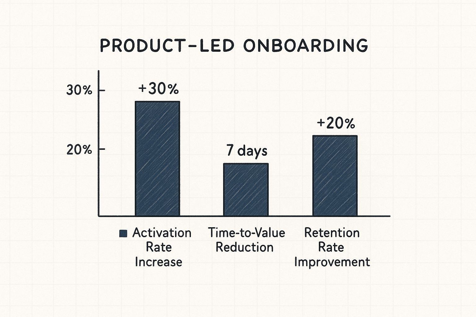
As you can see, the benefits aren't just theoretical. They translate into real, measurable improvements that fuel a healthier, more sustainable business.
Meeting Modern User Expectations
Today’s users are savvy, and they have options—lots of them. If they can’t figure out your product in the first five minutes, they’ll simply find one they can. A clunky, confusing first impression is a death sentence for adoption. For example, a user signing up for an analytics tool expects to see a dashboard—even a sample one—immediately, not a blank screen with a "Get Started" button.
The entire user journey, from the second they land on your signup page to the moment they activate, is now an integral part of the product experience. This is why weaving these principles into your process is a cornerstone of effective product development for startups. When you deliver a smooth onboarding flow, you’re not just meeting expectations; you’re building the foundation for a long-lasting customer relationship.
Finding and Building Around Your 'Aha!' Moment
Let's be honest, the best product-led onboarding isn't just a random assortment of tooltips and pop-ups. Far from it. The really effective ones are carefully crafted journeys with a single, clear destination: the 'Aha!' moment.
This is that magic instant when a new user doesn't just understand what a feature does, but truly gets your product's core value. For Slack, it’s when a team sends 2,000 messages. For Dropbox, it’s putting one file in one folder on one device and seeing it appear on another. They see exactly how it's going to solve their problem, and everything just clicks.
This single moment is the bedrock of long-term retention. Your primary job during onboarding is to get users there as quickly and smoothly as possible. Everything else can wait.
But how do you find something that feels so personal and subjective?
Uncovering Your Product's Core Value Moment
Pinpointing your 'Aha!' moment isn't about guesswork; it's about putting on your detective hat. The clues are already there, hidden in the behavior of your most successful, long-term users. They’ve basically left you a trail of breadcrumbs.
Actionable Insight: Use a tool like Mixpanel or Amplitude to compare the actions of users who retained after 30 days versus those who churned. Look for a strong correlation. Did 80% of retained users create a "shared workspace" in their first session, while only 15% of churned users did? That's a powerful clue.
Did they all invite a teammate right away? Maybe they connected a specific integration or created and shared their first report. This action, or a short sequence of them, is likely your 'Aha!' moment.
The 'Aha!' moment is the earliest point at which a user experiences the promised value of your product. Identifying this is your North Star for onboarding; every step, screen, and message should be designed to guide users there as efficiently as possible.
Once you have a solid hypothesis from the data, it's time to talk to people. Interview your power users. Ask them to pinpoint the exact moment the product "clicked" for them. Actionable question: "Can you remember the specific moment you thought, 'Ah, okay, I get how this is going to help me'?" Their stories and the specific words they use will give you the rich context that numbers alone can't provide.
Reverse-Engineering the Ideal User Path
Once you’ve clearly defined your 'Aha!' moment, the next job is to build the shortest, most frictionless path to get new users there. I love the "Bowling Alley Framework" analogy for this. Your goal is to add bumpers to the lane to keep the user (the ball) heading straight for the pins (the 'Aha!' moment).
This means you have to be ruthless about cutting out any unnecessary steps or distractions.
Does a user really need to fill out their entire profile before they can create their first invoice? Probably not. Push all those non-essential setup tasks until after they've had that first critical win.
Here’s a practical way to map this journey:
- Define the Destination: Be specific. For an analytics tool, it might be, "User creates their first dashboard and sees real-time data."
- Identify Critical Steps: What are the absolute bare-minimum actions required to get there? Maybe it's just connecting a data source and then dragging one widget onto a canvas.
- Remove Friction: Look at each step and ask, "Can this be simplified, automated, or postponed?" Practical example: Instead of asking users to connect their own data source immediately, pre-populate a dashboard with compelling sample data. That way, the user sees immediate value before they even connect their own accounts.
This streamlined approach is essential for launching a successful minimum viable product and is a core principle for any MVP development company trying to validate an idea quickly. You have to prove your product's worth before asking the user to invest a lot of time and effort.
Using Onboarding Elements as Helpful Signposts
With the path clearly mapped out, you can now strategically place in-app guidance—not as annoying interruptions, but as helpful signposts along the way. Think of welcome screens, walkthroughs, and checklists as your tools to keep users on the fastest route to value.
- Welcome Screens: Use this first touchpoint to set expectations and personalize the journey. Asking a simple question like, "What's your main goal today?" can help you tailor the entire experience to their specific needs.
- Interactive Walkthroughs: Ditch the passive, five-minute product tour that points out every single button. Instead, create a "learn-by-doing" walkthrough that actively guides the user through completing that first critical action. For example, a tooltip appears next to a button and says, "Click here to add your first client."
- Onboarding Checklists: A checklist with just 3-4 key steps is incredibly motivating. It gives users a clear roadmap and a satisfying sense of accomplishment as they get closer to their 'Aha!' moment. Example: Asana's checklist includes "Create a task," "Complete a task," and "Invite a teammate."
Trello is a classic example of this done right. Their onboarding doesn't throw a user manual at you. It drops you right into a pre-built board that functions as an interactive tutorial, guiding you to move cards and create lists—the very actions that define its core value. Users learn by doing, reaching their 'Aha!' moment in a completely natural, hands-on way.
Crafting In-App Guidance That Actually Helps
I've seen so many well-intentioned onboarding flows fall flat for one simple reason: they’re overwhelming. When users are hit with a constant stream of pop-ups, forced product tours, and blinking tooltips, it just creates noise. It doesn't lead to clarity.
The best product-led onboarding feels less like an interruption and more like a helpful whisper at just the right moment. The goal is to guide, not to dictate. Instead of showing off every single feature upfront, your in-app messages should show up based on what the user is actually doing. This approach trusts them to learn by doing, with support ready and waiting the second they need it.
Choosing the Right Message for the Right Moment
Not all in-app messages are created equal. Using a disruptive modal window to point out a minor button is like using a megaphone to ask for the salt. You have to match the message format to the importance of the information and what the user is trying to accomplish.
Here's an actionable breakdown of the tools in your toolkit and when to pull them out:
- Tooltips: Use for explaining a single UI element. Example: A tooltip over a "?" icon says, "Need help? Visit our support center."
- Hotspots: Use for drawing attention to new or underused features. Example: A pulsing dot on "Templates" invites users to discover pre-made project layouts.
- Modals (Pop-ups): Use only for critical, action-blocking information. Example: A modal appears to confirm a permanent action: "Are you sure you want to delete this project?"
- Slideouts: Use for non-critical announcements or celebrating wins. Example: A slideout appears after the first file upload: "Success! Your file is now ready to share."
A common pitfall is leaning on a single "one-size-fits-all" approach. I’ve often found that a deep-dive UX design audit uncovers exactly where current messaging is causing more friction than help.
The Power of Behavioral Triggers
This is where the real magic happens. The most helpful in-app guidance is tied to behavioral triggers. This means your messages don't just pop up on a timer; they appear in direct response to what a user does—or doesn't do. It makes the guidance feel incredibly personal and relevant.
Actionable example: If a user navigates to the "Integrations" page but doesn't connect anything after 60 seconds, trigger a slideout offering a link to a 2-minute setup video. This is a direct response to their inaction.
The most effective in-app guidance feels less like an automated system and more like an expert sitting next to the user, offering a helpful tip at the perfect moment. It's about anticipating needs, not just pointing out features.
Another great trigger is when a user hits a milestone. When they successfully add their first team member, don't just leave them hanging. Celebrate it! A small, cheerful slideout that says "Great job! Now, try assigning them their first task" reinforces the right behavior and nudges them toward that next key "aha!" moment.
Writing Copy That Connects
Even the best-designed tooltip can be ruined by bad copy. Your in-app messages need to be clear, concise, and sound like they were written by a human. Ditch the corporate jargon and overly formal language.
Just look at these two versions of a tooltip for a "sync" button:
- The Bad: "Utilize this function to initiate data synchronization with the server."
- The Good: "Click to sync your latest changes."
The second one is direct, action-oriented, and you can understand it in a split second. Actionable Insight: Read your copy out loud. If it sounds robotic or unnatural, rewrite it. Use active verbs and simple words. This ensures your guidance actually helps users make progress instead of just giving them more to read.
How to Measure Onboarding Success
A brilliant onboarding strategy is useless if you can’t prove it’s actually working. It's easy to get distracted by vanity metrics like total signups or screen views, but those numbers don't tell you the real story. You need to connect your onboarding efforts directly to business outcomes like user activation and long-term retention.
The first move is to decide on a single, primary objective. What's the one thing you're trying to achieve? Are you aiming to boost your user activation rate? Or is the main goal to slash the time it takes for someone to get real value from your product?
Pinpointing the right metrics is everything. While every company's goals are different, industry benchmarks show that the most effective onboarding programs zoom in on just 1–2 primary objectives, like cutting down the time-to-value or pushing key feature discovery. When you focus your efforts, you avoid a diluted strategy and make success much easier to track. You can get more great insights on choosing the right metrics on Productled Alliance.
Setting Up Analytics Funnels to Spot Friction
Once you have your primary goal locked in, it's time to find out exactly where new users are getting stuck. This is where analytics funnels become your best friend. A funnel simply tracks a user's journey through a series of steps you define, showing you precisely where they drop off.
Let's imagine an onboarding funnel for a project management tool:
- User signs up. (100% start here)
- Creates their first project. (85% make it)
- Invites a teammate. (55% make it)
- Assigns their first task. (40% make it)
By tracking the conversion rate from one step to the next, you can immediately find the biggest roadblocks. In this example, you see a massive 30% drop-off between creating a project and inviting a teammate. This is your action item. You now know exactly which part of your flow needs a rethink.
Core Quantitative Metrics to Track
Beyond funnels, a few key metrics will give you a clear, data-driven picture of how your onboarding is performing. These KPIs go way beyond simple completion rates and measure genuine user engagement.
- Activation Rate: What percentage of new users actually complete your defined activation event—that "Aha!" moment? This is the ultimate yardstick for onboarding success.
- Time-to-Value (TTV): How long does it take, on average, for a new user to hit that activation milestone? A shorter TTV is almost always a win, proving your onboarding is efficient and effective.
- Feature Adoption Rate: What percentage of new users try out a specific key feature within their first week? This is vital for making sure people discover the full power of your product.
- User Retention Rate (Week 1): What percentage of users come back to your product within the first seven days? Strong early retention is a fantastic predictor of long-term loyalty.
These numbers give you the hard data you need to justify changes and track your progress. This data-first mindset is a core part of the modern process to develop an app that can actually scale.
The point of measurement isn’t to fill up a dashboard; it’s to find actionable insights. A high TTV is a clear signal to simplify your setup. If feature adoption is lagging, you need to build better in-app guidance to shine a spotlight on that functionality.
Gathering Qualitative Feedback for the 'Why'
Numbers tell you what is happening, but they rarely tell you why. Your funnel might show a drop-off at a specific step, but it won't explain if it was because of a confusing interface, a bug, or just a poorly worded instruction. This is where getting qualitative feedback is so important.
To truly understand the user's experience, you have to talk to them. The good news is there are several ways to get this context without derailing their workflow.
Methods for Qualitative Insights:
| Method | Best For | Actionable Example |
|---|---|---|
| In-App Surveys | Getting instant feedback on a specific moment. | After a user finishes a key action, a simple one-question survey pops up: "On a scale of 1-5, how easy was that?" |
| User Interviews | Digging deep into motivations and pain points. | Schedule a 20-minute video call with users who dropped out of your onboarding funnel and ask, "What were you hoping to do that you couldn't?" |
| Session Replays | Seeing exactly how users interact with your product. | Use a tool like Hotjar to watch recordings of where people hesitate, rage-click, or get completely lost on a specific page. |
When you combine this kind of feedback with your quantitative data, you get the complete picture. You can see the drop-off point in your analytics, then watch a session replay to understand the exact reason it happened. This powerful mix of "what" and "why" is the key to continuously testing, iterating, and truly optimizing your onboarding for maximum impact.
Spotting and Fixing Common Onboarding Blunders
You can have the best product in the world, but a clunky first impression will sink it. A confusing, overwhelming, or just plain boring onboarding experience doesn't just frustrate new users—it actively shoves them out the door. Learning to spot these common tripwires is the fastest way to smooth out your user journey and stop that early-stage churn.

The good news is that most teams fall into the same traps, and these mistakes are all fixable. Think of this as a quick diagnostic for your own onboarding. We'll find those friction points and make a few small changes that can deliver huge wins in user activation and long-term loyalty.
The "All-You-Can-Eat" Feature Tour
We've all seen this one. It’s the most common mistake by far: trying to show off every single feature right after signup. I get it—you're proud of what you've built. But this "feature buffet" approach is a classic case of product-owner bias that completely steamrolls new users. They signed up to solve a problem, not to memorize your entire sitemap on day one.
Forget the grand tour that points out every button and menu. You need to laser-focus on the 2-3 core actions that get a user to their first "Aha!" moment as quickly as possible.
- How to Fix It: Swap the long, passive tour for a short, hands-on walkthrough. If you're building a video editor, don't overwhelm them with color grading and advanced audio mixing. Just guide them to upload one clip, make a single cut, and click "Export." That’s the win. You can introduce all the fancy stuff later, after they've felt that initial spark of success.
The Rigid, One-Size-Fits-All Onboarding
Treating every single user identically is a massive missed opportunity. A marketing manager and a software developer might both use your product, but their goals, technical comfort levels, and immediate needs are worlds apart. A generic, one-track onboarding experience will almost certainly feel irrelevant to one of them, if not both.
The solution is simple: let users tell you who they are, then adapt the experience.
A truly effective product-led onboarding journey doesn't feel like a rigid lecture; it feels like a personal conversation. It adapts to the user's role and goals, showing them exactly what they need to see and nothing more.
- How to Fix It: Add a simple question on your welcome screen. Example: Canva asks, "What will you be using Canva for?" and provides options like "Small Business," "Student," or "Personal." Based on their answer, it surfaces relevant templates and features. This little bit of upfront segmentation makes the entire experience feel more personal and valuable.
Forgetting to Celebrate the Small Wins
If onboarding is just a long checklist of tasks, it feels like a chore. People are driven by progress and a sense of accomplishment. When they complete a key step—like inviting their first teammate or creating their first report—and your app just sits there silently, the moment falls flat. It's a huge letdown.
Celebrating these small victories is absolutely essential for building momentum and encouraging good habits. It’s a simple psychological hack that keeps users engaged and eager to see what's next.
- How to Fix It: Acknowledge their progress with small, delightful UI moments. A quick animation, a pop-up saying "Nice one!", or even just a satisfying checkmark can make a world of difference. Example: Mailchimp shows a high-five animation after you send your first campaign. These little bursts of positive reinforcement make the user feel successful and motivated to take the next step. If you're finding it hard to build in that kind of engagement, it might be worth talking to some of the best UX design agencies to help spot those missed opportunities.
The stakes for getting this right have never been higher. User expectations are through the roof. Recent data shows that 90% of users feel companies could do a better job with onboarding. Worse, a staggering 80% have deleted an app simply because they couldn't figure out how to use it.
Product-Led Onboarding FAQs
Even with the best strategy laid out, moving to a product-led onboarding model always brings up a few questions. It’s a completely different way of looking at the user journey, so it’s natural to hit some bumps. Here are some of the most common questions I hear from teams, with some straightforward answers to help you navigate the tricky parts.
How Do You Balance Guidance with User Exploration?
Think of yourself as a helpful guide on a hiking trail, not a tour bus driver on a fixed route. The trick is to offer contextual, on-demand help instead of a rigid, forced tour that people just click through to get over with. You're trying to spark curiosity, not get in the way of it.
Actionable Insight: Use passive guidance elements. A hotspot or a gently pulsing icon can draw attention to a key feature without yanking the user out of what they're doing. A progress checklist is another great tool because it provides structure but lets the user decide which step to tackle next, empowering them to choose their own path.
The sweet spot is when guidance is easy to find but never mandatory. This gives users the freedom to explore on their own, but with a safety net right there if they get stuck. It’s the perfect mix of discovery and support.
Can Product-Led Onboarding Work for Complex Enterprise Products?
It absolutely can, but you have to be much smarter about it. A one-size-fits-all onboarding flow is doomed to fail when you’re dealing with a complex product that has a ton of features. The secret is to break the experience down into role-based or use-case-based paths.
Practical Example: Salesforce's Trailhead platform does this masterfully. Instead of one giant tutorial, it offers distinct learning paths for "Administrators," "Marketers," and "Developers." A new marketing user is immediately guided through creating a campaign, while an admin is shown how to manage user permissions. This approach stops you from overwhelming people with features they don’t need right away.
This way, you get them to their specific "Aha!" moment much faster, proving your product’s value for their job from the get-go.
What Is the Single Most Important Element?
If I had to boil it all down to one thing, it would be speed to value. Your entire product-led onboarding flow should be obsessed with one goal: helping a new user achieve something meaningful as fast as humanly possible. Everything else is built on this foundation.
That first small win is what hooks people. It gives them a reason to stick around and see what else your product can do. All the slick tooltips and clever checklists in the world mean nothing if a user logs out of their first session without feeling like they accomplished something.
- For an invoicing tool, it’s the feeling of creating and sending that first invoice.
- For a social media scheduler, it’s seeing their first post pop up on the calendar.
- For a design tool, it’s successfully exporting their first simple graphic.
That initial taste of success is the bedrock of keeping users for the long haul.
How Often Should We Update Our Onboarding Flow?
Onboarding is never a "set it and forget it" project. You have to treat it just like any other feature in your product—something that needs constant attention and improvement. It has to grow and change right along with your product and your users.
At a minimum, plan to review your onboarding metrics quarterly. Use that data, along with feedback from user surveys and interviews, to find out where people are getting stuck and what you can improve.
Actionable Insight: Implement a continuous feedback loop. At the end of your onboarding checklist, include a final item: "How was this walkthrough? Give feedback." This creates a permanent channel for qualitative insights directly from new users at the most relevant moment. This, combined with running small A/B tests on things like tooltip copy or checklist order, ensures your onboarding never feels dated.
This constant tinkering ensures your onboarding never feels dated and is always getting better at creating a fantastic first impression.
Ready to build a digital product with an onboarding experience that drives real results? Pixel One specializes in turning complex challenges into simple, scalable solutions that users love. Find out how we can help you at https://www.pixelonelabs.com.