UX Design for Startups: A Founder's Guide
Unlock growth with our guide to UX design for startups. Learn lean, budget-friendly strategies to build products users love and drive business results.Adopting a Lean UX mindset is your secret weapon. It’s how you validate ideas fast, cut out wasted development time, and actually build something people will pay for. This isn't some luxury reserved for big, well-funded companies; it's a core survival tactic when you're running on tight budgets and even tighter timelines. This approach turns user experience from a "nice-to-have" into the very engine that drives your growth.
Why Great UX Is a Startup Superpower
In the high-stakes world of startups, every dollar and every minute counts. There's always immense pressure to just ship features, often at the expense of how people will actually use them. That’s a critical mistake. A clunky, confusing product doesn’t just frustrate users—it actively burns through your limited resources with a flood of customer support tickets, plummeting conversion rates, and soaring acquisition costs.
I once advised a promising fintech startup that nearly ran itself into the ground by ignoring early user feedback. They were convinced their complex dashboard was a work of genius, but their first users found it completely unusable. By the time they admitted there was a problem, they had already burned through six months of their runway building a ghost town. It was only after a painful pivot to a user-centric approach—starting with simple interviews and paper prototypes—that they managed to save the business.
The Financial Case for User Experience
Investing in UX isn't just about making things look pretty; it's one of the highest-impact moves a startup can make. The financial return is staggering. Research consistently shows that every $1 invested in UX can bring back $100—that's a 9,900% ROI. For a startup chasing rapid growth, that's a game-changer.
Even a small, incremental budget increase of just 10% toward UX design can boost key conversion rates by as much as 83%, making your entire sales and marketing funnel more efficient.
Founders often think of UX as an expense. The reality is that poor UX is the real expense—paid for in lost customers, wasted development cycles, and missed opportunities.
Turning Theory into Action
So, what does this look like in practice? Great UX for a startup means making your product feel intuitive and valuable from the very first click. When users can effortlessly get what they came for, they start to trust your brand. That trust is the foundation for turning them into paying customers and, eventually, your biggest advocates.
A practical first step is to run a simple evaluation of your current product or prototype. Just identifying the biggest points of friction can give you a clear roadmap for what to fix first. To get started, you might be interested in a structured approach like a UX design audit, which can quickly uncover the critical usability issues holding you back. This isn't about chasing perfection; it's about making small, consistent improvements that deliver a real impact on your bottom line.
Now, let's break down the core principles of this approach. The table below summarizes the Lean UX mindset and what it actually means for your day-to-day grind as a startup.
The Lean UX Mindset for Startups at a Glance
| Principle | What It Means for Your Startup | Actionable Example |
|---|---|---|
| Move Fast, Learn Faster | Don't spend months building in a vacuum. Your goal is to get feedback on a core idea as quickly as possible, even if it's not perfect. | Instead of building a full feature, create a clickable prototype in Figma in one day and show it to 5 potential customers for immediate reactions. |
| Assumptions are Risks | Every unproven idea in your product plan is a potential point of failure. The mission is to systematically validate or invalidate these assumptions. | You assume users want a detailed analytics dashboard. Test it: create a simple "Coming Soon" button for the feature and see how many people click it. |
| Outcomes Over Output | Stop measuring success by the number of features you ship. Focus on whether those features actually solve a user problem and move your business metrics. | Instead of saying "We shipped the new onboarding flow," your goal becomes "We increased user activation by 15% with the new onboarding." |
| Collaborative Design | UX isn't one person's job. Involve everyone—engineers, marketers, founders—in the design process to build shared understanding and move quicker. | Run a 30-minute "crazy eights" sketching session with your whole team to generate a ton of ideas for a new screen before writing a single line of code. |
Embracing these principles isn't about adding more work; it's about doing the right work. It shifts the focus from building features to solving real problems, which is the only sustainable path to growth.
Finding Your First Users and What They Really Want
Here’s a hard truth: the biggest mistake any startup can make isn't running out of money. It’s building something nobody actually wants. So, before you write a single line of code or spend a dollar on development, you have to get inside the heads of your potential users.
Don't worry, this doesn't mean you need expensive focus groups or months of academic-level research. Some of the most powerful insights I've ever seen came from scrappy, creative, and incredibly fast user research. The goal isn't perfection; it’s about gathering just enough data to make informed decisions and point your product in the right direction.
And the market agrees. The global UX services market was valued at around $2.59 billion back in 2022 and is projected to explode to nearly $33 billion by 2030. Why? Because startups are finally realizing its importance. When 38% of people will ditch a website simply because of a confusing design, the cost of ignoring your users is just too high.
Uncovering Insights in Unexpected Places
You don't need a formal lab to find your first users. They're already out there, and their unfiltered opinions are pure gold. The trick is to meet them where they already are.
One of my favorite starting points is mining competitor reviews on platforms like G2, Capterra, or even the App Store. Look for the patterns. What do users consistently love? What drives them absolutely crazy? What do they wish the product could do? These reviews are a treasure trove of pain points and feature requests, just waiting for you.
- Actionable Insight: Go to Capterra, find a direct competitor, and filter for 1-star and 2-star reviews. Copy and paste the top 20 complaints into a document. This is your initial hit list of problems to solve better than they do.
- How to organize it: Use a simple spreadsheet with columns for Pain Point, Desired Feature, and a direct User Quote. After you've gone through 20-30 reviews, you’ll see clear themes jump out at you.
This simple exercise gives you a solid grasp of the market’s needs before you even speak to a single person.
The Power of Guerrilla Interviews
Once you have that foundational data, it’s time for what we call "guerrilla" interviews. This is just a fancy way of saying brief, informal chats with people you think are in your target audience. A local coffee shop, a co-working space, or an industry meetup can become your research lab.
Your goal isn't a deep interrogation. It's a quick, candid conversation to see if your assumptions hold water. Offer to buy someone a coffee for 10-15 minutes of their time. It's a low-stakes approach that, in my experience, gets you much more honest feedback than a stuffy, formal interview ever could.
Pro Tip: Whatever you do, never ask, "Would you use this?" It’s a leading question that only invites polite, useless answers. You need to focus on their past behaviors and current frustrations around the problem you're trying to solve.
Here's a simple script I’ve used dozens of times:
- The Opener: "Hi, I'm working on a new project for [your target audience, e.g., 'freelance graphic designers'] and I'd love to get your thoughts. Do you have 10 minutes? Coffee's on me."
- The Problem Probe: "Can you tell me about the last time you tried to [task your product solves, e.g., 'manage client invoices']? What was the most annoying part of that?"
- The Solution Question: "If you could wave a magic wand and fix one thing about [the process], what would it be?"
- The Value Prop Test: (Only after they've described their pain) "Interesting. I'm exploring an idea for a tool that [your one-sentence value proposition]. Does that sound like it would help with the frustrations you mentioned?"
This approach quickly tells you if the problem you think you're solving is actually a real, painful one for people.
Creating Actionable User Personas
All this raw data—from reviews and interviews—needs to be organized into something your team can actually use. That’s where user personas come in. But forget those multi-page documents with stock photos and fake hobbies. A startup persona should be a lean, one-page summary.
Focus on just these key elements:
- Role & Demographics: A simple title and the basics (e.g., "Maria, 32, Freelance Project Manager").
- Goals: What is she trying to achieve that relates to your product? Example: "Quickly see which projects are behind schedule without digging through emails."
- Frustrations: What are the biggest obstacles and pain points she faces day-to-day? Example: "Wasting time in status meetings to get simple updates."
- Key Quote: A single sentence that sums up her primary motivation or frustration. Example: "I just need to know what's on fire right now."
Start with just one or two of these. They will become your team's north star, guiding every single design and feature decision. When someone on the team suggests adding a new feature, you can simply ask, "Would Maria actually use this to solve her problem?" That one question can save you from building a bloated product and is a critical step in learning how to bring a product to market that people truly need.
Bringing Your Ideas to Life Quickly
You’ve done the research and have a stack of user insights. Great. Now comes the hard part: turning those abstract ideas into something real. For a startup, this is a dangerous phase. The temptation to build something perfect and polished is strong, but it's a trap that can kill your momentum. You simply don't have the luxury of endless debate. The real secret is to embrace the messy and move fast.
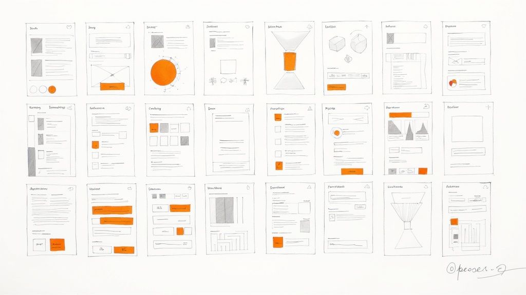
The quickest path from a thought to a testable concept doesn't start in a fancy design program. It starts with a pen and paper. Seriously. Sketching is the ultimate low-cost, high-speed way to get ideas out of your head and onto the table. It forces you to think about structure and flow, not get bogged down in colors and fonts.
You don't need to be an artist. The point isn’t to create a masterpiece; it's to communicate an idea clearly enough for a co-founder or a potential customer to get it.
Choosing Your Prototyping Tool
Once you’ve settled on a basic direction with your sketches, it’s time to level up to a digital tool and create a clickable prototype. This is a non-negotiable step. It’s how you get real, honest feedback from users before sinking precious engineering hours into building the wrong thing. And the good news? You don't need a massive budget.
The right tool for a startup usually comes down to your most immediate need. Are you trying to move as fast as possible? Is real-time collaboration with your remote team the priority? Or do you just need something incredibly easy to learn?
My Pro Tip: Don't try to prototype your entire application at once. That's a rookie mistake. Pick one, absolutely critical user journey and build that. For a new e-commerce app, that might just be the path from finding a product to checking out. A tight focus makes the whole process manageable and delivers feedback you can actually use.
So, which tool should you pick? I've seen startups succeed with all kinds of software, but a few consistently stand out. Here's a quick breakdown to help you decide.
Choosing Your Prototyping Tool Startup Edition
| Tool | Best For | Pricing Model | Key Advantage for Startups |
|---|---|---|---|
| Figma | Collaborative, high-fidelity design | Freemium | Its free tier is so generous that most startups can run their entire design and prototyping workflow on it. It’s all in-browser, so no one has to worry about software versions. |
| Balsamiq | Ultra-fast, low-fidelity wireframing | Subscription | Intentionally "sketchy" look keeps feedback focused on function, not finish. It’s brilliant for killing bad ideas before you get attached to how they look. |
| InVision | Creating clickable prototypes from static images | Freemium | The fastest way to make static designs (even photos of your napkin sketches) feel like a real app. Perfect for non-designers who need to show a user flow. |
Each of these tools has its place in the digital product development process. It's all about picking the right one for the job at hand. Are you just trying to prove a concept (Balsamiq), or are you building a polished design system (Figma)?
From Napkin Sketch to Clickable Prototype
Let’s make this real. Imagine a team has an idea for a dead-simple task manager. Their core hypothesis is that people are sick of complicated apps and just want to list their top three priorities for the day.
Here's how that idea can come to life in a few hours:
The Napkin Sketch: Over coffee, the founder grabs a napkin and sketches a screen. It shows the date, three empty checkboxes, and a single "+" button. That’s it. The core idea is visualized in 30 seconds.
Low-Fidelity Wireframe: Back in the office, someone spends 15 minutes in Balsamiq creating a clean, digital version of that sketch. They add a second screen to show what happens when you tap the "+" button—a simple text field appears to add a new task.
Clickable Figma Prototype: The team then pulls those simple screens into Figma. They spend an hour adding some basic branding and, crucially, linking the screens. Now, clicking the "+" button actually takes you to the "add task" screen.
In just a couple of hours, they've gone from a fuzzy concept to an interactive prototype. No code has been written. But now they have something tangible to put in front of real people to answer the only question that matters: "Is this actually useful?"
This is what lean UX design for startups looks like in practice. It's about learning and pivoting before you commit the time and money to build.
How to Test Your Ideas Without Wasting Time
https://www.youtube.com/embed/NYi1W1EEOD0
Building a product based on assumptions is like trying to navigate a new city without a map—it’s slow, expensive, and you’ll almost certainly get lost. The most direct route to knowing if you're on the right track is usability testing. It's as simple as watching real people try to use what you've built.
This feedback is the lifeblood of good UX design for startups. It transforms pure guesswork into a clear, actionable plan.
You don't need a fancy, one-way-mirror lab or a massive budget. In fact, you can uncover a shocking number of usability problems by testing with just five users. The goal here isn't to get a statistically perfect sample; it's to find the biggest points of friction that are tripping people up.
Finding Your First Testers for Free
Recruiting people to test your product can feel like a huge hurdle, but it's often way easier and cheaper than most founders think. Forget expensive recruiting services for now. Your first group of testers is probably hiding in plain sight.
Here are a few scrappy ways I’ve found participants without spending a dime:
- Your Personal Network: Start with friends, family, or former colleagues who roughly fit your target user profile. The key is to screen them a bit—make sure they can give you honest feedback and aren't just going to tell you they love it because they know you.
- Relevant Online Communities: Find where your audience hangs out. That could be a Slack channel for marketers, a Discord server for gamers, or the
/r/entrepreneursubreddit. Politely ask the moderators if you can post a request for feedback. People are often surprisingly willing to help. - LinkedIn Connections: Your second- and third-degree connections on LinkedIn are a goldmine. Search for people with job titles like "Sales Manager" (if that's your target) and send a brief, personal message asking for 15 minutes of their time in exchange for a coffee gift card.
A classic rookie mistake is over-recruiting. You don't need dozens of people. Five focused sessions will almost always give you a punch list of high-impact problems to solve, which is more than enough to keep your team busy for the next sprint.
Conducting a Lean Usability Test
Once you have your participants lined up, the test itself should be simple and focused. Remember, your job is to be a quiet observer, not a salesperson. The golden rule of usability testing is to listen way more than you talk.
Give them a specific task to accomplish with your prototype. For example, instead of asking something vague like, "What do you think of this page?" try a direct scenario: "Imagine you're looking for a way to track your project expenses. Show me how you would do that here."
As they work through the task, keep an eye out for these signals:
- Task Completion: Can they actually do it? If 4 out of 5 people can't complete the task, your design has failed, not the user.
- Moments of Confusion: Notice where they pause, squint at the screen, or aimlessly move the mouse. These are the "uh-oh" moments you’re looking for.
- Unsolicited Comments: Listen for the little things—sighs ("Ugh, another form"), confused muttering ("Wait, where's the save button?"), or exclamations. These raw, unfiltered reactions are pure gold.
Steer clear of leading questions like, "That was easy, right?" You'll just get the answer you want to hear. Instead, use open-ended prompts like, "What are you thinking right now?" or "What did you expect to happen when you clicked that?"
Turning Feedback into Action
After just a handful of sessions, you’ll be left with a messy pile of notes, quotes, and observations. This qualitative feedback is incredibly valuable, but it's useless until you organize it. The final step is to translate these insights into a prioritized list of design improvements.
Start by looking for patterns. Group similar feedback points into themes. For instance, if three out of five users struggled to find the "Settings" menu, that's a clear theme worth paying attention to.
Next, create a simple action plan. I like using a basic spreadsheet with four columns:
| The Problem | The Proposed Fix | The Effort | The Impact |
|---|---|---|---|
| "User couldn't find how to change their password." | "Move 'Account Settings' to main navigation bar." | Low | High |
| "Confused by the 'Archive' button terminology." | "Rename button to 'Delete Project'." | Low | Medium |
| "Wants to see a project dashboard with all stats." | "Design and build a new dashboard widget." | High | High |
This simple framework helps you instantly spot the quick wins—those low-effort, high-impact fixes that will immediately make your product better.
This cycle of building, measuring, and learning is the heart of the Lean Startup methodology. It’s also deeply connected to the principles of building a minimum viable product. To learn more about this approach, it's worth exploring the best practices of an MVP development company, as their entire process is built around this rapid loop of testing and learning. By embedding this habit into your startup’s DNA, you create a culture where failing fast leads directly to building a better product.
Scaling Your UX as Your Startup Grows
The scrappy, guerilla-style design that gets your startup out the door won't work forever. What’s brilliant when you're a two-person team in a garage starts to crack and splinter once real customers, new features, and a growing team enter the picture. Scaling your UX practice is all about graduating from reactive fixes to building a proactive, strategic advantage.
This isn’t just about hiring more people. It’s about creating a system that protects quality and consistency as you accelerate. If you ignore this, you'll end up with a fragmented user experience, painfully slow development cycles, and a product that feels cobbled together. The real goal is to weave UX so deeply into your product's DNA that it becomes second nature.
When to Make Your First UX Hire
Knowing when to bring on your first dedicated designer is a massive decision. Pull the trigger too early, and you burn through precious cash. Wait too long, and you rack up a mountain of design debt that's a nightmare to pay down later.
Forget revenue milestones; the real signals are the bottlenecks in your workflow.
You’re probably ready if this sounds familiar:
- The Founder Bottleneck: The CEO is the only person who can approve a design, and they spend half their day in Figma instead of on sales calls. Your development sprint is blocked waiting for a final mockup.
- Inconsistent Interfaces: Your product is starting to look like a patchwork quilt. The buttons on the settings page look different from the ones on the dashboard, creating a jarring and unprofessional experience for users.
- Engineers Playing Designer: Your developers are spending hours debating the placement of a button or the wording of an error message. It’s a huge time sink and rarely leads to a great user outcome.
Once you’ve decided to hire, you’ve got another choice: freelancer, agency, or full-time? A freelancer is perfect for a specific, one-off project. An agency brings a ton of expertise but at a high cost. A full-time hire, though a big investment, builds deep product ownership and becomes the keeper of your institutional knowledge.
What to Look for in Your First Designer
For your very first design hire, don't hunt for a niche specialist. You need a versatile UX generalist—someone who can jump from conducting user interviews on Monday to building high-fidelity mockups on Wednesday. Think of them as a "T-shaped" professional: they have a broad understanding of the entire design process but go deep in a few key areas, like interaction design or research.
This person has to thrive in ambiguity and be comfortable working on their own. They need to be a fantastic communicator who can explain their design rationale to non-designers and work hand-in-glove with engineering and product.
Finding this person also means being ready with a competitive offer. The UX talent market is fierce, and you’re not just competing with other startups. The average salary for a UX designer in the United States is around $106,224, and seasoned pros command much more. This reflects just how much value great UX brings to a company, as shown in reporting on the growing UX services market on FortuneBusinessInsights.com.
A classic rookie mistake is hiring a pure UI or visual designer first. Looks are important, but your first hire should be completely obsessed with solving user problems, not just making pixels pretty. Function and usability have to come first.
Building a Simple Design System Early
One of the most powerful things you can do to scale your UX is to start a design system. Don't let that term scare you off. You don't need to build something as complex as Google's Material Design. For a startup, a simple design system is just a central, shared library of reusable components and guidelines.
Think of it as a custom LEGO set for your product. Instead of designing a new button from scratch for the hundredth time, your team just grabs the official "primary button" component. This is how you maintain consistency and radically speed up both design and development.
Your early-stage design system just needs a few basics:
- Core Principles: A few ground rules for your design philosophy (e.g., "Clarity over cleverness," "Default to simple").
- Brand Elements: Your official logos, your primary brand color (#HexCode), and your primary font (e.g., "Inter").
- UI Components: The building blocks like buttons (primary, secondary, text), form fields (input, dropdown), navigation bars, and icons.
Starting this early stops the "design drift" that inevitably happens when different people are building things at the same time. This simple system ensures that a button built in Week 2 looks identical to one built in Week 20, creating a professional and coherent user experience.
Common UX Questions from Startup Founders
Even with the best roadmap, you're going to hit some bumps. Specific questions always come up when you start putting UX into practice, and I've found that most founders run into the same hurdles. Here are the answers to the questions I hear most often, framed to give you the clarity and confidence to move forward.
How Much Should We Really Budget for UX?
Forget about trying to find a magic percentage. The smart way to think about a UX budget is to tie every dollar directly to a specific business risk you want to eliminate.
Instead of asking your co-founder for a vague "$10,000 UX budget," frame it like this: "Let's spend $1,000 on five user tests to validate our new checkout flow. The data suggests this could increase conversions by 5%, and more importantly, it stops us from wasting $20,000 in engineering time building something nobody uses."
You don’t have to go big. Start small and prove the ROI. A "micro-budget" is often all you need to get started:
- $50: Grab five $10 coffee gift cards for five 30-minute user interviews. It's amazing what you'll learn.
- $0: Use a free-tier tool like Figma for wireframing and prototyping.
- $0: Create two versions of a landing page headline and run a simple A/B test on social media ads with a tiny budget to see which one gets more clicks.
The whole point is to show how a tiny, focused investment in user feedback can prevent massive, expensive mistakes down the road.
What Is the Single Biggest UX Mistake Startups Make?
I see this one all the time. The most common and costly mistake is skipping direct user research because you think you are the user.
Founders are brilliant people, often true experts in their field. But that expertise is a double-edged sword—it creates massive blind spots. You simply know too much about your own product and the problem you're trying to solve.
I once worked with a B2B SaaS founder who built this incredibly complex data visualization tool. He personally loved it. But his actual users, who were busy project managers, found it completely overwhelming. They didn't need a dozen filters; they just wanted one clear chart showing them if a project was on track. He built a product for himself, not his market.
The most dangerous assumption you can make is that your intuition is a substitute for real user feedback. It isn't. Your job isn't to be the user; it's to be the person who understands the user better than anyone else in the world.
Do We Need a UI Designer or a UX Designer First?
This is a classic question, and the answer is almost always the same for an early-stage startup: you need a UX Designer first.
Here’s a simple way to think about it. A UI (User Interface) designer is all about the visuals—the colors, the fonts, the look and feel. A UX (User Experience) designer, on the other hand, obsesses over the underlying structure and logic—how the product actually works to solve someone's problem.
It’s like building a house. The UX designer is your architect. They're the one making sure the floor plan is logical, the rooms flow together, and the house is actually functional for the family who will live there. The UI designer is the interior designer, picking out the paint colors, furniture, and light fixtures that make the space beautiful.
You have to get the blueprint right before you start decorating. A good UX generalist can often handle both the core research and the initial UI design, making them the perfect first hire to build that solid foundation.
At Pixel One, we help startups move from idea to execution by embedding user-centric design into every stage of the product journey. If you're ready to build a product that customers love and your business needs, let's talk about turning your vision into a reality. Get in touch with us at Pixel One.