10 Essential UX Design Methods to Try in 2025
Discover 10 powerful UX design methods to improve your product. Learn when to use them with actionable examples for user research, testing, and more.Building a digital product that users love isn't about luck; it's about a systematic, human-centered approach. The right UX design methods are the tools that separate wildly successful products from those that miss the mark. They provide a structured framework for understanding user needs, validating ideas, and making data-informed decisions instead of relying on assumptions or guesswork. Without a clear process, teams risk building features nobody wants, creating confusing interfaces, and wasting valuable resources.
This guide moves beyond theory to offer a practical, actionable breakdown of 10 essential UX design methods. We will explore each technique, detailing not just what it is, but precisely when and how to apply it for maximum impact. You'll find specific examples and insights to help you integrate these powerful practices into your workflow immediately.
Whether you're a startup founder aiming for product-market fit, a product manager steering a complex project, or a designer committed to creating meaningful experiences, this list will equip you with the knowledge to de-risk your project. By mastering these methods, you'll learn how to build deep empathy with your audience, validate your design choices, and ultimately create products that resonate and succeed.
1. User Research & Interviews: The Foundation of Empathy
User research is the bedrock of effective UX design, involving direct observation and conversation with your target audience. This foundational method moves beyond assumptions, providing raw, qualitative data about user needs, behaviors, and frustrations. It’s the difference between building what you think users want and what they actually need.
How It Works
This process typically involves one-on-one interviews, either in-person or remote, where a facilitator asks a participant open-ended questions about their experiences with a specific problem or product. The goal isn't to pitch a solution but to listen and understand their world. Observing a user interacting with an existing product (contextual inquiry) can reveal pain points they might not even know how to articulate. This is one of the most direct UX design methods for building empathy.
When to Use It
- At the very beginning: Use it during the discovery phase of a project to validate a problem or business idea before investing significant resources.
- Before a major redesign: Understand existing user frustrations to ensure the new design solves real, not perceived, problems.
Actionable Tip: Instead of asking "Would you use a feature that does X?", ask "Tell me about the last time you tried to accomplish Y." The first question invites biased, polite answers; the second uncovers genuine stories and pain points.
Practical Example: A fintech app team wants to build a tool for small business owners. Instead of asking about features, they interview five owners about their invoicing process. They discover the real frustration isn't creating invoices but chasing late payments. This single insight pivots the product strategy from a simple invoice generator to a tool with automated payment reminders, solving a much more valuable problem.
2. Personas: Giving a Face to Your Data
Personas are fictional, archetypal characters created to represent your key user segments. Developed from real user research data, they consolidate user goals, motivations, behaviors, and pain points into a memorable profile. Personas transform abstract data into a relatable human story, ensuring the design team remains focused on a tangible user rather than their own biases or assumptions.
How It Works
After conducting user research, you synthesize patterns and commonalities from your findings to build a composite user. Each persona is given a name, a photo, and a backstory that includes their goals, frustrations, and relevant demographic details. These profiles serve as a constant reference point, guiding decisions from feature prioritization to copywriting. This is one of the most effective UX design methods for aligning a team around a shared user vision.
When to Use It
- After initial user research: Use personas to distill research findings into a digestible format that the entire team can understand and reference.
- Throughout the design and development process: Refer to personas when making feature decisions, writing UI copy, or evaluating design mockups to ask, "What would [Persona Name] do?"
Actionable Tip: Give your persona a direct quote that captures their primary frustration or goal. For example, a persona for a project management tool might say, "I need to see what my team is working on without having to constantly ask for updates."
Practical Example: A travel booking site creates two personas: "Wanderlust Wendy," a 28-year-old solo traveler who values unique experiences over luxury, and "Practical Paul," a 45-year-old father of two who prioritizes budget and convenience. When deciding whether to add a "curated local experiences" feature or a "family-friendly deals" filter, the team can consult these personas to make a user-centered decision, ultimately deciding to prioritize the deals filter for Paul's larger user segment.
3. User Journey Mapping: Visualizing the Entire Experience
User journey mapping is a powerful visualization technique that tells the story of a user's relationship with a product or service over time. It goes beyond a single screen or interaction, capturing every touchpoint, from initial awareness to long-term use. This holistic view reveals critical insights into user emotions, motivations, and pain points that isolated usability tests might miss.
How It Works
The process involves creating a visual timeline of a user’s actions, thoughts, and feelings as they work toward a specific goal. Based on qualitative data from user research, the map documents each phase of the journey, noting the highs (moments of delight) and lows (points of frustration). This is one of the most effective UX design methods for aligning cross-functional teams around a shared, user-centric vision of the customer experience.
When to Use It
- To identify service gaps: Use it to see where the experience breaks down between different channels (e.g., from a marketing email to the app to customer support).
- To prioritize features: Focus development efforts on fixing the biggest pain points or enhancing the most critical moments identified in the journey.
Actionable Tip: Don't just map the digital path. Include offline actions and real-world context. For a retail app, the journey includes finding parking, navigating the store, and interacting with staff, not just tapping buttons on a screen.
Practical Example: A healthcare provider maps a patient's journey for a surgical procedure. The map reveals high anxiety during the pre-op waiting period (a low point) and confusion around post-op instructions sent via email (another pain point). These insights lead to tangible improvements: an in-app progress tracker for family members and a centralized portal for all recovery information, addressing the specific emotional and practical needs uncovered. Learn more about user journey mapping and other UX techniques on pixelonelabs.com.
4. Wireframing: The Architectural Blueprint
Wireframing is the practice of creating low-fidelity, skeletal outlines of a digital interface. Stripped of all visual design elements like colors and fonts, these blueprints focus purely on structure, content hierarchy, and functionality. They act as a critical communication tool, aligning designers, developers, and stakeholders on the core layout and user flow before any code is written.
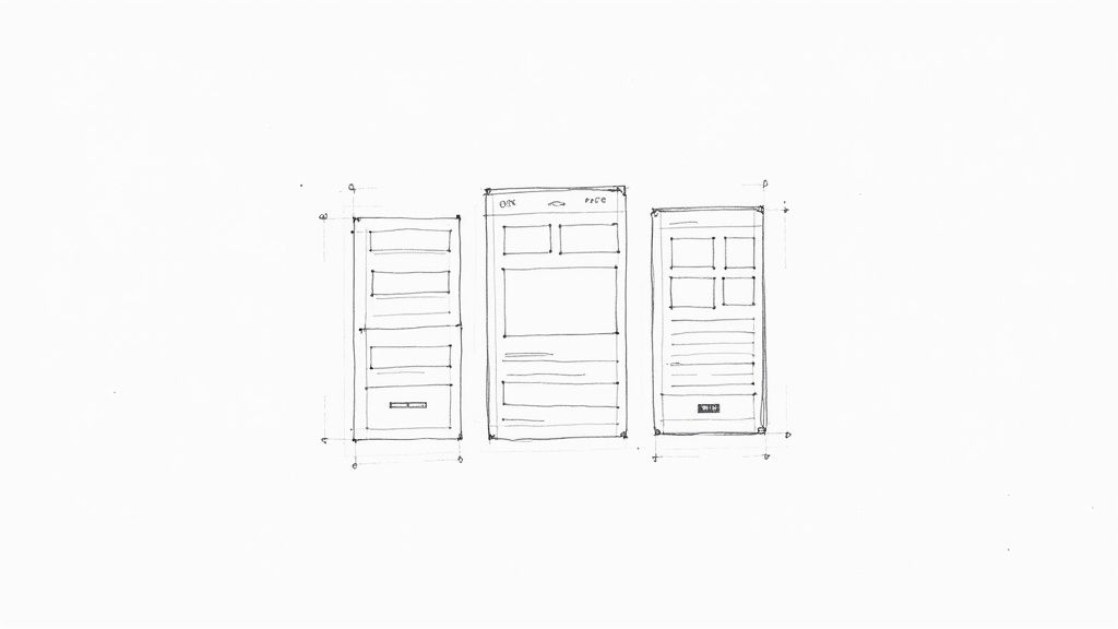
How It Works
Designers use simple shapes, lines, and placeholder text to map out where key elements like buttons, images, and navigation menus will go. The process often starts with rough paper sketches to quickly explore ideas before moving to digital tools like Balsamiq or Figma. This method is one of the most efficient UX design methods for testing and refining information architecture and functionality at a low cost, making it easy to iterate based on feedback without getting bogged down by visual details. For a deeper look, you can learn more about how to create wireframes at pixelonelabs.com.
When to Use It
- Early in the design process: Use wireframes immediately after user research to translate user needs and business requirements into tangible screen layouts.
- To validate navigation and flow: Create clickable wireframe prototypes to test whether users can easily find information and complete key tasks.
Actionable Tip: Annotate your wireframes. Add small notes explaining the purpose of a specific button, the behavior of an interactive element, or the reasoning behind a layout decision. This context transforms a simple layout into a clear specification for your team.
Practical Example: A team designing an e-commerce checkout flow creates two wireframe variations. One has a single-page checkout, while another uses a multi-step accordion. By testing these bare-bones layouts with five users, they observe that three users get confused by the accordion. This quick, low-cost test provides clear evidence to proceed with the single-page structure before investing time in detailed visual design.
5. Usability Testing: Observing Real-World Interaction
Usability testing is a crucial evaluation method where real users interact with a product to identify usability problems. It moves design from theory to practice by revealing how intuitive a system is in the hands of its intended audience. Watching someone struggle with a feature provides undeniable evidence of design flaws that are often invisible to the creators.
How It Works
In a typical session, a facilitator gives a participant realistic tasks to complete using a prototype or a live product. Observers watch the user's behavior, listen to their thought process, and note any points of confusion or difficulty. This method isn't about asking users for their opinions; it’s about observing their actual performance. As one of the most effective UX design methods, it provides direct insight into how a design functions in the real world.
When to Use It
- During development: Test low-fidelity prototypes to catch major navigational or conceptual flaws before a single line of code is written.
- Before launch: Validate a near-final product with a high-fidelity prototype or beta version to polish the user experience and fix critical bugs.
- Post-launch: Continuously test the live product to identify areas for improvement and inform future iterations.
Actionable Tip: You don't need a formal lab or dozens of users. Testing with just 5 to 8 people will uncover the vast majority of usability issues. Focus on creating realistic tasks and scenarios, not just a list of features to click through.
Practical Example: An e-commerce site team asks participants to "find a pair of blue running shoes in your size and add them to the cart." By observing this simple task, they might discover that users consistently fail to find the size filter because it's hidden inside an "Advanced Search" menu. This specific, observable failure provides an actionable insight: make the size filter visible by default.
6. A/B Testing (Split Testing): Data-Driven Design Decisions
A/B testing, or split testing, is a quantitative method that puts design choices to the test with real users. It involves creating two or more versions of a page or element (Version A, the control, and Version B, the variation) and showing them to different segments of your audience simultaneously. By measuring which version better achieves a specific goal, you can make objective, data-backed decisions instead of relying on opinions or assumptions.
How It Works
This process is a controlled experiment. For example, 50% of your website traffic might see the original "Sign Up" button (A), while the other 50% sees a new version with different text or color (B). You then track which button generates more clicks or sign-ups. The key is to isolate a single variable to ensure you know exactly what caused the change in performance. This is one of the most direct UX design methods for optimizing user actions and business metrics.
When to Use It
- To optimize key conversion points: Use it on landing pages, call-to-action buttons, pricing pages, or checkout flows to increase sign-ups, sales, or other key performance indicators.
- To validate small-scale UI changes: Test the impact of new icons, color palettes, or copy before rolling them out to your entire user base.
Actionable Tip: Define your primary success metric before launching the test. If you're testing a new "Add to Cart" button, your metric is the click-through rate on that button, not overall page views. This prevents you from misinterpreting data to fit a desired outcome.
Practical Example: A SaaS company tests two versions of their pricing page headline. Version A is "Powerful Project Management Software," while Version B is "Finish Your Projects 2x Faster." After running the test on 10,000 visitors, they find that Version B increases clicks on the "Start Free Trial" button by 18%. This data provides a clear, quantitative reason to adopt the benefit-oriented headline. For more insights into how testing drives business results, you can learn more about conversion rate optimization strategies.
7. Card Sorting: Architecting Intuitive Navigation
Card sorting is a powerful method used to understand how people group and categorize information. By asking participants to organize topics onto cards that represent content or features, you can directly tap into their mental models. This insight is crucial for building an information architecture that feels natural and intuitive to your end-users. It’s the key to designing navigation systems that don't require a map.
How It Works
Participants are given a set of cards, either physical or digital, each with a single concept written on it (e.g., "Returns Policy," "Men's Shoes," "Account Settings"). They are then asked to group these cards in a way that makes sense to them. In an "open" sort, they also create labels for their groups. In a "closed" sort, they place cards into predefined categories. The patterns that emerge from multiple sessions reveal a user-centric structure, making it one of the most effective UX design methods for information design.
When to Use It
- Designing a new website or app: Use it early to build the foundational site map and navigation structure from the ground up.
- Redesigning an existing product: Identify why the current information architecture might be confusing users and validate a more intuitive structure.
Actionable Tip: Run a follow-up session called "tree testing" to validate your card sorting findings. Ask users to find specific information within your proposed navigation structure. This confirms whether your new architecture actually works in practice.
Practical Example: A university is redesigning its website. They conduct an open card sort with prospective students, who consistently group "Tuition Fees," "Scholarships," and "Financial Aid" together under a label they create called "Paying for College." The university's old site had these topics in three separate sections. This insight leads them to create a single, user-friendly "Tuition & Aid" section in the new navigation.
8. Prototyping: Making Ideas Tangible
Prototyping is the art of creating tangible, interactive models of a design concept before any code is written. It allows teams to simulate user interactions, test flows, and gather feedback on a functional representation of the product. These models can range from simple paper sketches to highly polished, clickable mockups that feel like the final product.
How It Works
Using tools like Figma or Adobe XD, designers link static screens together to create clickable pathways that mimic a user’s journey. For example, a "Sign Up" button on one screen is linked to the "Create Account" screen. This creates a powerful illusion of functionality, letting stakeholders and test users experience the design’s flow and logic. This is one of the most cost-effective UX design methods for validating complex interactions and getting buy-in.
When to Use It
- During the design phase: To test usability and validate user flows with real people before development begins.
- For stakeholder presentations: Use high-fidelity prototypes to communicate the design vision and user experience more effectively than static images.
- To explore complex interactions: When designing a feature with unique animations or state changes, a prototype makes it easier to refine the experience.
Actionable Tip: Start with low-fidelity paper prototypes to quickly test core concepts and workflows. As you gain confidence in the structure, increase the fidelity to test visual design and micro-interactions. Don't waste time perfecting a concept that might be flawed.
Practical Example: A team designs a new mobile banking feature for depositing checks. They build a clickable prototype in Figma and ask users to complete the task. During testing, they observe that every user hesitates before tapping the "Confirm" button. When asked why, users say they weren't sure if the photo of the check was clear enough. The team immediately adds a "Preview Image" step to the prototype, solving a major usability issue in hours, a fix that would have taken days in development.
9. Heuristic Evaluation: The Expert Usability Audit
A heuristic evaluation is a usability inspection method where experts assess an interface against a set of established usability principles, known as "heuristics." Instead of involving end-users, this approach leverages the knowledge of experienced UX professionals to identify potential usability problems quickly and cost-effectively. It’s a rapid way to uncover common design flaws before they ever reach a user.
How It Works
Typically, a small group of 3-5 evaluators independently inspects the product's interface. They navigate through the system, comparing its elements and flows against recognized principles like Jakob Nielsen's 10 Usability Heuristics. Each evaluator documents potential issues, noting which heuristic is violated. Afterward, their findings are consolidated and prioritized based on severity, allowing the team to focus on the most critical fixes. This is one of the most efficient UX design methods for a quick expert review.
When to Use It
- Before user testing: Use it to catch and fix obvious usability problems first, so you can use valuable user testing time to uncover more complex issues.
- For competitive analysis: Evaluate competitor products to benchmark their usability and identify opportunities for your own design to excel.
- When resources are limited: It's a faster and cheaper alternative to full-scale usability testing, providing high-value feedback with less overhead.
Actionable Tip: Assign severity ratings (e.g., from cosmetic issue to usability catastrophe) to each identified problem. This helps your team prioritize which issues to tackle first, ensuring you allocate development resources to the fixes that will have the biggest impact on the user experience.
Practical Example: During a heuristic evaluation of a travel booking website, an expert notes that after a user's session times out, they are sent back to the homepage and lose all their search results. This violates the "error prevention" and "help users recover from errors" heuristics. The evaluator flags this as a "critical" issue. The actionable insight is to implement a feature that saves the user's search upon timeout, preventing a major point of user frustration. For a more in-depth look, see how a user experience audit on pixelonelabs.com can systematically uncover these issues.
10. Design Thinking: A Framework for Innovation
Design Thinking is not a single method but an iterative, human-centered framework for solving complex problems. It integrates empathy for user needs with the creative possibilities of technology and the requirements for business success. This approach provides a structured process for innovation, ensuring that solutions are desirable, feasible, and viable.
How It Works
The process is traditionally broken down into five phases: Empathize, Define, Ideate, Prototype, and Test. Teams start by deeply understanding user challenges (Empathize), then clearly articulate the core problem (Define). Next, they brainstorm a wide range of creative solutions (Ideate), build inexpensive, scaled-down versions of those solutions (Prototype), and finally, share these prototypes with users for feedback (Test). This cycle is often repeated, making it one of the most comprehensive UX design methods for tackling ambiguous challenges.
When to Use It
- When facing "wicked" problems: Use it for complex, ill-defined challenges where the problem itself is not as clear as the solution.
- To foster innovation: Apply it when you need to move beyond incremental improvements and discover breakthrough solutions.
Actionable Tip: During the Ideate phase, defer all judgment. The goal is quantity over quality at first. Encourage wild ideas, as even impractical suggestions can spark a genuinely innovative concept from another team member. Use techniques like "Crazy Eights" where each person sketches 8 ideas in 8 minutes to force rapid, uninhibited thinking.
Practical Example: Airbnb used Design Thinking to overcome a growth plateau. By empathizing with hosts in New York (Empathize), they defined the problem: low-quality photos were hurting bookings (Define). They brainstormed solutions (Ideate), and one idea was to provide professional photography. To test this, the founders prototyped the solution themselves by renting camera equipment and taking high-quality photos of host listings (Prototype & Test). The test proved that better photos led to more bookings, a pivotal insight that scaled into a global professional photography program.
Top 10 UX Design Methods Comparison
| Technique | Implementation complexity | Resource requirements | Expected outcomes | Ideal use cases | Key advantages |
|---|---|---|---|---|---|
| User Research & Interviews | Medium–High (planning, skilled moderation) | Researchers, recruitment, recording/transcription tools | Deep qualitative insights into needs and motivations | Early discovery, problem framing, validating assumptions | Reveals motivations, uncovers unexpected needs, builds empathy |
| Personas | Low–Medium (synthesis of research) | Research data, templates, analyst/designer time | Representative user archetypes guiding decisions | Aligning teams, prioritization, design communication | Makes users concrete and memorable; guides design focus |
| User Journey Mapping | Medium–High (workshops, synthesis) | Research inputs, cross-functional workshops, mapping tools | End-to-end experience map showing pain points and opportunities | Service design, multi-touch flows, prioritizing improvements | Highlights touchpoint connections and moments of truth |
| Wireframing | Low (quick, iterative) | Designers, basic tools (paper or digital) | Structural layouts and information hierarchy blueprints | Early UI structure, information architecture, flow exploration | Fast to create/iterate; focuses discussion on structure |
| Usability Testing | Medium (session design, observation) | Participants, moderator, prototype, recording tools | Usability issues, task success rates, qualitative feedback | Validating prototypes, pre-release testing, accessibility checks | Reveals real user problems; provides actionable evidence |
| A/B Testing (Split Testing) | Medium–High (experimental rigor) | Traffic, analytics, A/B platform, engineering support | Quantitative impact on KPIs and user behavior | Optimizing conversions, copy, layout, feature changes | Data-driven decisions; measures real-world performance |
| Card Sorting | Low (straightforward sessions) | Participants, cards/digital tool, facilitator | Preferred content groupings to inform IA and labels | Navigation/taxonomy design, content-heavy sites | Aligns IA with user mental models; quick and cost-effective |
| Prototyping | Variable (low to high fidelity) | Design tools, time; dev support for hi-fi prototypes | Interactive representations to test interactions and flows | Testing interactions, stakeholder buy-in, user testing | Communicates vision; uncovers interaction and feasibility issues |
| Heuristic Evaluation | Low–Medium (expert review) | UX experts, heuristic checklist, reporting time | List of usability violations with severity ratings | Early audits, competitive reviews, accessibility checks | Fast, inexpensive expert findings without user recruitment |
| Design Thinking | High (facilitated, iterative process) | Cross-functional teams, workshops, time for iteration | Reframed problems, diverse solution ideas, prototypes | Complex or ambiguous challenges requiring innovation | Encourages creativity, user-centered solutions, team alignment |
Choosing the Right Method for the Right Moment
Navigating the landscape of UX design methods can feel overwhelming. We've explored ten powerful techniques, from foundational User Research and Personas to iterative Prototyping and evaluative A/B Testing. The true mark of an effective design process, however, is not the sheer number of methods used, but the strategic wisdom in selecting the right tool for the right moment. Think of it less like a checklist to complete and more like a dynamic toolkit to draw from based on your project's unique needs.
The journey from a vague idea to a polished, user-centric product is a path from ambiguity to clarity. Each method serves a specific purpose in lighting the way. You don’t need to conduct a Heuristic Evaluation when you’re still trying to understand your audience with User Interviews, just as you wouldn’t rely solely on Wireframing without validating your assumptions through Usability Testing. The key is to see these ux design methods not as isolated activities but as interconnected parts of a holistic strategy.
Building Your Strategic UX Toolkit
To make this actionable, consider how these methods map to the core phases of product development. By organizing your approach, you can ensure you are asking the right questions and generating the right insights at each stage.
- Discovery & Empathy (Understanding the Problem): In the early stages, your goal is to build deep empathy and define the problem space. Methods like User Interviews, Personas, and User Journey Mapping are your cornerstones here. They prevent you from designing in a vacuum and anchor your decisions in real user needs and pain points.
- Ideation & Exploration (Designing the Solution): Once the problem is clear, you can begin exploring potential solutions. This is where Design Thinking workshops, Card Sorting, and low-fidelity Wireframing shine. These techniques facilitate creative brainstorming and help structure information architecture in a way that feels intuitive to users.
- Validation & Refinement (Testing the Solution): An idea is only a hypothesis until it's tested. Creating interactive Prototypes allows you to put tangible solutions in front of users. Following up with rigorous Usability Testing, A/B Testing, and expert-led Heuristic Evaluations provides the critical feedback needed to refine, iterate, and build with confidence.
Mastering these UX design methods empowers you to move beyond aesthetics and build products that solve real problems, drive user engagement, and deliver tangible business value. It transforms the design process from a subjective art into a data-informed discipline, ensuring every decision is purposeful and every feature serves the end-user. This strategic application is what separates good products from truly great experiences that users love and return to.
Ready to move from theory to execution? At Pixel One, we embed this strategic toolkit of UX design methods into every project, transforming complex business challenges into simple, scalable, and impactful digital products. Let's build something exceptional together. Learn more at Pixel One.