How to Create Wireframes: A Beginner's Guide
Learn how to create wireframes with our practical guide. We cover user research, sketching, digital tools, and the core design process for better products.Before you even think about color schemes or font choices, you need a plan. A wireframe is exactly that: a simple, structural blueprint for your website or app. It's the skeleton you build everything else on top of.
Think of it less as a design and more as a map. It shows where things go and how someone will move through the space. For example, it answers questions like, "Is the 'Sign Up' button obvious?" or "Can a user find the search bar instantly?"
Your Blueprint Before You Build
This initial stage is all about function, not flair. By stripping away all the visual distractions—the colors, the fancy typography, the polished images—you force the entire team to focus on what truly matters first: structure, user flow, and usability.
Are the most important buttons easy to find? Does the layout make sense? Can a user accomplish their goal without getting lost? These are the practical questions wireframing answers.
Why You Can't Afford to Skip Wireframes
The main goal here is to establish a solid visual hierarchy that guides the user. This is your first and best chance to spot major usability problems before they become costly headaches to fix during development.
A good wireframe does a few critical things for your project:
- Makes Ideas Concrete: It turns a fuzzy concept like "a user-friendly dashboard" into a tangible layout with a defined navigation bar, key data widgets, and a clear call-to-action button.
- Gets Everyone on the Same Page: It becomes a single source of truth for designers, developers, and stakeholders. Everyone is looking at the same plan, eliminating misunderstandings.
- Saves a Ton of Time and Money: It is infinitely cheaper and faster to move a box on a simple diagram than it is to re-architect a feature that's already been coded. Discovering a flawed user flow at this stage costs almost nothing to fix.
A wireframe is the skeleton of your digital project. It forces you to think about structure and flow first, ensuring the final design is built on a solid, user-focused foundation.
The Core of the Process
The wireframing process is a fundamental part of a project’s lifecycle. It’s where you can explore different approaches to layout and navigation quickly. For example, you can test whether a three-column or a single-column layout works better for a blog's homepage without committing to a full design.
For a deeper dive into the discipline, the Interaction Design Foundation is an excellent resource.
Here’s a quick overview of the essential stages for turning an idea into a structural layout.
Core Wireframing Process at a Glance
| Stage | Key Action | Objective |
|---|---|---|
| Discovery & Research | Gather requirements, user stories, and competitive analysis. | Understand the "why" behind the project and define user needs. |
| Sketching (Low-Fidelity) | Create rough, hand-drawn layouts on paper or a whiteboard. | Quickly explore and iterate on multiple ideas without commitment. |
| Digitizing (Mid-Fidelity) | Recreate the best sketches using a digital tool like Figma or Balsamiq. | Refine the layout, add basic interactivity, and create a clean version for feedback. |
| Feedback & Iteration | Share the digital wireframes with the team and stakeholders. | Gather input, identify issues, and make necessary adjustments. |
This cycle of sketching, digitizing, and iterating is what produces a solid, validated blueprint for the design and development teams to build upon.
Ultimately, this blueprinting phase ensures your project kicks off with a clear, validated direction. It’s a non-negotiable step in the overall digital product development process that connects high-level strategy to the final visual design. Get this right, and you’re setting yourself up for success from day one.
Laying the Groundwork for Your Design
It’s tempting to jump right into sketching, but that’s a classic rookie mistake. Drawing a single box before you have a clear strategy is just a fast track to redoing your work later. The real magic happens before the pen even hits the paper. You have to know who you’re designing for and what problem you’re actually solving.
This prep work is what separates a pretty picture from a powerful tool. It’s about building your design on a foundation of solid insights, not just assumptions.
This is the process I follow to get started on the right foot.
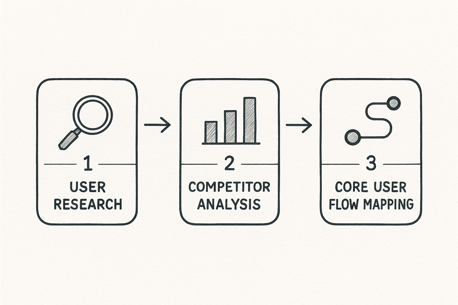
As you can see, each step logically builds on the last. You start broad by understanding your users, then narrow your focus to the structure of the solution.
Understand Your Users Deeply
First things first: who is actually going to use this thing? What are they trying to get done? Nail this down, and you're halfway to a wireframe that works. User research isn’t just a box to check; it’s the compass for your entire design.
You don't need a massive budget to get started. A few simple methods go a long way:
- User Interviews: Just talk to 3-5 potential users. Ask open-ended questions like, "Walk me through how you currently manage your projects," to uncover pain points.
- Surveys: If you need to reach more people, tools like Google Forms can help you gather hard data. Ask specific questions like, "On a scale of 1-5, how important is a mobile-friendly view?"
- Persona Creation: Synthesize all that research into a few fictional—but realistic—user profiles. For example, you might create "Marketing Manager Maria," who's always short on time and needs to see campaign ROI on a single dashboard at a glance.
This initial digging gives you the "why" behind every button and menu you’ll eventually design. It’s so fundamental, in fact, that any professional user experience audit worth its salt starts here to find out what might have been missed from the beginning.
Analyze the Competitive Landscape
Look, you don’t have to reinvent the wheel. Checking out what the competition is doing gives you a massive head start. You can see what patterns users already know and, more importantly, spot opportunities where everyone else is dropping the ball.
Pick 2-3 of your direct competitors and walk through their key tasks. For instance, if you're designing an e-commerce checkout, go through the entire purchase process on their sites. How do they handle shipping info, payment options, and order summaries? Take screenshots and make notes on what feels smooth and what feels clunky. This simple exercise can save you from repeating mistakes.
By studying what’s already out there, you establish a baseline for user expectations. Your goal isn't to copy but to learn what users are familiar with and find smart ways to improve upon it.
Map the Core User Flow
A user flow is just the path someone takes through your product to get something done. Sketching this out first ensures your wireframes connect in a way that makes sense, creating a journey that feels effortless.
Start by focusing on a single, critical goal. For an e-commerce site, that’s usually the path from "Add to Cart" to "Purchase Complete." You’d map out every screen and decision point along the way:
- User lands on the Product Page.
- User clicks "Add to Cart".
- User navigates to the Cart Summary screen.
- User proceeds to Checkout.
- User enters shipping and payment details.
- User sees the Order Confirmation page.
This map becomes your blueprint. It tells you exactly which screens you need to wireframe and how they all need to link together to create a seamless experience.
From Plan to Blueprint: Building Your First Wireframe

This is where the magic starts to happen. All that strategic groundwork—the user flows, the competitive analysis—gets translated into a tangible blueprint everyone on the team can actually see and critique. The image above shows a digital wireframe coming together in a tool like Figma, turning abstract ideas into a defined structure.
Now that your plan is solid, it’s time to give it some form. This is the moment your research shifts from concepts on a document to a real, visible layout that invites discussion.
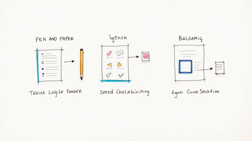
And believe it or not, the best way to start is with the simplest tools you have: a pen and some paper.
Start with Low-Fidelity Sketches
Before you even think about opening a design app, grab a notebook or head to a whiteboard. Low-fidelity sketching isn’t about making things pretty; it’s all about speed and getting ideas out of your head. You're just drawing boxes, lines, and maybe some scribbles to represent different UI elements.
This lo-fi approach lets you burn through dozens of layout ideas in minutes. Let's say we're designing a dashboard for a project management app. Your initial sketches could quickly explore a few different concepts:
- Layout 1: A vertical sidebar for navigation on the left, with project cards filling the main area.
- Layout 2: A traditional horizontal menu at the top, with projects shown in a simple list view below.
- Layout 3: A widget-based layout where users can customize what they see first.
The entire point is to fail fast and discover a direction that clicks, all without getting hung up on pixel-perfect alignment or font choices.
The real beauty of sketching on paper is that it’s disposable. It frees you up to iterate without getting emotionally attached to one specific idea too early on.
Transition to a Digital Wireframe
Once you’ve landed on a rough sketch that feels promising, it’s time to bring it into a digital tool. The goal here isn't to start adding colors or fancy fonts. It’s simply to create a clean, organized version of your sketch that’s easier to share, discuss, and refine with the team.
This is where you’ll start defining a clear visual hierarchy and mapping out the core interactive elements. Taking our project dashboard example, this is how we translate the rough sketch into a more defined layout:
- Navigation Bar: We’ll clearly label the main menu items: "Dashboard," "Projects," "Reports," and "Settings."
- Data Visualization Blocks: Placeholder boxes get added for charts and graphs, with simple labels like "Project Progress" or "Upcoming Deadlines."
- Interactive Components: We’ll use simple shapes to represent buttons, search bars, and dropdowns, adding placeholder text like "[User Name]" or "Search for a task..." to give it context.
This digital blueprint becomes the single source of truth for the team. Developers can see what components they need to build, and stakeholders can finally visualize the user journey without getting distracted by the final look and feel.
Building this solid foundation is a core principle of effective UX design for startups, as it ensures the end product is built on a user-centric and well-reasoned structure. This is how you create wireframes that serve as strategic guides, not just simple diagrams.
Choosing the Right Tools for the Job
The right tool can feel like an extension of your brain, turning abstract ideas into a clear blueprint with minimal fuss. But with a sea of options out there, it’s easy to get analysis paralysis. Remember, the "best" tool isn't always the one with the most bells and whistles; it's the one that fits your workflow like a glove.
Believe it or not, sometimes the most powerful tool is the simplest. For those first chaotic brainstorming sessions, nothing beats the raw speed of a pen and paper or a whiteboard. This old-school approach lets you fly through dozens of layouts and ideas without getting bogged down by software constraints. It’s all about getting your raw thoughts onto the page before you even think about pixels.
Comparing Digital Wireframing Software
Once your ideas start to take shape, it's time to bring them into the digital realm where they can be refined and shared. The demand for these platforms is exploding for a reason. The global wireframing software market hit an estimated value of USD 5.55 billion in 2024 and is still climbing, which tells you just how central these tools have become to product development.
Each piece of software has its own personality and is built for different kinds of projects and teams.
Your tool should accelerate your thinking, not get in the way of it. The goal is to find software that matches the fidelity you need at each stage, from rough concepts to detailed layouts.
For example, a tool like Balsamiq is a champion of low-fidelity. Its intentionally sketchy, hand-drawn aesthetic is its superpower. It forces everyone to focus on layout and user flow, preventing those early, unhelpful conversations about colors and fonts.
On the other end of the spectrum, you have powerhouses like Figma and Sketch. These are more like complete design ecosystems. They come with a steeper learning curve, but they let you go from wireframe to interactive prototype to final pixel-perfect design, all in one place. They're a fantastic choice when you know you’re building a project that will eventually need a comprehensive design system.
Wireframing Tool Comparison
Making a choice can be tough, so I've put together a quick comparison to highlight what makes each popular tool shine. This should help you narrow down the options based on what you truly need.
| Tool | Best For | Learning Curve | Key Feature |
|---|---|---|---|
| Balsamiq | Rapid, low-fidelity wireframing and brainstorming. | Low | Its unique hand-drawn style keeps feedback focused on structure. |
| Figma | Collaborative, all-in-one design from wireframe to prototype. | Medium | Real-time collaboration and a vast library of community plugins. |
| Sketch | Detailed UI design and creating design systems (macOS only). | Medium | A clean interface and powerful vector editing capabilities. |
| Pen & Paper | The absolute fastest way to get initial ideas out of your head. | None | Unmatched speed and flexibility for early-stage ideation. |
At the end of the day, the best tool is the one your team will actually use consistently. If you're looking for inspiration, you can see what the best UX design agencies are using in their professional workflows. The main thing is to pick an option that makes your process smoother, not more complicated.
How AI Is Shaping Modern Wireframing
Artificial intelligence isn't some far-off concept anymore; it's a real-world tool that’s completely changing how designers build wireframes. Think about it: instead of spending hours meticulously drawing every single box, line, and placeholder, we can now offload the most repetitive parts of the job to an AI.
This isn't just about saving time. It's about shifting our focus from the tedious manual work to what really matters—the high-level strategy and the actual user experience. AI makes the process faster, sure, but it also makes it smarter. It's no surprise that by 2025, over 75% of UX teams are expected to have AI tools in their daily workflow, and wireframing is one of the biggest areas seeing this change. You can dive deeper into the state of wireframing on claritee.io to see where things are headed.
Automating Layouts and Content Hierarchies
One of the most impressive things AI brings to the table is its knack for generating layout variations in a flash. You can give an AI tool a simple prompt—something like, "Create a modern e-commerce product page with a prominent image, customer reviews, and a sticky 'add to cart' button."
Almost instantly, you’ll get back several different wireframes, each exploring a unique structural approach. This kind of rapid iteration means you can explore far more creative avenues than you ever could sketching by hand. It's like having a brainstorming partner that never runs out of ideas.
But it goes beyond just spitting out layouts. AI can also analyze your user goals and suggest a smart content hierarchy. It can figure out the best way to arrange elements on the page to naturally guide a user’s eye toward the most important calls-to-action. That means your very first draft is already built on a foundation of good UX principles.
From Assistant to Creative Partner
Let's be clear: this new wave of technology isn't here to replace designers. It’s about augmenting our skills, positioning AI as a powerful assistant that frees up our brainpower for the tough, strategic problems.
AI handles the "how" of arranging elements, giving you more time to focus on the "why" behind your design decisions. This makes the process more strategic and less about manual labor.
For example, some tools can even run preliminary accessibility checks on your wireframes. They’ll flag potential problems like poor color contrast or confusing navigation long before those issues get cemented into the final design. This is a huge win for building more inclusive products right from the start.
Learning to work with these tools is a core part of modern digital transformation consulting services, because it helps teams build better products, faster. By letting AI handle the mechanics, you get to create more thoughtful, user-centered wireframes than ever before.
Answering Your Top Wireframing Questions
As you get started with wireframing, you're bound to run into a few common questions. It happens to everyone. Think of this as a quick-hit guide to clear up those early uncertainties so you can wireframe with confidence.
Let's cut through the noise and get straight to the practical answers you need.
Wireframe vs. Mockup: What’s the Real Difference?
This is, hands down, the question I hear most often. The simplest way to put it is that the difference comes down to fidelity—how much visual detail you're showing. They look different because they do completely different jobs.
Imagine you're building a house. The wireframe is your blueprint. It shows the structure: where the walls go, the size of the rooms, and how you’ll get from the kitchen to the living room. It’s all about function and flow.
A mockup, then, is the interior designer's presentation. It’s a static image that shows you the exact paint colors on the walls, the style of the furniture, and the texture of the curtains. It’s not functional, but it gives you a fantastic sense of the final look and feel.
A wireframe is all about structure and functionality, using basic shapes and placeholders. A mockup is about visual design—it brings in color, typography, and imagery to show the finished aesthetic.
How Much Detail Should I Actually Include?
When it comes to wireframes, less is more. Seriously. The whole point is to focus the conversation on layout, information hierarchy, and the user’s journey. If you start adding too much visual detail, you’ll find yourself in a meeting discussing button colors instead of whether the checkout flow actually makes sense.
So, what’s essential?
- The basic structure: Draw boxes for the header, footer, sidebar, and main content area.
- Content hierarchy: Use larger boxes or bold text to show what’s most important on the page. For example, a headline gets a bigger box than body text.
- Key UI elements: Put in placeholders for buttons, forms, navigation menus, and other interactive components. Label them clearly (e.g., "Submit," "Search").
You want to build the skeleton, not dress it up. Stick with grayscale, simple boxes, and placeholder text like "Lorem Ipsum." It keeps everyone focused on what matters at this stage.
Do I Need to Be an Artist to Do This?
Not at all. This is probably the biggest myth about wireframing, and it stops too many people from even trying. Wireframing is about communicating an idea, not creating a masterpiece.
If you can draw a square, a circle, and a line, you have all the artistic talent you need. The real work is in the thinking—translating user needs into a logical screen layout. It's a planning skill, not a drawing skill.
How Do I Know If My Wireframe Is Any Good?
A good wireframe isn't pretty; it's clear. The real test is showing it to someone else. Without you explaining every little detail, can a teammate or a stakeholder look at it and understand what a user is supposed to do?
A practical test is the "5-second test." Show someone the wireframe for five seconds, then take it away. Ask them what the page was for and what they remember seeing. If they can identify the main purpose and key elements, you're on the right track. Their feedback is gold—if they get stuck or ask a lot of questions about a certain area, you know exactly where you need to clarify the design.
Ready to transform your ideas into tangible, user-centric digital products? At Pixel One, we specialize in turning complex challenges into simple, scalable solutions. Learn how our product strategy and design services can bring your vision to life.