Your Guide to a User Experience Audit
Transform your product with a user experience audit. Learn to find issues, analyze user data, and create actionable plans for real growth.A UX audit is a deep dive into how real people interact with your product. It’s a methodical process of evaluating its usability, accessibility, and overall user satisfaction. We’re not just squashing bugs here; we’re pinpointing the key friction points in the user journey and connecting design improvements directly to business goals. For example, instead of just noting "the navigation is confusing," a UX audit identifies that users take, on average, six clicks to find the pricing page, and then provides a clear, actionable plan to reduce that to two clicks.
Why a UX Audit Is Your Secret Growth Engine
Too often, teams treat a UX audit like a routine check-up, just another task on the website maintenance list. That view completely misses the point. A proper audit is one of the most powerful strategic tools you have for finding hidden revenue, building user loyalty, and making smart, data-driven decisions that actually move the needle.
This isn’t about arguing over button colors or relying on gut feelings. It’s a systematic investigation into why users get frustrated and bail—and, just as importantly, what makes them stick around and convert. A great audit connects the dots between that confusing checkout flow and your sky-high cart abandonment rate, or that clunky navigation menu and your bounce rate.
The Direct Impact on Business Metrics
When you smooth out these friction points, the results speak for themselves. A classic practical example is an overly complicated registration form. An audit might reveal you're asking for a phone number when it's not needed, causing a 30% drop-off. The actionable insight? Remove the phone number field and A/B test the form. I've seen teams simplify theirs—by cutting unnecessary fields or adding social logins—and watch their user sign-up rates jump almost overnight.
The business case for this work is rock-solid. A well-known Forrester study found that every $1 invested in UX can bring back $100—that's a staggering 9,900% ROI. This makes sense when you consider that bad experiences actively push customers away. In fact, 88% of users are less likely to return to a site after a single bad interaction. You can find more data on UX's financial impact at wearetenet.com.
A great user experience feels invisible, letting people achieve their goals without ever thinking about the interface. An audit is how you find and remove everything that makes your interface stick out for the wrong reasons.
This process flow shows exactly how a UX audit leads to business growth by identifying issues and improving the metrics that matter.
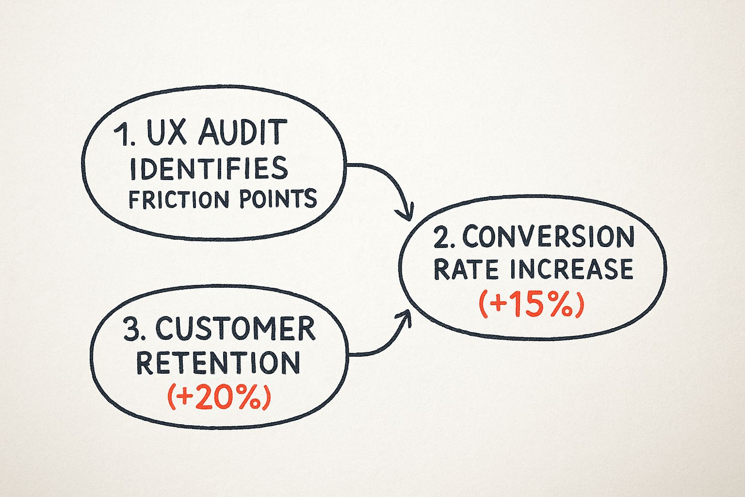
As you can see, addressing the friction points you uncover directly translates into tangible gains in both winning new customers and keeping the ones you have.
Uncovering Actionable Growth Opportunities
A good audit doesn't just tell you what's broken; it shows you where to grow. For instance, an audit might reveal through user session recordings that many customers are trying to use the search bar to find "how-to" guides, but your search only returns product pages. The actionable insight is clear: expand your site search to include blog posts and help articles, turning a point of frustration into a valuable user resource.
For more on this, take a look at our guide on building a product-led onboarding strategy. When you start looking at a UX audit as a revenue driver instead of a cost, it becomes much easier to justify a continuous investment in your user's experience.
Laying the Groundwork for a High-Impact UX Audit

Here’s a truth every seasoned UX professional knows: a great user experience audit is won long before you ever analyze a single screen. Proper planning is what separates a truly strategic investigation from a subjective design review that goes nowhere. Without it, you’ll just end up with a long list of opinions and no real business impact.
The entire process needs to be anchored to clear, measurable goals. So, before you do anything else, you have to ask the most critical question: What business problem are we actually trying to solve?
Vague goals like "improve the user experience" just won't cut it. You need something concrete that you can tie directly to business KPIs. A much better goal would be, "reduce our shopping cart abandonment rate by 15% in Q3," or "increase user sign-ups through the free trial flow by 20% this quarter." This kind of clarity immediately gives your audit a sharp focus.
Nailing Down Your Scope and Focus
Once you’ve got that primary goal, it’s time to define the scope of your audit. This is where so many audits go wrong. It’s tempting to try and fix everything at once, but that’s a recipe for a shallow analysis that misses the details that matter. Instead, you need to concentrate your firepower on the areas that directly impact your objective.
For instance, if your goal is to boost sign-ups, your audit should zero in on very specific parts of the user journey:
- The homepage call-to-action (CTA): Is it buried? Is the language compelling? Can people find it instantly? A practical test is the "5-second test": can a new user identify the main CTA in five seconds?
- The sign-up form itself: Are you asking for too much information? Are there confusing fields causing people to give up? For example, does the "password requirements" helper text only appear after a user fails the first time?
- The mobile registration experience: What does that entire flow feel like on a small screen? Is it a nightmare of tiny text and fat-fingering? Actionable step: actually complete the form on three different mobile devices to experience the friction firsthand.
This surgical approach ensures your findings are highly relevant. Your recommendations will be a precise set of actions aimed at moving the one metric you care about most.
You Are Not Your User: Getting into Their Headspace
Let's be blunt: an audit performed without a deep, empathetic understanding of your users is just a guessing game. Your entire analysis has to be grounded in the reality of who these people are and what they’re trying to get done on your platform.
Start by digging into your user personas. Are you auditing the experience for a tech-savvy power user who loves complexity, or a first-time novice who needs their hand held? Their needs and pain points are worlds apart. For a practical example, a power user might want keyboard shortcuts, while a novice needs clear, descriptive button labels.
With a clear persona in mind, map out their primary user journey related to your audit's goal. For an e-commerce site focused on conversions, that’s probably the "product discovery to final purchase" flow. You need to walk in their shoes.
A great user experience audit is an exercise in empathy. By mapping the user journey, you are stepping into your customer's shoes and experiencing your product from their perspective—frustrations and all.
Assembling the Right Toolkit
With your goals, scope, and user journeys defined, it’s time to gather your tools. A truly comprehensive UX audit never relies on just one source of truth; it blends qualitative and quantitative data to paint a complete picture.
Here’s my go-to stack:
- Analytics Platforms: Tools like Google Analytics are your starting point. They show you the what—the high drop-off pages, the leaky conversion funnels, and the paths users take.
- Behavioral Analytics Tools: I love using tools like Hotjar or Crazy Egg for this. Heatmaps and session recordings show you the why. You can literally watch where users click, how far they scroll, and where they get stuck in real-time.
- User Feedback Platforms: Direct feedback from tools like UserTesting or even simple surveys is gold. It helps you validate your assumptions and hear about problems in your users' own words.
The massive industry investment in getting user experience right is fueling the growth of these tools. The global UX services market, valued at USD 4.68 billion in 2024, is projected to explode to USD 54.93 billion by 2032. That's a massive shift.
To help you get started with scoping, I've put together a simple framework.
UX Audit Scoping and Objectives Framework
This table can help you connect high-level business goals directly to the specific user journeys and metrics you'll need to investigate.
| Business Goal | Relevant User Journey | Key UX Metrics to Track | Example Audit Question |
|---|---|---|---|
| Increase Free Trial Sign-Ups | Homepage > Pricing Page > Sign-up Form | Conversion Rate, Form Abandonment Rate, Time on Task | Where are users dropping off during the three-step sign-up process? |
| Reduce Customer Support Tickets | Onboarding Flow & Help Center | Task Success Rate, Search vs. Click Rate | Is the "forgot password" flow confusing and driving support calls? |
| Improve User Retention | First-Time User Experience (FTUE) | D1/D7/D30 Retention, Feature Adoption Rate | Do new users complete the core setup actions within their first session? |
| Boost Average Order Value (AOV) | Product Discovery & Checkout | Items per Order, Cart Abandonment Rate, Upsell Clicks | Are our "related products" recommendations actually relevant and visible? |
Using a framework like this ensures your audit stays on track and delivers a prioritized roadmap for meaningful improvements, not just a laundry list of issues.
And if you feel you need some expert help to get this done right, our guide on the best UX design agencies can point you toward a partner with the deep expertise you need.
https://pixelonelabs.com/best-ux-design-agencies
Uncovering Insights with a Heuristic Review

Once your audit plan is locked in, it’s time to roll up your sleeves and dive into the interface itself. This is where a heuristic review really shines. Think of it as a methodical inspection of your product, where you use a set of established usability principles to spot common design flaws.
This isn’t about gut feelings or personal preferences. It’s a disciplined approach guided by a proven framework. The gold standard here is Jakob Nielsen's 10 Usability Heuristics, a set of principles that have held up for decades. They give you a lens through which to evaluate everything from the clarity of system feedback to the helpfulness of error messages.
Putting Nielsen's 10 Heuristics into Practice
So, how does this work in the real world? Let’s look at a few of Nielsen’s heuristics and what they mean for your user experience audit.
Visibility of System Status: People need to know what's going on. When someone uploads a file, does a progress bar appear, or are they left wondering if it's working? A practical example: after a user adds an item to their cart, does a mini-cart slide out or does the cart icon update with a "1"? Even a simple "Message Sent!" confirmation provides crucial feedback that builds trust and reduces anxiety.
Recognition Rather Than Recall: An interface shouldn't feel like a memory test. Good design means users don't have to remember information as they move from one screen to another. For example, an e-commerce site that shows a "Recently Viewed Items" panel is a perfect, actionable use of this heuristic. It helps users pick up right where they left off without needing to remember a product's exact name.
Error Prevention: The most effective error message is the one a user never sees. Proactive design can prevent mistakes before they happen. Think of a form that disables the "Submit" button until all required fields are filled out correctly. A more specific example is a booking site that grays out dates in the past on a calendar picker. These small touches are what separate a frustrating experience from a smooth one.
Walking a Mile in Your User's Shoes
A heuristic review gives you a solid framework, but to truly understand the user journey, you need to perform a cognitive walkthrough. This is where you put on your user hat and try to complete a core task, step-by-step.
Let’s say a key task is to "find and purchase a specific product." You'd start on the homepage and meticulously document your process and thoughts.
- Homepage: Is the search bar easy to spot? Are the categories logical? Actionable test: Time yourself. How long does it take to find the search bar?
- Search Results: Are the results relevant? Can I easily filter by size, color, or price? Practical check: Are the filter checkboxes still visible after I apply the first filter, or do they disappear?
- Product Page: Is the "Add to Cart" button impossible to miss? Is the pricing clear and transparent? Is shipping information clearly displayed before checkout?
- Checkout: Is the form asking for my life story, or just the essentials? Is the payment process simple? For example, does it offer a "use shipping address for billing" checkbox?
Going through this process forces you to see the product through fresh eyes, revealing confusing labels, hidden buttons, or awkward flows you’d otherwise miss.
A cognitive walkthrough is so powerful because it makes you abandon your "insider knowledge" of how the product is supposed to work. You experience the same friction and confusion a brand-new user would.
Documenting and Prioritizing Your Findings
As you uncover issues, you need to document everything. A messy list of notes won't convince anyone. You're building a case for change, and that requires evidence.
For every issue, make sure to log:
- A Clear Description: What’s the problem? (e.g., "The password error message is generic and unhelpful.")
- The Heuristic Violated: Which principle does this break? (e.g., "Help users recognize, diagnose, and recover from errors.")
- A Screenshot or Recording: Visual proof is hard to argue with. Annotate it to highlight the exact problem.
- The User Task Affected: What was the user trying to accomplish? (e.g., "Log into their account.")
With a full list of findings, the next step is prioritization. Not all usability issues are created equal. A typo in the footer is a minor annoyance; a broken checkout button is a five-alarm fire.
A simple severity rating system is all you need to bring order to the chaos:
- Critical: Completely blocks a core task (e.g., a user cannot complete a purchase).
- High: Causes significant frustration and could lead users to give up (e.g., a confusing and long registration form).
- Medium: A noticeable problem, but users can likely find a workaround (e.g., inconsistent button styles).
- Low: A minor cosmetic issue or nuisance with little impact on usability (e.g., a slightly misaligned icon).
This rating system transforms your raw data into a prioritized action plan that makes it easy for stakeholders to see what needs to be fixed first. If you're new to this, focusing on these fundamentals is key. Our guide on UX design for startups is a great resource that goes deeper into many of these core principles.
Finding the Truth in Your User Data

Your heuristic review is fantastic for identifying potential problems based on established usability principles. It gives you a strong, educated hypothesis about what might be going wrong. But to make a powerful case for change, you need to back it up with cold, hard numbers. This is where quantitative data turns your expert opinions into undeniable facts.
Think of it this way: your heuristic review tells you a bridge looks weak, but your data tells you exactly how many cars are falling off it every day. By digging into your user analytics, you can measure the true scale of the issues you've flagged and pinpoint precisely where your user experience is breaking down.
From Heuristic Hunches to Data-Backed Facts
The magic happens when you pair a qualitative finding with a quantitative metric. This combination is what gets stakeholders to sit up and take notice. Instead of just saying a process is confusing, you can show exactly how much it's costing the business.
Let's walk through a real-world scenario. During your heuristic review, you might flag a multi-page checkout process as overly complex—a clear violation of the "Recognition Rather Than Recall" principle. That’s a great start, but it’s still just an observation.
Now, you open up Google Analytics and build a conversion funnel for that exact checkout flow. The data reveals a massive 45% drop-off rate between the shipping details page and the payment page. Suddenly, your observation is no longer a theory; it’s a measurable problem with a clear financial impact. You've found the leak, and you can quantify its size.
Data doesn't have an opinion. It simply shows you what your users are actually doing, not what you think they're doing. This objective truth is the most powerful tool in your entire user experience audit.
Pinpointing User Struggles with Behavioral Analytics
While traditional analytics tell you where users are leaving, behavioral analytics tools show you why. This is where you get to witness their struggles firsthand, providing visual evidence that is impossible to ignore.
Heatmaps: These tools, like those offered by Hotjar or Crazy Egg, create a visual map of where users click, move, and scroll. A practical example: if your heuristic review flagged a non-clickable element that looks like a button, a heatmap will show a cluster of "rage clicks" right on that spot. You can also see if a critical call-to-action is being ignored because it’s placed below the average scroll depth on the page.
Session Recordings: This is like looking over your user's shoulder. You can watch anonymized recordings of real user sessions, seeing them hesitate, scroll up and down in confusion, or repeatedly try to click something that isn't working. A practical insight might be watching five different users struggle for two minutes to find the "contact us" link because it's hidden in the footer. That's a powerful, actionable finding.
These tools provide the human context behind the numbers. They transform abstract data points like "bounce rate" into vivid stories of user frustration.
Following the Data Trail to Improve KPIs
The whole point of this data analysis is to find opportunities that directly improve your key performance indicators (KPIs). For example, if you see high traffic to a help page about your pricing in Google Analytics, that’s a clear sign your main pricing page is confusing. The actionable insight is to rewrite the pricing page copy for clarity, which could lead to fewer support tickets and a higher conversion rate.
This data-driven approach has become fundamental, especially as businesses invest more in refining digital interactions. The North American User Experience market, for instance, nearly doubled from USD 1.38 billion in 2021 to USD 2.50 billion in 2024, showing the surging demand for data-backed UX improvements. This trend is expected to continue, underscoring the value of a meticulous user experience audit.
Ultimately, this process helps you focus your efforts where they'll have the greatest effect. It’s not just about fixing problems; it's about optimizing for outcomes. By understanding which friction points are causing the most damage to your metrics, you can also better predict the financial impact of your proposed fixes. For a deeper dive into this, check out our handy customer acquisition cost calculator, which can help frame the value of retaining users you might otherwise lose to a poor experience.
Creating a Truly Actionable Audit Report
All that data you've meticulously gathered is just a pile of numbers until you give it a voice. The final, and frankly most critical, part of a user experience audit is turning your raw findings into a compelling story that stakeholders can’t ignore. This report is your primary tool for sparking real, tangible change.
A classic mistake I see all the time is just handing over a long, disconnected list of problems. That's the fastest way to overwhelm everyone and ensure nothing gets done. Instead, your report needs to weave a narrative, connecting individual friction points to the broader user journey and, most importantly, back to the business goals we defined at the very beginning.
Structuring Your Report for Maximum Impact
To make your findings stick, you need to group related issues thematically. Don't just list ten different button problems. Frame it as "Checkout Flow Friction," detailing how each of those small issues contributes to cart abandonment. This adds context and a sense of urgency that a simple list just can't match.
Every finding you present is an argument you're making, and every argument needs solid evidence to back it up.
- Qualitative Evidence: Use annotated screenshots to visually pinpoint the exact UI flaw. Show, don't just tell. For example, circle a low-contrast button and add a note: "Fails WCAG AA contrast ratio."
- Quantitative Evidence: This is where your analytics come in. Connect the issue to real numbers, like, "This confusing step is where we see a 35% user drop-off in Google Analytics."
- User Voice: Nothing hits harder than a direct quote from a user survey ("I couldn't figure out where to enter the coupon code, so I just gave up.") or a video clip of someone audibly sighing in frustration during a session recording.
This combination of what, where, and why is what elevates your report from a collection of opinions to a data-driven case for improvement.
From Vague Problems to Concrete Recommendations
This is where many audit reports completely fall apart. Simply stating "the button is confusing" is useless to a developer or designer. Your job is to translate that observation into a specific, actionable recommendation that leaves zero room for interpretation.
The goal is to provide a clear path forward. A great recommendation is prescriptive and measurable, making it incredibly easy for the team to understand exactly what needs to be built or fixed. When feedback is this clear and targeted, the entire digital product development process runs smoother.
An actionable recommendation doesn't just identify a problem; it provides a clear, testable solution. It's the bridge between an audit finding and a sprint-ready development ticket.
Let’s look at the difference. It's about moving from a weak observation to a strong, specific recommendation:
Weak: "The sign-up form has usability issues."
Strong: "Reduce the number of fields in the sign-up form from nine to four (name, email, password, company size). Our session recordings show users hesitating for an average of 25 seconds on the non-essential fields."
Weak: "The call-to-action button isn't effective."
Strong: "Increase the 'Get My Free Trial' button's contrast to meet WCAG AA standards. Change the label from 'Submit' to 'Start My 14-Day Trial' to improve clarity, and A/B test this change to measure the impact on clicks."
Prioritizing for Action
Let's be realistic: your report will probably uncover dozens of issues, and no team can fix everything at once. This is where a prioritization matrix becomes your best friend. It helps the team focus their energy where it matters most. A simple but incredibly effective way to do this is to map each issue based on its impact on the user versus the effort required to fix it.
This simple exercise immediately highlights the quick wins—those high-impact, low-effort fixes—that can build momentum and get everyone excited. It also helps justify why a high-effort fix for a critical problem is absolutely worth the investment.
UX Audit Finding Prioritization Matrix
This kind of framework is invaluable for turning a daunting list of issues into a clear, strategic roadmap for improvement.
| Priority Level | User Impact | Implementation Effort | Example Finding |
|---|---|---|---|
| P1 Quick Win | High (e.g., blocks a core task or causes major frustration) | Low (e.g., simple text or color change) | Change the confusing "Proceed" button label on the cart page to "Continue to Payment." |
| P2 Major Project | High (e.g., significantly degrades the user experience) | High (e.g., requires redesign or new code) | Redesign the entire multi-page checkout flow into a streamlined single-page experience. |
| P3 Fill-In Task | Low (e.g., a minor annoyance with a simple workaround) | Low (e.g., quick CSS fix) | Fix the misaligned icon in the website footer. |
| P4 Revisit Later | Low (e.g., a nice-to-have improvement) | High (e.g., significant backend work) | Rebuild the internal user dashboard to allow for more customization. |
When you present your findings with this level of clarity and prioritization, you ensure your UX audit actually leads to meaningful action, not just another report that gathers digital dust.
Got Questions About Your UX Audit? We've Got Answers
Even with a solid plan, jumping into a UX audit can feel a little daunting. A few practical questions always seem to pop up. Getting these sorted out is crucial for making sure your audit is effective and that all your hard work actually leads to meaningful improvements.
Here are some of the most common questions we hear, along with some straight-talking answers from our experience.
How Often Should I Actually Run a UX Audit?
This is a classic question, and the honest answer is: it depends. The right cadence really comes down to the maturity of your product and how quickly things are moving in your business. There’s no magic number, but a good baseline for most companies is to schedule a comprehensive, deep-dive audit at least once a year.
That said, you’ll want to pull the trigger on smaller, more focused audits in a few key situations:
- Before a big redesign: Kicking off a redesign without an audit is like trying to navigate without a map. An audit gives you that critical baseline, ensuring your new design actually solves real problems instead of just creating new ones.
- After launching new features: You need to see if that shiny new functionality is genuinely intuitive and doesn't feel bolted on. A practical example: after launching a new "project templates" feature, run a small audit specifically on that user flow to see if people understand how to use it.
- When your metrics take a nosedive: Seeing a sudden drop in conversions? A spike in support tickets? A focused audit is your best tool for quickly diagnosing the root cause. For instance, if sign-ups drop by 20% after a release, audit the sign-up flow immediately.
Think of the annual audit as a full physical and the smaller ones as regular check-ins with your doctor. Staying on top of things helps you catch issues before they turn into major headaches.
How Can I Pull This Off on a Shoestring Budget?
A tight budget is a reality for many teams, but it absolutely shouldn't stop you from doing an audit. You can uncover incredibly valuable insights by leaning into low-cost, high-impact methods. You don't need to splurge on fancy enterprise software to get started.
For example, Google Analytics is completely free and a powerhouse for spotting high-exit pages and understanding how users are really moving through your site. Pair that with a free-tier heatmap or session recording tool—many offer generous plans for smaller sites—and you've got a solid quantitative foundation.
And what about user feedback? Forget the formal lab setting. A practical, low-budget action is to run informal "guerrilla" usability tests. Simply ask five people who match your user profile (they could be colleagues from other departments, or friends) to complete a key task on your site while you watch and take notes. You'd be amazed at what you can learn from a fresh set of eyes.
What Are the Biggest Traps to Avoid?
It's surprisingly easy for a well-meaning audit to go off the rails. Knowing the common pitfalls ahead of time is the best way to steer clear of them and make sure your work actually delivers results.
The single biggest mistake we see is auditing without clear goals. If you don't anchor your audit to a specific business objective, you just end up with a long list of opinions that stakeholders can easily ignore. Always tie your findings back to something tangible, like "our goal is to reduce cart abandonment by 10%."
Another common trap is getting lost in "analysis paralysis." It’s so easy to drown in data and feel completely overwhelmed. A practical tip is to time-box your data analysis. Give yourself a set number of hours to find the biggest opportunities, then move on. The goal is actionable insight, not a perfect, exhaustive analysis.
Finally, a critical error is not involving developers and designers early enough. If you just drop a 50-page report on their desk at the end, you’re practically asking for pushback. A practical action is to hold a kickoff meeting with the engineering lead and lead designer to get their input on the audit scope. Their insights on technical feasibility are invaluable, and they'll feel a sense of ownership over the solutions.
Remember, a UX audit isn't just about finding what's broken. It's about creating a shared understanding of your user and building a clear, prioritized roadmap toward a much better product.
At Pixel One, we specialize in turning audit insights into scalable, high-impact digital products. If you're ready to transform your user experience challenges into real growth opportunities, see how our product strategy and development services can help. Learn more about us at https://www.pixelonelabs.com.