Your Guide to an Effective Audit UX Design
Master your next audit UX design with this practical guide. Learn to uncover usability issues, get stakeholder buy-in, and drive real business growth.A UX design audit is a deep-dive, systematic checkup of your digital product. Its entire purpose is to find those hidden snags and friction points that are quietly killing your conversions and frustrating your users.
Think of it as a health-check for your app or website. You're looking for the exact reasons why people drop off, get lost, or just give up before they do what you want them to do. This isn't just about making things look pretty—it's a strategic move that directly boosts customer retention and, ultimately, your revenue.
Why a UX Audit Is Your Secret Weapon for Growth
Let's cut through the buzzwords. A UX audit is how you build a real competitive edge by figuring out exactly where your product is letting users down. We’re not guessing here; this is a data-backed investigation into your user experience. The main goal is to find, catalog, and prioritize all the usability headaches that are hurting your business. Sometimes they’re obvious, but often, they're sneakily subtle.
Uncovering Hidden Friction Points
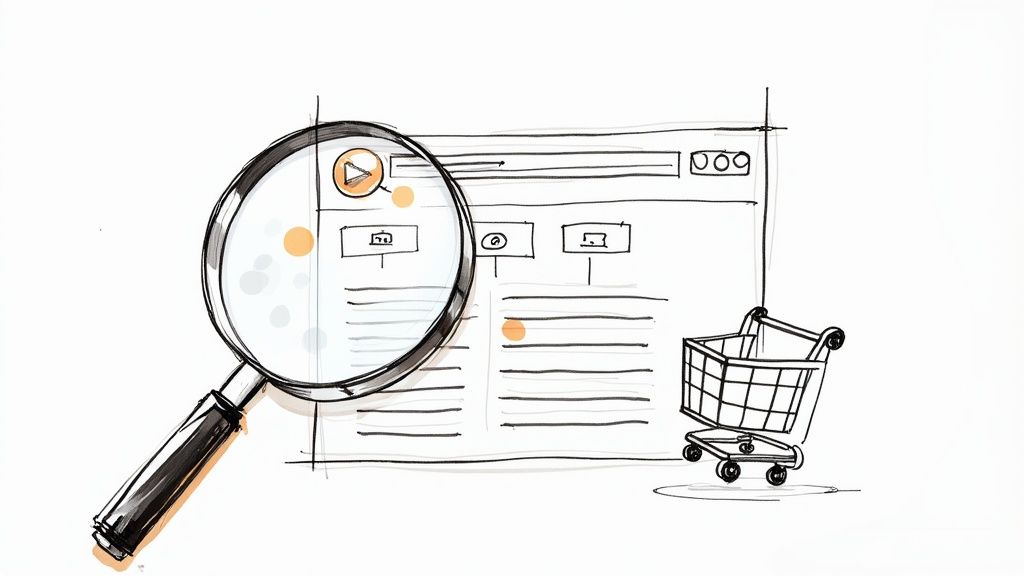
Lots of businesses see the symptoms—high bounce rates, abandoned carts, low trial sign-ups—but they can't quite pinpoint the disease. A UX audit is what connects those frustrating metrics to real, fixable problems in your design. It finally answers the questions that raw analytics can't.
- Why are users abandoning their shopping carts? An actionable insight from an audit might reveal a checkout process that forces users to create an account upfront, or that shipping costs are only shown on the final confirmation screen.
- Why aren't users signing up for our free trial? A practical example could be that the call-to-action button uses vague text like "Learn More" instead of a clear, compelling command like "Start Your 14-Day Free Trial."
- Why do users spend so little time on key pages? The audit might show that a wall of text is burying the one key piece of information users are looking for, or that auto-playing videos are driving them away.
A well-executed audit transforms vague problems like "low engagement" into a concrete list of actionable fixes. It gives you a clear roadmap for building a more intuitive and successful user journey.
I saw this firsthand with a diagnostics SME I worked with. They had steady website traffic, but their online appointment bookings were flat. The audit revealed the culprits: key buttons were hard to spot, navigating on a phone was a nightmare of pinching and zooming, and the pages were painfully slow.
After they implemented the fixes—restructuring the content for clarity and adding one-tap booking—the company saw its appointment rates triple in just three months.
By pinpointing these exact issues, you stop wasting time and money on changes that don't matter. You can instead invest in fixes that deliver a measurable return. It’s a proactive way to build a product that people don't just use, but actually enjoy using—a key part of what we explore in our guide to https://pixelonelabs.com/product-led-onboarding.
Setting the Stage for a Successful UX Audit
A great audit doesn’t just happen. It all starts with a rock-solid plan. If you jump straight into analyzing screens without clear objectives, you're essentially just clicking around—you might feel busy, but you won't get anywhere meaningful. This initial prep work is where you lay the groundwork for a truly effective audit ux design.
Think of this phase as turning a vague wish like "improve the website" into a concrete, measurable mission. Real success needs a number attached to it.
Defining Your Audit Goals
Your goals have to be specific and directly linked to business outcomes. The first question to ask is, what problem are we actually trying to solve here? Are people leaving their shopping carts half-full? Is the bounce rate on your pricing page through the roof?
Here are a few practical examples of what a strong, measurable goal looks like:
- Reduce shopping cart abandonment from 40% to 25% within the next quarter.
- Increase the free trial sign-up conversion rate by 15% in the next two months.
- Improve the user satisfaction score (maybe from a post-interaction survey) from a 3.5 to a 4.5.
- Decrease the number of support tickets related to navigation issues by 30%.
Goals like these give you a clear finish line. They keep the entire audit focused on what really matters, preventing you from getting lost in a sea of interesting but ultimately useless data.
Assembling Your Tools and Team
Once your goals are locked in, you need the right tools to dig up the data and, just as importantly, the right people to make sense of it all. A UX audit is a team sport, not a solo mission.
You’ll want a mix of tools in your kit. Quantitative platforms like Google Analytics are fantastic for getting that 10,000-foot view of user behavior—where they come from, what pages they visit, and where they bail. For a much closer look, session recording software like Hotjar or FullStory is invaluable. Seeing actual heatmaps and screen recordings tells you exactly how people are interacting with your site.
Involving a cross-functional team isn't just a nice-to-have; it's essential. When you pull in people from product, marketing, and development from day one, you get a much richer set of perspectives. It also builds a sense of shared ownership, which makes getting your recommendations implemented later on so much easier.
Your team should also be grounded in fundamental design principles. A shared understanding of how to structure information is crucial. For instance, knowing how to create wireframes can provide a common language and foundation for discussing potential solutions. If that’s a new concept for some, it's a great place to start building alignment.
Before diving in, a quick checklist can ensure everyone is on the same page and you have everything you need.
Essential UX Audit Preparation Checklist
Follow these essential steps before you begin your audit ux design to ensure a focused, efficient, and effective process.
| Phase | Action Item | Key Outcome |
|---|---|---|
| Scoping & Goals | Define 2-3 specific, measurable goals | A clear definition of "success" for the audit. |
| Team Assembly | Identify and invite cross-functional stakeholders | Diverse perspectives and buy-in from key departments. |
| Tool Setup | Verify access and data collection for analytics/session tools | Uninterrupted data gathering and no technical hiccups. |
| User Definition | Document primary user personas and their key tasks | A user-centered focus for the entire analysis. |
| Timeline | Set a realistic schedule for research, analysis, and reporting | A clear project plan that keeps everyone on track. |
Nailing this preparation is what sets you up for success. By establishing clear goals and bringing together the right combination of tools and talent, you ensure your audit will deliver actionable insights that drive real business impact.
Your Framework for Conducting the Audit
Alright, with your goals set and the team on board, it’s time to actually dig in. A proper audit ux design framework isn’t about just one method. The real insights come from blending a few different evaluation techniques to get a 360-degree view of your user experience. This approach helps you spot everything from high-level strategic problems to those small, annoying interface glitches that drive users crazy.
We'll kick things off with an expert-led review, using battle-tested design principles. Then, we’ll layer in hard data from real user behavior. It’s this mix of qualitative expertise and quantitative evidence that truly uncovers the gold.
Starting with a Heuristic Evaluation
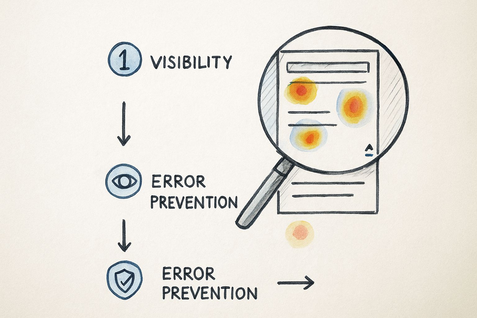
A heuristic evaluation is really just a structured walkthrough of your interface, checking it against a list of proven usability principles. Think of it like a home inspector using a checklist to find potential problems. For this, Jakob Nielsen's 10 Usability Heuristics are the gold standard—they give you a fantastic place to start.
These aren't just abstract ideas; they point to real, tangible issues you can see right away. For example:
- Visibility of system status: Does your e-commerce site show a clear "Item Added to Cart" notification, or does the user just have to guess? A practical fix is a simple pop-up or a number badge appearing on the cart icon.
- Error prevention: A great example is disabling the "Submit" button on a form until all required fields are filled out. This prevents users from getting an annoying error message and having to start over.
- Consistency and standards: Does your app use a gear icon for "Settings" on one screen but a slider icon on another? This inconsistency forces users to re-learn your interface, creating unnecessary friction.
The biggest win with a heuristic evaluation is its efficiency. It lets you quickly flag common usability issues without having to immediately run extensive user tests, making it a powerful first pass.
This initial review gives you a solid list of potential pain points. From there, we can see if the data backs up our assumptions by looking at what users are actually doing. The digital product development process is all about these cycles of evaluation and refinement, and a good audit fits right in.
Diving Into User Behavior Data
A heuristic review tells you where a design might fail, but user behavior data shows you where it is failing. There's a big difference. Tools like Hotjar or FullStory are invaluable here because they give you visual proof of how people interact with your site, moving you from educated guesses to data-backed facts.
This infographic does a great job of showing how different layers of data—like heuristics and heatmaps—come together to paint a complete picture.
You can see how a heuristic violation (like poor visibility) is confirmed by a heatmap showing that nobody is clicking on a key call-to-action button. That’s the kind of evidence that gets things fixed.
Here are a couple of my go-to data sources for actionable insights:
- Heatmaps: These are fantastic for seeing where people click, tap, and hover. If you see a cluster of clicks on an image that isn't a link, that's a clear, actionable insight: users expect that image to be clickable.
- Scroll Maps: These tell you how far down a page people are actually scrolling. If you find that 90% of your visitors never scroll past your "Features" section, that's a signal to move your "Pricing" button higher up.
Completing the Picture with Critical Checks
Beyond heuristics and behavioral data, a truly thorough audit needs to cover a few more bases. These final checks ensure your product isn't just usable but also accessible, fast, and makes sense to your users.
First up is accessibility, which is simply non-negotiable today. Auditing your site against the Web Content Accessibility Guidelines (WCAG) is essential to make sure people with disabilities can use your product. This includes simple but crucial things like checking for sufficient color contrast and making sure all your images have descriptive alt text.
Next, look at performance. Nothing kills a user experience faster than a slow website. Use a tool like Google PageSpeed Insights to find technical bottlenecks. A practical finding could be that uncompressed images are adding 3 seconds to your homepage load time—a quick fix with a big impact.
Finally, take a hard look at your information architecture. Is the navigation logical? Can people find things easily? A quick card-sorting exercise with a few users can reveal huge gaps between how you’ve organized your site and how they expect it to be organized.
Don't underestimate the payoff here. Research consistently shows that every $1 invested in UX can yield a return of up to $100. And with average task success rates hovering around 78%, there's almost always room to improve. You can find more compelling product design statistics on UX ROI and usability benchmarks that make a strong business case for this work.
Turning Your Findings Into an Action Plan
An audit is only as good as the action it inspires. You've done the hard work of digging through the product, and now you probably have a mountain of notes, screenshots, and observations. The real challenge—and where the value truly lies—is turning that raw data into a clear, prioritized roadmap your team can actually get behind.
Without a solid plan, even the most brilliant insights will die a slow death in the backlog. Your job now is to move from simply pointing out problems to building a compelling story for the solutions.
First, Prioritize with an Impact/Effort Matrix
Let's be honest: not all fixes are created equal, and you can't tackle everything at once. That's a surefire way to overwhelm your team and achieve nothing. This is where a simple but incredibly effective tool comes in: the impact/effort matrix. It’s my go-to for cutting through the noise.
The idea is to plot every issue based on two simple questions: How much effort will this take to fix? And how much positive impact will it have on our users and business goals? This helps you categorize everything into four buckets, making it obvious where to focus your energy first.
- Quick Wins (High Impact, Low Effort): Jump on these immediately. Think of something like clarifying a vague button label. Changing "Submit" to "Get Your Free Quote" is a tiny text edit that could have a massive impact on conversions. These are the fixes that build momentum.
- Major Projects (High Impact, High Effort): These are the big, strategic bets. A complete checkout redesign, for example, falls squarely in this category. They promise huge returns but require serious planning and resources.
- Fill-Ins (Low Impact, Low Effort): These are the nice-to-haves. Maybe it's fixing an inconsistent icon or tweaking some spacing. They're great for tackling when a developer has a spare afternoon, but they shouldn't distract from bigger priorities.
- Reconsider (Low Impact, High Effort): Seriously question anything that lands here. If a feature is a beast to build and won't really move the needle for users, it’s probably a waste of time and money. Put it on the back burner, or kill it altogether.
This simple exercise completely reframes the conversation from "here's everything that's broken" to "here's what we should fix first to make the biggest difference."
Frame Problems as Actionable Solutions
A truly great audit report never just dumps problems on the table. It offers clear, tangible solutions. Your stakeholders aren't just looking for a list of flaws; they're looking to you for a path forward. This means translating your findings into specific, unambiguous recommendations.
Never just say, "The navigation is confusing." That's not helpful. Instead, propose a concrete solution: "Let's restructure the main navigation by combining 'Services' and 'Solutions' into a single 'What We Do' menu. This will reduce cognitive load for new users and make our core offerings easier to find."
See the difference? One is a complaint; the other is a plan. This approach shows you've thought the problem through and builds confidence with your team. It makes it infinitely easier for a project manager to create a ticket and for a developer to know exactly what needs to be built. For larger-scale initiatives, working with a seasoned digital product development agency can be invaluable in turning these strategic plans into polished, functional code.
When you present your findings this way, you position yourself as a proactive problem-solver, not just a critic. You show that you're focused on driving real improvement, and that's how you get the buy-in you need to make things happen.
How AI Is Shaping the Future of UX Audits

The way we conduct a UX design audit is definitely changing. New technologies aren't just tweaking our old methods; they're fundamentally reshaping how we evaluate user experience. More and more, artificial intelligence is becoming a go-to tool in the modern audit toolkit, rather than just a futuristic idea.
Generative AI, in particular, is proving to be a game-changer for automating the repetitive, data-heavy lifting. Think about an AI that can crawl an entire application and instantly highlight common UI flaws—like inconsistent button designs or color combinations that fail accessibility standards. This isn't science fiction; it's happening right now.
This kind of automation lets designers and researchers step back from the tedious, manual checklist work. Instead of spending days documenting every little inconsistency, we can apply our expertise to the stuff that really matters: creative problem-solving, strategic thinking, and digging into the subtle, human side of the user journey.
AI as a Powerful Analysis Partner
One of the biggest wins with AI is its raw power to chew through massive amounts of qualitative data. An AI model can tear through thousands of user feedback comments, support tickets, and app store reviews in minutes. It can spot recurring themes and user sentiment in a way that would take a human analyst weeks to manually code and categorize.
Imagine a practical application: an AI analyzes 10,000 customer support chats and spits out a report showing that 18% of users express frustration with the "password reset flow." Just like that, your audit team has a data-backed, high-priority area to investigate.
AI isn't here to replace the UX professional. It’s here to make us better. It's a partner that handles the 'what' by finding patterns in the data, which frees us up to focus on the 'why' and come up with truly thoughtful solutions.
The global UX design market is booming, expected to reach a staggering $32.95 billion by 2030. This growth just underscores how critical a solid audit ux design is for any serious business strategy. With 65% of companies already experimenting with generative AI, the technology is pushing UX evaluation to be faster and more insightful. If you want to dive deeper, you can find more on these UX statistics and the impact of AI and see how they're shifting the industry.
Beyond Usability Auditing for an Evolving World
The scope of a UX audit is also getting wider. As user expectations evolve, we have to look past the classic usability heuristics. Today’s audits need to consider factors that build long-term trust and loyalty with our audience.
These forward-thinking audits are now checking for things like:
- Ethical Design: Is the product using sneaky dark patterns to manipulate users into doing things they didn't intend to? A practical example is a subscription service that makes it incredibly difficult to find the "cancel" button.
- Inclusivity: Does the language and design create a welcoming space for people from all backgrounds and abilities? For example, are form fields for names flexible enough to accommodate different cultural naming conventions?
- Sustainability: What is the digital product's carbon footprint? How does its performance affect the environment? An actionable insight could be to switch to a more energy-efficient, system-default font.
By weaving these modern perspectives into your audit process, you keep your work relevant and genuinely effective. Staying on top of these trends ensures that both your skills and the products you help build will continue to connect with users in a meaningful way.
Common Questions About UX Design Audits
If you're gearing up for your first audit ux design, you probably have a lot of questions. That’s completely normal. Getting a handle on the practical side of things is the best way to make sure your audit actually leads to meaningful changes.
Let's walk through some of the questions I hear most often from teams just starting out.
How Often Should We Really Be Doing a UX Audit?
This is easily the most common question, and the honest answer is: it depends. There’s no magic number, but I’ve found a few cadences that work well for most teams.
Think of a full-scale, comprehensive audit as an annual physical for your product. You should also definitely plan one before any major redesign. This gives you a solid, evidence-based starting point.
But you don't have to wait a full year to check in. Smaller, more focused audits can be a game-changer when done quarterly. You could zero in on a specific user flow that’s underperforming or a newly launched feature. And of course, if a key metric suddenly tanks, that's your emergency signal to start digging in right away.
Here’s a practical breakdown of when to run an audit:
- Annually or Before a Big Redesign: This is your deep dive. It’s for understanding the big picture and making sure your strategic decisions are on the right track.
- Quarterly Health Checks: These are smaller, targeted audits. Maybe you focus on the checkout process one quarter and the onboarding flow the next. It’s all about catching problems before they grow.
- When the Data Screams for It: Don't just stick to a schedule. A sudden spike in customer support tickets or a nosedive in your conversion rate is a clear sign that something is wrong and needs immediate attention.
The biggest mistake you can make is viewing a UX audit as a one-and-done task. It's a recurring health checkup for your product. Regular check-ins prevent tiny annoyances from turning into massive, business-damaging problems.
Is a UX Audit Possible on a Shoestring Budget?
Yes, absolutely. You don't need a massive budget or a suite of expensive enterprise tools to get powerful, actionable insights. It’s all about being resourceful.
A heuristic evaluation, for instance, costs nothing but time. You and your team can walk through the product using established frameworks like Nielsen's 10 Heuristics to spot obvious usability issues.
For data, free tools like Google Analytics are incredibly powerful for understanding user behavior. What pages do people leave from most often? Where do they get stuck? The answers are usually right there in the numbers.
And don't forget qualitative feedback. You can learn so much just by reading through customer support tickets or running a simple, free survey. This scrappy approach is a lifeline for new companies, which we cover in more detail in our guide on UX design for startups.
At the end of the day, a great audit comes down to the quality of your analysis, not the price tag on your software.
At Pixel One, we specialize in turning audit findings into scalable, high-impact digital products. If you're ready to move from insights to action, see how we do it at https://www.pixelonelabs.com.