A Guide to User Experience Methodologies
Discover essential user experience methodologies. This guide provides actionable insights and practical examples to help you build better products.Ever feel like you’re just guessing what users want? User experience methodologies are structured frameworks designed to replace that guesswork. They guide you in understanding what people actually need, so you can design products that are effective and a genuine pleasure to use.
These frameworks provide a repeatable process, ensuring every design choice is backed by solid user evidence, not just a gut feeling. As an actionable insight, this means your team can move from endless debates to data-informed decisions, saving time and building a better product.
What Are User Experience Methodologies Anyway?
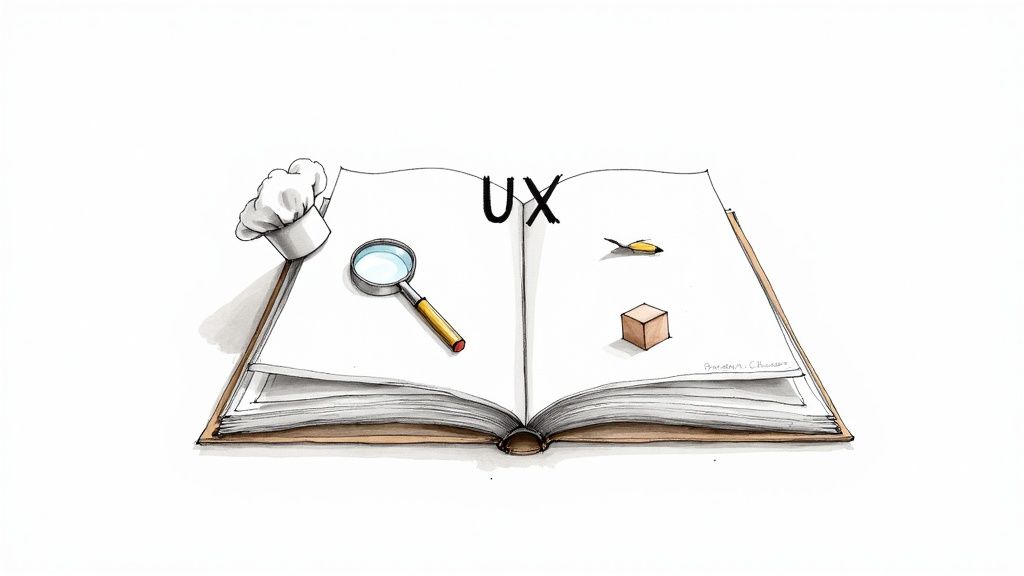
Let's be real—the phrase "user experience methodologies" sounds academic. In practice, it’s just a structured approach to solving problems for the people who will actually use your product. Think of it as a recipe book for creating great digital experiences.
Just as you wouldn't use a cake recipe to roast a chicken, you need to select the right methodology for the design challenge at hand. These frameworks are the recipes that guide you from understanding your users all the way to launching a polished product they can't live without.
From Guesswork to a Clear Process
Without a structured method, design becomes a chaotic mix of personal opinions. Teams end up building features nobody asked for or creating interfaces that leave users completely lost. UX methodologies flip that script by putting the user at the center of everything.
This shift from guesswork to a clear, repeatable process is what separates products that people rave about from those that flop.
For a practical example, imagine your team is debating a new feature. Instead of endless meetings, a methodology like User Interviews provides an actionable path forward. By talking to five target customers, you might discover they don't need another complex feature; they just want the existing one to be faster. That insight becomes your blueprint, saving months of wasted development on the wrong thing.
Why a Structured Approach Matters
Following a defined methodology isn't about adding red tape; it's about bringing clarity and focus. The benefits are huge and lead to much better outcomes.
- Creates Alignment: It gives the entire team—from designers to developers—a shared roadmap. For example, a User Journey Map ensures everyone understands the customer's emotional state at each step, aligning the team on fixing key pain points.
- Reduces Risk: By testing ideas with users early, you can catch what isn't working before sinking time and money into it. A simple paper prototype can reveal a fatal flaw in your navigation in an afternoon, saving weeks of engineering effort.
- Drives Consistency: A systematic approach helps you deliver a consistent user experience. Following a style guide and component library (a design methodology) ensures a button looks and behaves the same way everywhere, reducing user confusion.
Believe it or not, the core idea of designing for people has been around forever. While Don Norman officially gave us the term "user experience" in 1995, its principles can be traced back to concepts like Feng Shui, which is all about creating harmony between people and their surroundings. This intense focus on the user has fueled incredible growth in the field, which exploded from about 1,000 professionals in 1983 to over 1 million by 2017. If you're curious, you can explore more about the history of user experience and its evolution.
Understanding the Three Pillars of UX
https://www.youtube.com/embed/0VIemNjaSBc
The world of UX methodologies can feel like a maze. To make sense of it all, think of them as fitting into three core pillars that create a continuous cycle: Research, Design, and Testing.
Don't picture this as a rigid, step-by-step process. It's more of a loop, where what you learn in one stage directly informs and improves the next.
Imagine building a custom house. You wouldn't start digging the foundation without first understanding the family's needs (Research), and you definitely wouldn't start putting up walls without a solid blueprint (Design). The same logic applies when you're building a digital product.
The Research Pillar: Uncovering Needs
First up is the Research pillar. This is your detective phase. The goal is to get to know your users on a deeply human level—what drives them, what frustrates them, and what they’re trying to achieve. It’s all about swapping assumptions for evidence.
Just as an architect sits down with a family to learn about their daily routines, UX research helps us understand our users' real-world context. For example, by observing how a busy parent uses a grocery app, you might discover they always shop one-handed while holding a child. This single insight—the need for one-handed navigation—is a game-changer for the design.
The Design Pillar: Shaping Solutions
Once you have a firm grasp of who you're building for, you move into the Design pillar. This is where you start giving form to your ideas, turning rich research data into tangible plans. You're not writing code yet; you're creating the blueprints.
Back to our house analogy, this is the architect drafting floor plans. In the UX world, we create wireframes and build interactive prototypes. These are the UX design techniques that allow the team to see the solution before a single line of code is written. For example, a clickable prototype lets a product manager experience the sign-up flow firsthand and spot confusing steps before development even begins.
The Testing Pillar: Validating Your Work
Finally, we have the Testing pillar. This is your reality check. A design might look perfect on screen, but its true worth is only revealed when real people try to use it. This stage is about putting your designs in front of users to find out what clicks and what causes confusion.
It’s like letting the family walk through a model home. In UX, we accomplish this with usability testing or A/B testing. For instance, watching five users fail to find the "checkout" button on your prototype provides an immediate, actionable insight: the button needs to be more prominent. This feedback is concrete and indisputable.
This cycle of research, design, and testing isn't a one-and-done deal. The feedback from testing almost always uncovers new insights that send you back to refine the design. Sometimes, it even reveals deeper user needs you missed, kicking off a new round of research.
To help visualize how these pillars connect, here’s a quick breakdown of their goals and common methods.
Overview of the Three UX Pillars
| Pillar | Primary Goal | Common Methodologies |
|---|---|---|
| Research | Understand user behaviors, needs, and motivations. | User Interviews, Surveys, Personas, Journey Mapping |
| Design | Translate research insights into a tangible solution. | Wireframing, Prototyping, Information Architecture |
| Testing | Validate designs with real users to find problems. | Usability Testing, A/B Testing, Heuristic Evaluation |
This framework provides a clear, repeatable process for creating products that are not only functional but also genuinely solve problems for the people using them.
Getting to Know Your Users: Essential Research Methods

Great products aren't built on guesswork. They come from a real understanding of the people who will use them. The research phase is where we stop assuming and start listening, digging deep to understand not just what our users do, but why they do it.
To get there, you need the right tools. Let’s walk through four foundational methods that turn fuzzy observations into a crystal-clear strategy.
Uncovering Motivations with User Interviews
At their core, user interviews are simply guided conversations. The goal isn’t to fire off a list of questions, but to get someone to open up and share their story. You're trying to see the world through their eyes.
It’s easy to ask leading questions that just confirm your beliefs. "Wouldn't it be great if the app did this?" shuts down honest feedback. A better, more actionable approach uses open-ended questions.
Practical Example: Instead of asking, "Do you like our checkout process?" ask, "Tell me about the last time you bought something online. Walk me through it." This invites a story where you might uncover frustrations they wouldn't have otherwise mentioned, like difficulty entering a shipping address on mobile. For a deeper dive, learn how to conduct user interviews properly.
Use this when: You need rich, qualitative insights into why people do what they do. It’s perfect for the early discovery stages.
Gathering Clean Data with Surveys
While interviews give you depth, surveys give you breadth. They’re your go-to for collecting quantitative data from a large group, allowing you to spot trends you’d never see in one-on-one chats.
The secret to a good survey is its design. If questions are confusing, you’ll get junk data. A well-crafted survey uses clear language and a logical flow.
Practical Example: A simple Likert scale question like, "On a scale of 1 to 5, how easy was it to find the product you were looking for?" gives you a measurable Key Performance Indicator (KPI). If the average score is 2.3, you have a clear, actionable signal that your product discovery experience needs immediate attention.
A well-designed survey is more than a list of questions; it's a scientific instrument. The data can validate hypotheses from interviews or identify widespread pain points, giving you confidence in your strategic decisions.
Observing Natural Behavior with Contextual Inquiry
This is the "fly-on-the-wall" method. Contextual inquiry means going to your users' natural environment—their office, home, or workshop—and watching them use your product in the wild. People often say one thing and do another; this is how you spot the difference.
Practical Example: Imagine designing software for accountants. An interview in a conference room might not reveal much. But sitting with them at their desk during tax season (a contextual inquiry) might show you they keep a separate spreadsheet open to double-check your software's calculations. This is a powerful, actionable insight: your software lacks a feature that builds trust.
Use this when:
- You need to understand a complicated process.
- You suspect what users say they do isn't the full story.
- You’re designing for a specific physical environment.
These firsthand observations uncover unspoken needs that lead to truly effective design.
Synthesizing Research into Actionable Personas
So, you’ve done your interviews and surveys. Now you have a mountain of data. What’s next? This is where personas come in. They are a tool to synthesize all that research into something human and relatable for the team.
A user persona isn't a fictional character you invent. It’s a research-based archetype representing a significant user group. It has goals, motivations, and frustrations, all pulled directly from patterns in your data.
Practical Example: After research, you might find that 70% of users are tech-savvy but time-poor professionals who value efficiency above all else. This insight becomes a persona you might call "Efficient Ethan." His primary goal is to complete tasks in under two minutes. Now, when designing a new feature, your team has an actionable filter: "Would this slow Ethan down?" This keeps everyone focused on solving problems for real people.
Bringing Ideas to Life with Core Design Methods
Alright, your research is done. You're sitting on a pile of incredible insights about what your users need. Now, we shift gears from understanding the problem to shaping the solution.
Welcome to the design phase. This is where abstract ideas and raw data become something tangible.
Think of yourself as an architect who just spent weeks learning about a family's dream home. You wouldn't just start building. You’d sketch layouts and build models. In UX, we have our own blueprints and models that help us translate what we've learned into a solid design.
From Sketch to Model with Wireframing and Prototyping
Wireframing and prototyping are the bread and butter of visualizing a digital product. They are essential for turning a concept into something you can interact with, saving you a world of headaches by catching problems long before code gets written.
A wireframe is the architectural blueprint. It’s a deliberately simple, low-fidelity sketch—usually black and white—that focuses only on structure and layout. It intentionally strips away visual noise like colors to answer one critical question: does the basic layout work? If you want to dive deeper, we have a guide on how to create wireframes that will get you started.
A prototype is the next step up. It's the 3D model of the house you can walk through. Prototypes can be simple, clickable wireframes (low-fidelity) or detailed mockups that look and feel real (high-fidelity). Their job is to simulate the actual user experience.
Actionable Insight: Use a low-fidelity prototype to test the core user flow for a new feature. If users can successfully complete the main task (e.g., adding an item to the cart), you have validated the fundamental concept. If they can't, you've discovered a major flaw with minimal investment.
Building a Logical Structure with Information Architecture
Ever walked into a grocery store and found milk in the hardware aisle? It’s frustrating. The best stores are organized so intuitively you can find what you need without thinking. That’s the magic of Information Architecture (IA).
IA is the art and science of organizing and labeling everything in your app or website so that it makes sense to a human. The goal is to help people find information and get things done with the least friction possible.
Practical Example: A clothing website could organize its navigation by item type ("Shirts," "Pants") or by collection ("Summer Sale," "Workwear"). A good IA process, like card sorting, helps you determine which mental model your users actually follow. Getting this right is the difference between a seamless shopping trip and a user who gives up and leaves.
Visualizing the Experience with User Journey Mapping
If IA is the skeleton, then a User Journey Map is the story of how a person lives within that structure. This powerful tool helps your team visualize a user's entire experience with your product from start to finish.
A journey map is a narrative that captures what the user is doing, thinking, and feeling at every step. This forces your team to see the world through the user's eyes, building genuine empathy.
Actionable Insight: A journey map for an e-commerce site might show that while users feel "excited" during product discovery, they feel "anxious" and "confused" during checkout. This specific insight provides a clear directive for the design team: simplify the checkout process to reduce anxiety. It pinpoints exactly where in the experience to focus your efforts.
Validating Your Designs with Key Testing Methods
You’ve poured your heart into a design. It's grounded in solid research. But will actual users find it intuitive? This is where the rubber meets the road—the testing phase, where all your assumptions get a reality check.
Testing isn’t just a final step; it's a core part of any smart UX process. It’s about gathering hard evidence to make informed decisions. Think of it as a way to end internal debates. Instead of arguing about which design is "better," you let user feedback settle the score.
Finding the Friction with Usability Testing
Usability Testing is about one simple thing: watching real people try to use what you’ve built. You give a participant a specific task to complete and then observe where they get stuck.
It's like designing the signage for a new building. You think your signs are clear, but it’s only when you watch someone try to find the cafeteria that you realize your "obvious" arrow is pointing them toward a broom closet.
- Moderated Testing: A facilitator is present to guide the user and ask follow-up questions like, "What did you expect to happen when you clicked that?" It’s perfect for digging into the why behind a user's confusion.
- Unmoderated Testing: Users complete tasks on their own. A software platform records their screen and voice. It’s faster and more affordable, great for getting feedback from a larger group.
Actionable Insight: During a usability test, you observe that four out of five participants hesitate before clicking the "Submit" button. This is a clear signal that the button's label or placement is causing uncertainty. A practical fix would be to re-label it "Confirm Your Order" to provide more clarity.
Letting the Data Decide with A/B Testing
While usability testing gives you the "why," A/B Testing gives you the "what." This is all about quantitative proof. The method is straightforward: you pit two versions of a design element against each other to see which performs better.
You show half your audience Version A and the other half Version B, then measure the results. The data doesn't lie; it removes guesswork and lets user behavior declare the winner.
Practical Example: A classic A/B test is the call-to-action button.
- Version A (Control): A button that says "Sign Up"
- Version B (Variation): A button that says "Get Started Free"
After running the test for a week, you discover that "Get Started Free" increases sign-ups by 15%. This is a clear, data-driven win. The actionable insight is to permanently change the button text to the winning variation.
Testing isn’t about proving you were right; it’s about discovering what’s right for the user. Every "failed" test is a successful lesson, preventing a flawed design from reaching your entire audience.
Making Sense of Structure with Card Sorting
Ever been on a website and felt completely lost? That’s usually a symptom of poor information architecture. Card Sorting is a simple technique designed to solve that problem.
In a card sorting session, you give participants a set of topics on digital cards and ask them to group them in a way that makes sense. You're uncovering your users' mental models—how they naturally organize information.
Actionable Insight: You run a card sorting session for a university website. You discover that prospective students consistently group "Tuition Fees" and "Financial Aid" together under a category they label "Cost & Aid." Your current website has these on separate pages. The actionable insight is to restructure your navigation to match this user-defined grouping, making critical information easier to find.
Ultimately, these testing methods create a powerful feedback loop. Performing a complete user experience audit can be a great first step to pinpoint which parts of your product need this kind of validation.
Your Questions on UX Methodologies Answered
Getting started with user experience methodologies always kicks up a few questions. How do you pick the right one? Is it okay to mix and match? Let's dive into the most common questions and get you clear, practical answers.
How Do I Choose the Right UX Methodology for My Project?
The best methodology is the one that answers your most pressing question right now. It all comes down to where you are in your project and what you need to learn.
Actionable Guide:
- If your question is "What are our users' biggest problems?": Start with qualitative research like User Interviews.
- If your question is "Will users understand this design?": Use Usability Testing with a prototype.
- If your question is "Which of these two headlines will get more clicks?": Run an A/B Test.
Think of these methods less as a rigid, step-by-step process and more like a toolkit. Your job is to figure out the immediate challenge and grab the right tool for the job.
Can I Combine Different User Experience Methodologies?
Not only can you, but you absolutely should. A "mixed-methods" approach gives you the full story by combining the "what" (quantitative data) with the "why" (qualitative insights).
Practical Example: You run a survey and discover that 45% of users are abandoning their shopping carts (the "what"). This is concerning, but it doesn't tell you how to fix it. So, you follow up with five in-depth interviews with those users. You quickly uncover the "why"—they were blindsided by unexpected shipping costs at the last minute. This powerful combination turns a scary statistic into an immediately solvable design problem.
This decision tree can help you visualize which path to take.
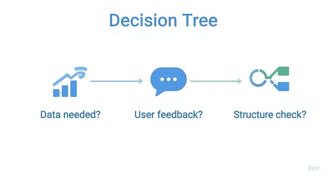
As the graphic shows, the right method depends entirely on what kind of validation your design needs at this exact moment.
How Can a Small Team with No Budget Use These Methods?
You don't need a huge budget or a fancy lab to get incredible user feedback. Many powerful UX methods can be done on the cheap—or for free.
- Guerilla Usability Testing: Head to a coffee shop and offer to buy someone a latte for five minutes of feedback on your prototype. This is a quick way to get fresh eyes on your design.
- Free Survey Tools: Use platforms like Google Forms to send surveys to your email list or social media followers and gather quantitative data immediately.
- Simple Card Sorting: Grab a stack of sticky notes. Ask a few people to group topics into categories that make sense to them, and you're on your way to building an intuitive site structure.
The cost of not doing this scrappy research—building something nobody wants—is always higher than the price of a few cups of coffee. This mindset also fits perfectly with conversion rate optimization strategies, where small tests can lead to massive improvements.
At Pixel One, we transform complex challenges into simple, scalable digital products. Whether you’re launching a startup or scaling an enterprise, our full-stack services can help bring your vision to life. Learn more about our work.