A Guide to User Experience Metrics
A practical guide to user experience metrics. Learn how to track, interpret, and use quantitative and qualitative data to build successful products.User experience metrics are more than just numbers on a dashboard; they’re the vital signs of your product. They give you a clear, quantifiable look into how people actually feel and what they actually do when they interact with your software or website.
Think of it this way: these metrics turn vague feelings about your design into cold, hard facts. They show you precisely what’s working, what’s causing frustration, and where you need to direct your team's energy for the biggest impact.
Why User Experience Metrics Matter

Building a great user experience isn’t about guesswork or following your gut. It’s a discipline grounded in data. UX metrics are the bridge between a user's click-by-click journey and your business's bottom line.
They allow you to move from saying, "I have a hunch the checkout page is confusing," to stating confidently, "Our data shows a 70% drop-off rate at the payment step, and it’s costing us revenue."
That shift is everything. It arms you with concrete evidence to make informed design decisions and get buy-in from stakeholders. Instead of debating opinions, you can point to the data that connects a smooth user journey directly to core business goals like customer retention, operational efficiency, and, of course, revenue.
Turning User Behavior into Business Value
The real magic happens when you see how tracking UX directly impacts business performance. Research from Forrester famously found that every $1 invested in UX can yield a return of $100. That's a staggering 9,900% ROI.
This incredible value isn't pulled from thin air. It comes from higher sales, customers who stick around longer, and fewer calls to your support team.
In short, solid UX metrics help you:
- Find Friction Points: Pinpoint the exact moments where users get stuck, frustrated, or leave. For example, you might discover that 80% of users abandon the sign-up form on the "phone number" field, giving you an immediate, actionable insight to either make it optional or explain why it's needed.
- Validate Design Choices: Use A/B testing and performance data to prove that one design truly works better than another. You can test a one-page checkout against a multi-step process and see which one has a higher completion rate.
- Secure Resources: Justify your budget and team's time by showing the financial impact of UX improvements. A clear metric like "reducing checkout time by 30 seconds increased our conversion rate by 5%" is a powerful argument for more investment.
- Track Progress Over Time: Measure the real-world effects of your changes and demonstrate continuous improvement.
When you focus on the right metrics, you’re not just making something that looks good. You’re building a product that’s efficient, effective, and even enjoyable to use—and that’s what drives sustainable business growth.
A High-Level Map of Key Metrics
To get started, it helps to group the different kinds of UX metrics into categories. A comprehensive user experience audit almost always starts by examining a mix of these to paint a complete picture of a product's health.
Here’s a quick look at the main metric categories we’ll be diving into.
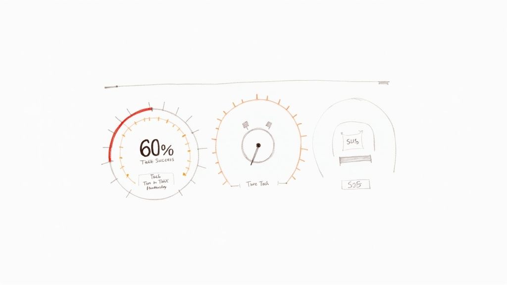
Key User Experience Metrics At a Glance
This table gives you a snapshot of the essential metrics you'll encounter. Think of it as a quick reference guide before we dig deeper into each one.
| Metric Category | Example Metrics | What It Measures |
|---|---|---|
| Behavioral | Task Success Rate, Time on Task, Clicks | What users are doing and how efficiently they are performing actions. |
| Attitudinal | System Usability Scale (SUS), NPS, CSAT | How users feel about their experience and their perception of the product. |
| Business-Focused | Conversion Rate, Retention, Churn | The direct impact of the user experience on key business performance indicators. |
Understanding these three pillars—what users do, how they feel, and how it affects the business—is the foundation for making smarter, data-driven design decisions.
Understanding Quantitative Metrics
Alright, we’ve covered the different types of UX metrics. Now let’s get into the nitty-gritty and talk about the hard numbers: the quantitative metrics. These are your source of objective truth, answering the critical question, "What are people actually doing on my site or app?"
Think of these numbers as the unblinking eye of a security camera. They track exactly where users click, how long they stick around, and whether they manage to get things done. This isn't about feelings or guesswork; it's impartial, measurable data that gives you undeniable proof of what's working and what's falling flat.
With solid numbers in hand, you can stop making assumptions and start making informed decisions. You can pinpoint the exact spots where users are getting stuck and, just as importantly, see if your fixes are actually making a difference.
Task Success Rate: The Bottom Line of Usability
If you only track one thing, make it the Task Success Rate (TSR). This is one of the most foundational metrics in all of user experience. It simply measures the percentage of users who successfully complete a specific task. That's it. The beauty is in its simplicity—they either did it, or they didn't.
Practical Example: An e-commerce site wants to improve its checkout process. They run a usability test with 20 users, asking them to purchase a specific item.
- 15 users complete the purchase successfully.
- 5 users abandon the process.
The Task Success Rate is (15 / 20) * 100 = 75%.
Actionable Insight: A 75% TSR means a quarter of potential customers are failing to check out. This is a red flag. The team's immediate action should be to investigate where and why those 5 users failed. This data makes a powerful case for prioritizing improvements to the checkout flow, using conversion rate optimization strategies.
Time on Task: How Long Does It Really Take?
Knowing if users succeed is crucial, but knowing how long it takes them adds another vital layer of context. The Time on Task metric measures the average time it takes for someone to complete an action.
Generally, a faster time suggests a smooth, intuitive design. But context is king here. A quick checkout is fantastic, but a user blazing through a detailed blog post in ten seconds might signal that your content isn't engaging them.
Practical Example: A software company finds it takes users an average of 4 minutes and 30 seconds to find and download their first invoice. Based on internal testing, the team expected this to take less than a minute.
Actionable Insight: This significant time gap signals friction. The actionable step is to review the user flow for this task. Are the labels confusing? Is the "Invoices" section buried in the wrong menu? The team can then design and test a more prominent link or clearer navigation to reduce this time.
By looking at Task Success Rate and Time on Task together, you get a much richer story. A high success rate doesn't mean much if users are spending way too much time struggling to get there.
System Usability Scale: Putting a Number on Perception
Not all quantitative data has to come from purely behavioral tracking. The System Usability Scale (SUS) is a tried-and-true questionnaire that brilliantly quantifies a user’s subjective feeling about your product's usability. It’s the perfect bridge between what users do and how they feel about doing it.
The SUS is a 10-item survey where users rate statements on a five-point scale, from "Strongly Agree" to "Strongly Disagree." These responses are then crunched into a single score from 0 to 100.
An average SUS score is 68. If you score above an 80.3, you’re in the top 10% of products tested and can give yourself a pat on the back.
Practical Example: Before a major redesign, a project management tool has a SUS score of 65. After launching the new interface, they re-run the survey and the score jumps to 78.
Actionable Insight: This isn't just a "feeling" that the new design is better; it's a quantifiable improvement. The team now has concrete data to show stakeholders that the investment in the redesign paid off in user-perceived usability. This score becomes a benchmark they can track over time to ensure future updates don't harm the experience.
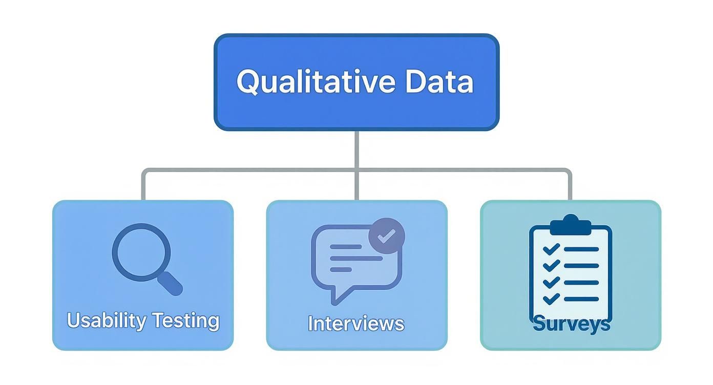
What About the "Why"? Exploring Qualitative Metrics
Quantitative metrics are fantastic for showing you what users are doing. They’ll tell you where people click, how long they stay, and if they completed a task. But they almost never tell you why. That's the missing piece of the puzzle—the human story behind all those numbers.
This is where qualitative metrics come into play. They provide the rich, descriptive context that breathes life into your data.
Think of it like this: your quantitative data is an X-ray of your product. It shows you the skeleton, the structure, and maybe even a few fractures. But your qualitative data? That’s the conversation with the patient. It tells you how the injury happened, exactly where it hurts, and what they were trying to accomplish in the first place. For a proper diagnosis, you absolutely need both.
We don't get these insights from analytics dashboards. We get them by talking to and observing real people. Qualitative feedback reveals the motivations, frustrations, and emotions that truly drive behavior, helping you build genuine empathy and create products that don't just function, but feel great to use.
Uncovering the "Why" with Usability Testing
One of the most powerful tools in the qualitative toolbox is usability testing. It’s surprisingly simple: you watch real people try to accomplish specific tasks in your product and ask them to think aloud as they do it. This gives you a direct, unfiltered window into their thought process in real-time.
Practical Example: Your analytics show a massive drop-off rate on your app's new photo-editing feature, but you don't know why. During a usability test, you watch a user struggle and hear them say:
"Okay, I'm trying to crop this picture... where's the crop tool? I'd expect it to be under 'Adjustments,' but all I see are filters. Ugh, this is frustrating. I'm just going to give up."
Actionable Insight: Boom. That single quote is worth more than a thousand data points. It tells you the feature is hard to find, it violates the user's expectations, and the emotional outcome is frustration. The clear, actionable fix is to test a new design where the crop tool is more visible or located where users expect it.
Digging Deeper with User Interviews
While usability testing zooms in on specific tasks, user interviews pull the camera back to see the bigger picture. These are open-ended conversations designed to understand a user's world—their goals, pain points, and overall feelings about your product and the problems it's meant to solve.
The key to a great interview is to listen far more than you talk. Knowing how to conduct user interviews is a non-negotiable skill. Instead of asking, "Do you like the new dashboard?" try, "Can you walk me through how you typically start your day using our software?"
Practical Example: During an interview, a user casually mentions a clunky workaround they've invented. "Oh yeah, every Monday I have to export three different reports, copy-paste the data into Excel, and create a pivot table just to see my team's weekly progress. It takes about 20 minutes."
Actionable Insight: This isn't just a complaint; it's a feature idea served on a silver platter. It reveals an unmet need for a consolidated weekly progress report. The product team can now investigate building a "Weekly Summary" dashboard, solving a real user problem and saving them significant time.
Finding Patterns in Support Tickets
Don't overlook the goldmine of qualitative data sitting in your customer support channels. Every email, chat log, and phone call is a direct report from the front lines—a real user hitting a real roadblock. By analyzing support tickets, you can spot recurring issues and widespread confusion.
The trick is to be systematic. Start tagging support tickets by theme or feature.
Practical Example: You start tagging support tickets and notice a pattern. Every month, about 50 tickets are tagged with "Billing Confusion." Looking closer, you see that most of them come in within two days of the monthly billing cycle.
Actionable Insight: This isn't random noise; it's a clear signal. The pattern suggests that the monthly invoice is unclear or the billing notification email is confusing. The actionable next step is to redesign the invoice to be more readable or rewrite the email to be more transparent, potentially reducing support load by dozens of tickets per month.
Choosing the Right Metrics for Your Product
Knowing which UX metrics to track can feel completely overwhelming. With so many options, it’s easy to get lost in a sea of data, tracking numbers that look impressive on a slide but don’t actually help you make better decisions.
The secret isn't to measure everything. It's to measure what matters for your specific goals.
Think of it like packing for a trip. You don't just dump your entire closet into a suitcase. You think about where you're going and what you'll be doing, then pack only what you need. In the same way, your product's goals should dictate which metrics you put on your dashboard.
This is where a solid framework comes in handy. It gives you a structured way to connect your big-picture business objectives to the real, tangible things users do inside your product.
Using the HEART Framework to Guide Your Choices
One of the most battle-tested models out there is Google's HEART framework. It’s a fantastic tool that forces teams to look at the user experience from five different angles, giving you a much more balanced view of how your product is truly performing.
The five categories are:
- Happiness: How do users feel about your product? This is all about attitude, often measured with things like satisfaction surveys or a Net Promoter Score (NPS).
- Engagement: How deep and how often are users interacting with what you’ve built? This is where you look at daily active users, how long people stick around, or how many key actions they take.
- Adoption: Are people trying out your product or a new feature for the first time? You'll track this with metrics like new sign-ups or the usage rate of a feature you just launched.
- Retention: Are users coming back? This is critical. Metrics like churn rate and user retention rate tell you if you have a leaky bucket.
- Task Success: Can people actually get things done efficiently? This blends behavioral data like task completion rates with efficiency measures like how many errors they run into along the way.
By looking at all five areas, you avoid the classic mistake of obsessing over one thing—like getting new sign-ups—while completely ignoring whether those users are happy or if they'll still be around next month. A deep dive into different user experience methodologies can shed more light on how to pick what to measure.
Putting HEART into Practice: An Example
Let's make this real. Imagine we’re working on a fitness app called "FitPulse." The main goal for the business is to build a loyal community of users who are consistently hitting their fitness goals with our app.
To turn that big goal into numbers we can actually track, the FitPulse team uses a Goals-Signals-Metrics process for each piece of the HEART framework.
Goals are what you're trying to achieve. Signals are user behaviors that suggest you're on the right track. Metrics are the specific numbers you'll watch to measure those signals.
Here’s a practical look at how the team breaks this down for their mobile app.
Applying the HEART Framework to a Mobile App
| Category (HEART) | Goal | Signal | Metric |
|---|---|---|---|
| Happiness | Users feel motivated and positive about their journey. | Users express satisfaction after completing a workout. | Average score on a post-workout CSAT survey (1-5 scale). |
| Engagement | Users build a consistent habit of working out daily. | A user logs a completed workout session in the app. | Percentage of daily active users who complete at least one workout. |
| Adoption | New users set up their first personalized workout plan. | A new user saves a custom plan within their first 24 hours. | New user activation rate (% of sign-ups completing the setup task). |
| Retention | Users continue using the app for the long haul. | A user returns to the app week after week to log activity. | Week 4 user retention rate. |
| Task Success | Users can quickly find and start a workout. | A user gets from the home screen to an active workout without errors. | Task success rate for the "start workout" flow (e.g., 95% completion). |
This simple exercise transforms a fuzzy goal like "improve the user experience" into a clear dashboard of actionable metrics.
Now, the FitPulse team knows exactly what to watch. If they ship a new feature, they can see precisely how it impacts user behavior and satisfaction. It's a clear playbook for choosing your own user experience metrics that truly matter.
But remember, numbers only tell half the story. The diagram below shows how qualitative insights—the "why"—provide the essential context behind your quantitative data.
This really drives home the point that the best insights come from pairing hard numbers with human stories. The qualitative feedback from interviews and usability tests is what helps you understand what's really going on behind the charts and graphs.
How to Collect and Analyze UX Data
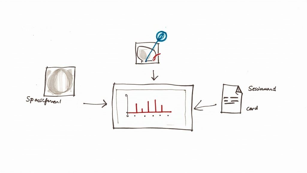
So, you’ve picked out the user experience metrics that matter most. Great. Now comes the real work: actually gathering the data. This is where theory gets its hands dirty and you start building a system to capture the numbers, watch user behavior, and listen to what people are telling you.
The trick isn’t just to stockpile data, but to get the right data from different places. When you do that, you can start weaving together a story that tells you not only what’s happening on your site, but why it's happening.
Building Your Data Collection Toolkit
Think of your data collection strategy like putting together a detective's kit. You wouldn't try to solve a case with just a magnifying glass, right? You need different tools for different clues. The same goes for UX—you need a mix of tools to capture both the hard numbers and the human feelings.
A solid toolkit will usually have a few key things:
- Web Analytics Platforms: This is your bread and butter. Tools like Google Analytics are non-negotiable for tracking the big picture stuff—conversion rates, bounce rates, and how users move through your site.
- Behavior Analytics Tools: To see what users are actually doing, you need tools like Hotjar or FullStory. They give you heatmaps and session recordings, so you can see every click, scroll, and moment of frustration.
- Survey and Feedback Tools: Sometimes, you just need to ask. Services like SurveyMonkey or Typeform are perfect for getting feedback directly from the source with post-task surveys or Net Promoter Score (NPS) questions.
By pulling data from all these sources, you can compare what users do with what they say. That overlap is where the most powerful insights live.
From Raw Data to Actionable Insights
Collecting data is just the starting line. The real magic happens when you start analyzing it and connecting the dots. The global UX services market is a testament to how crucial this skill has become. Valued at $2.59 billion in 2022, it's expected to explode to $32.95 billion by 2030. That’s a massive signal that businesses are betting big on data-driven design.
The most powerful insights emerge when you combine different data points. A high drop-off rate on a specific page (from analytics) becomes much clearer when you watch session recordings and see users repeatedly rage-clicking a broken button.
Here’s a simple, practical way to make sense of it all:
- Start with a Hypothesis: Don't just wander through the data. Begin with a question. Practical Example: "We believe users are abandoning their carts because the shipping costs are shown too late in the process."
- Gather Quantitative Evidence: Jump into Google Analytics and track your checkout funnel. Pinpoint the exact step where you see the biggest drop-off. If there's a 60% drop-off on the "Shipping" page, your hypothesis is gaining strength.
- Find the Qualitative 'Why': Now, pull up heatmaps for that page using Hotjar. Are people hovering over the shipping section? Watch a few session recordings to see their real-time behavior. You could even set up a quick exit-intent survey that asks, "What stopped you from completing your purchase today?"
- Connect the Dots and Act: Let's say your analytics show a 60% drop-off at the shipping step and your surveys are full of comments about "surprise fees." Boom. You have a clear, data-backed problem. The actionable insight is to test a new design where an estimated shipping cost is displayed on the product page itself.
This structured approach takes you from staring at spreadsheets to telling a story that gets your team to act. There are all sorts of UX design methods that can help you formalize this process of discovery and validation.
By systematically collecting and analyzing your data, you stop guessing. User experience transforms from an art based on opinions into a science based on evidence, empowering your team to make smart, targeted changes that lead to happier users and better business outcomes.
Got Questions About UX Metrics?
Once you start weaving user experience metrics into your projects, a few questions always pop up. It’s completely normal. Let's walk through some of the most common ones to clear things up, so you can move forward with confidence.
Think of this as your quick-start guide. Getting these fundamentals right from the beginning means you’ll be using data to make smart decisions, not just collecting numbers for the sake of it.
What’s the Difference Between a UX Metric and a KPI?
It’s really easy to get these two mixed up, but they play different roles on the same team.
Imagine you're driving a car. Your UX metrics are the gauges on your dashboard: your speed, your fuel level, your engine temperature. They give you immediate, real-time feedback on how the car is performing.
Your Key Performance Indicator (KPI), however, is your destination. It’s the big-picture goal, like "Get to the beach before sunset."
A great UX metric has a direct impact on a business KPI. For example, lowering your checkout abandonment rate (a UX metric) is going to directly improve your company's conversion rate (a business KPI). All KPIs are metrics, but not every metric is a strategic KPI.
How Often Should I Be Measuring This Stuff?
The honest answer? It depends entirely on what you're measuring and why. There’s no magic number, but we can break it down into a few common cadences.
- Always On: Behavioral metrics like Daily Active Users (DAU), conversion rates, and site speed need constant monitoring. Think of them as your product's pulse. A live dashboard is perfect for this.
- By the Project: Attitudinal metrics, like the feedback you get from a usability test or a SUS survey, are usually tied to a specific project. You’ll measure them before a redesign to get a baseline, and then again afterward to see if you actually made things better.
- Part of a Routine: Get your team together to review key UX data every week or two. This keeps everyone focused on the user. Then, roll up those insights to show how UX improvements are hitting business goals in your monthly or quarterly stakeholder reports.
The most important thing is consistency. Find a rhythm that your team can stick to.
What Are Some Common Mistakes to Avoid?
Even seasoned pros can trip up when it comes to UX data. One of the biggest traps is falling for vanity metrics—things like total page views or social media followers. They look great on a slide, but they don't tell you anything about the user experience or how to improve it.
Another classic mistake is only looking at the quantitative data. The numbers tell you what people are doing, but they almost never tell you why. If you ignore the rich, contextual stories you get from qualitative methods like user interviews, you're operating with one eye closed.
Here are a few other pitfalls to watch out for:
- Analysis Paralysis: Don't try to measure everything. You'll just drown in data. Pick a handful of metrics that are directly tied to what you’re trying to achieve right now.
- Tunnel Vision: Never look at a single metric in a vacuum. A super-fast Time on Task is a terrible sign if the User Error Rate is through the roof. It probably just means people are rushing and messing up.
- Forgetting the Basics: It’s easy to get distracted by fancy new metrics, but the fundamentals are still the most important. Foundational user experience metrics around usability, effectiveness, and satisfaction are the bedrock of a successful product. A simple task success score from a usability test can often tell you more than a dozen complex analytics events. You can dive deeper into these core concepts and how to apply them over at thealien.design.
By sidestepping these common traps, you can make sure your measurement efforts are focused, insightful, and lead to changes that your users will actually appreciate.
Ready to turn user insights into measurable business growth? At Pixel One, we specialize in building digital products that are not only beautiful but also data-driven and user-centric. Learn how we can help you launch and scale your next big idea.