A Practical Guide to Website UX Audits
Discover how a website UX audit can fix usability issues and boost your conversions. Learn our practical, step-by-step process for real results.Ever wonder why visitors click away without buying? A website UX audit is how you find out. It's not a fuzzy, abstract check-up; it's a deep dive into how real people experience your website, designed to uncover every single friction point—from a confusing menu to a slow-loading page—that costs you customers and cash.
Think of it as an X-ray for your business. You’re looking for the exact spots where your site is letting users down and creating a data-backed plan to fix them. For example, you'll discover why users add items to their cart but never check out, or why your brilliant new feature is being completely ignored.
Why a Website UX Audit Is a Business Imperative
Your website is your digital storefront, your lead salesperson, and your brand ambassador all rolled into one, working 24/7. If that salesperson is confusing, sluggish, or unhelpful, people will leave. A website UX audit isn't about cosmetic changes like tweaking button colors. It's about diagnosing the functional health of your site and tying user behavior directly to what really matters: sales, leads, and keeping customers happy.
You'd be surprised how often tiny issues cause huge business problems. For instance, a checkout process that forces users to create an account before buying can slash conversion rates by over 30%. A sign-up form that’s a nightmare on a phone means you're just throwing away leads. These aren't just design flaws; they're revenue leaks, plain and simple.
The Staggering Cost of Poor User Experience
Ignoring user experience isn't cheap. In the U.S. alone, poor UX is responsible for a mind-boggling $1.4 trillion in lost business every single year. This comes from all the usual suspects: slow load times, sites that look broken on mobile, and navigation that feels like a maze.
The data doesn't lie. A staggering 88% of users admit they won't return to a site after a bad experience, and 73% will leave if it isn't responsive on their device. You can find more of these eye-opening UX stats over at Tenet.
A great user experience doesn't just happen by chance. It is the result of a systematic process of discovery, testing, and refinement. Ignoring this process means you're actively choosing to leave money on the table.
This is exactly where an audit brings clarity. It gets you out of the "I think this looks good" mindset and into a data-driven strategy. You get to see precisely where users are getting stuck. Actionable insight: An audit might reveal that 60% of your visitors bounce from the pricing page. This isn't just a design problem—it’s a massive business signal telling you to test clearer feature comparisons or add a simple FAQ section to address common pricing questions.
Core Components of a Website UX Audit
So, what are we actually looking at during an audit? A good one breaks down the user experience into a few core areas to get a complete picture of your website's performance. Each piece of the puzzle helps answer a critical question about your user's journey. Fixing these issues systematically doesn't just make users happier; it's a powerful way to learn how to reduce customer churn.
Here’s a quick overview of the key areas we evaluate during the audit process.
Table: Core Components of a Website UX Audit
| Audit Area | What It Covers | Actionable Insight & Example |
|---|---|---|
| Usability | The ease with which users can navigate the site, find information, and complete tasks. | Example: If users can't find the "Contact Us" link in under 5 seconds, it's buried too deep. Action: Move it to the primary header and footer. |
| Accessibility | Ensuring the website is usable for people with disabilities (e.g., screen reader compatibility, color contrast). | Example: A "Buy Now" button with light grey text on a white background is unreadable for many. Action: Use a color contrast checker to ensure a ratio of at least 4.5:1. |
| Performance | Page load speed, mobile responsiveness, and technical stability. | Example: If your product page takes more than 3 seconds to load, you're losing nearly half your potential buyers. Action: Compress images and leverage browser caching. |
| Content Clarity | How well the copy, CTAs, and information architecture guide users toward their goals. | Example: A button that says "Submit" is vague. Action: Change it to "Get Your Free Quote" to set a clear expectation for the user. |
By examining each of these pillars, you start building a comprehensive roadmap for improvement—one that connects a better user experience directly to better business results.
Setting the Stage for a Successful Audit
Jumping into a website UX audit without a clear plan is like starting a road trip without a map. You might stumble upon something interesting, but you'll almost certainly waste time and energy without ever reaching your real destination. Solid prep work is what separates a focused, insightful investigation from a chaotic mess of opinions.
Before you even look at a single page, you need to decide what a "win" looks like. Generic goals like "make the website better" are totally useless. You need specific, measurable objectives that tie directly back to what the business actually wants to achieve. This clarity is your North Star for the entire audit.
Define Your Audit Goals and Scope
First things first: what problem are you actually trying to solve? Is your cart abandonment rate through the roof? Is that brand-new newsletter form getting completely ignored? Vague goals will only ever lead to vague findings.
Instead, frame your objectives with hard numbers. Here are some practical examples:
- Reduce cart abandonment from 75% to below 60% by simplifying the checkout to a single page.
- Increase mobile conversion rate for our lead generation form by 20% by removing three non-essential fields.
- Decrease bounce rate on key service pages by 15% by adding a short explainer video above the fold.
Goals like these give your audit a clear purpose and a yardstick for measuring success later on. This whole process is a core part of any structured problem-solving framework, similar to what you'd see in the early phases of the design thinking process.
With your goals locked in, it's time to define the scope. Are you looking at the entire customer journey, from the first ad they see to the final "thank you" page? Or are you zeroing in on just the checkout flow? A tight scope keeps the audit from spiraling out of control and focuses your effort where it will make the biggest difference.
Understand Your Users and Their Journeys
You can't fix a user's experience if you have no idea who they are or what they want. Any good UX audit is built on a rock-solid understanding of your audience and the paths they take on your site. This goes way beyond simple demographics—we need to get into their heads.
Start by dusting off or creating your key user personas. For an e-commerce site, this could be "Bargain Hunter Brenda," who is always looking for a deal, versus "Quick Shopper Quentin," who just wants to find the product, buy it, and get out. Knowing their different motivations helps you see the site through their eyes.
Next, you need to map out their user journeys for the most important tasks. For example, what are the literal steps a first-time visitor takes to find a product, add it to their cart, and pay for it? Documenting this flow reveals hidden friction points, like realizing a user has to click seven times just to see shipping costs.
Gather Your Baseline Data
An audit without data is just a collection of subjective opinions. Before diving in, you absolutely must gather baseline metrics to create a "before" snapshot of your site's performance. This data is the proof you'll need to identify real problems and, just as importantly, to prove your fixes actually worked.
Your analytics tell you what users are doing. Tools like heatmaps and session recordings show you why. The magic happens when you combine both quantitative and qualitative data—that's how you uncover the truly powerful insights.
Your pre-audit data toolkit should include a few key things:
- Analytics Data: Get into Google Analytics and look for high-traffic pages with scary exit rates. Track your conversion funnels to pinpoint exactly where people are dropping off. Actionable insight: If you see a huge drop-off on the shipping details page, you know your shipping costs are a problem.
- Qualitative Feedback: Dig through customer support tickets, live chat logs, and survey results. This is a goldmine for hearing about user frustrations in their own words. Practical example: Five support tickets complaining "I can't find the return policy" is a clear signal to make that link more prominent.
- Behavioral Insights: Fire up tools like Hotjar or Crazy Egg. Watching a real user's mouse wiggle around in confusion as they try to use your navigation is infinitely more powerful than just staring at a bounce rate percentage.
This infographic does a great job of showing the simple, three-step process that a well-prepared audit really follows.
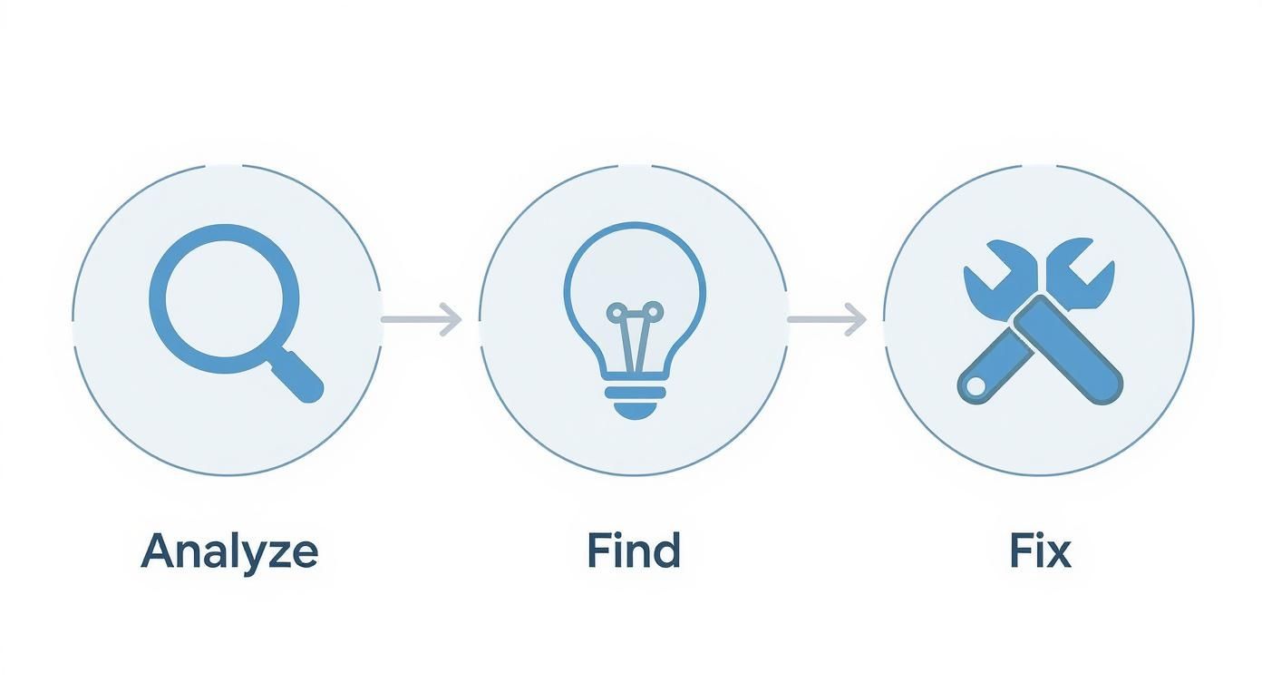
The flow from analysis to actionable fixes really drives home why this prep phase is so critical. Without it, you’re just guessing. But with clear goals, deep user insights, and solid baseline data, you’re ready to stop planning and start doing.
Diving Into Your Heuristic Evaluation
Alright, let's get our hands dirty. The heuristic evaluation is one of the most powerful and cost-effective tools in your UX audit toolkit. It’s a methodical way to comb through your website and spot common design flaws by checking it against a list of established usability principles, or "heuristics."
Think of it as looking at your site through an expert's eyes, using a battle-tested checklist. You don't need a fancy lab or dozens of test users to get started—just a sharp eye and a solid framework for what makes a great user experience. This approach gets you out of the "I think this looks good" mindset and into a structured process for identifying real friction points.

Unpacking the 10 Usability Heuristics
The gold standard for this comes from Jakob Nielsen's 10 Usability Heuristics. They can sound a bit academic at first, so let's translate them into plain English with some real-world scenarios you can look for on your own site.
1. Visibility of System Status: Basically, don't keep your users guessing. They need to know what’s happening at all times.
- Practical Example: When someone uploads a file, show a progress bar. After they add an item to their cart, display a confirmation message like "Item added!" This kind of feedback builds trust and stops people from wondering if the site is broken.
2. Match Between System and the Real World: Use language your audience understands, not your internal company jargon.
- Practical Example: If you sell B2B software, don't say "asynchronous data processing" on the homepage. Instead, try "your reports update automatically in the background." Speak their language, not yours.
3. User Control and Freedom: People make mistakes. Let them fix things easily.
- Practical Example: Is there an "undo" button for accidental deletions? Can a user easily edit items in their shopping cart without starting over? These "emergency exits" are crucial for preventing frustration.
A heuristic evaluation is powerful because it doesn't just find problems; it categorizes them. Knowing that an issue violates "Error Prevention" versus "Aesthetic Design" gives you a much clearer path to finding the right solution.
Spotting Errors and Guiding Users
Some of the most critical heuristics focus on preventing mistakes before they happen and helping users recover when they do. Nailing these can have a massive impact on your conversion rates because they directly tackle user frustration.
4. Consistency and Standards: Don't reinvent the wheel on every page. Your users expect things to behave predictably.
- Practical Example: Is your main call-to-action button the same color and in the same general area on every page? If "Contact Us" is in the header, it should always be in the header. Consistency breeds familiarity.
5. Error Prevention: It's far better to design something in a way that prevents errors than it is to write a great error message.
- Practical Example: On a checkout form, disable the "Submit" button until all required fields are filled out. This proactively guides the user and prevents frustrating validation errors.
6. Recognition Rather Than Recall: Make things visible so users don't have to rely on their memory.
- Practical Example: Showing a "Recently Viewed Items" section on an e-commerce site is perfect. It helps users pick up right where they left off without having to remember what they were looking for.
7. Flexibility and Efficiency of Use: Your site should work for both beginners and power users.
- Practical Example: A project management tool might offer keyboard shortcuts (like 'N' for a new task) for its experienced users. These "accelerators" don't get in the way of novices but offer a faster path for the pros.
Ensuring Clarity and Simplicity
The last few heuristics are all about keeping your interface clean, clear, and helpful. This is the foundation of many successful user experience methodologies because a confusing design is a guaranteed way to lose visitors.
8. Aesthetic and Minimalist Design: Every extra piece of information on a screen is one more thing to process.
- Practical Example: Your checkout page should be a fortress of focus. Get rid of the main navigation, sidebars, and promotional pop-ups. Anything that doesn't directly contribute to completing the purchase is a potential distraction.
9. Help Users Recognize, Diagnose, and Recover from Errors: When an error does happen, make the message helpful.
- Practical Example: A generic "Invalid Input" is useless. A great error message on a password field says, "Password must be at least 8 characters and include a number." It tells them what went wrong and exactly how to fix it.
10. Help and Documentation: While the goal is a site so intuitive it needs no manual, sometimes a little help is necessary.
- Practical Example: On a complicated settings page, do you have little tooltip icons next to confusing options? This provides help right where it's needed, saving users from having to hunt through a separate help section.
Uncovering Insights with User Data
https://www.youtube.com/embed/bcfqmx2hnUQ
So far, your heuristic evaluation has given you a solid, expert-backed idea of what might be wrong. But now it’s time to find out what is wrong. That requires digging into real user data.
This is where the magic happens—where we move from educated guesses to confirmed diagnoses. We're going to blend the "what" (quantitative data) with the "why" (qualitative data) to get the full story. A great website UX audit absolutely depends on this combination. Your analytics can tell you that a page has a high drop-off rate, but they'll never tell you it’s because a pop-up is covering the "add to cart" button on mobile. To find that, you need to see the site through your users' eyes.
Analyzing Quantitative Data to Find Trouble Spots
Your first stop should always be your analytics platform, which for most of us means Google Analytics. Think of yourself as a detective following the digital breadcrumbs people leave behind. We’re not here to admire vanity metrics like total page views; we're hunting for evidence of user frustration.
The goal is to pinpoint specific pages or flows that just aren't pulling their weight. Look for these practical red flags:
- High Exit Rates on Key Pages: Are people bailing on your pricing or product pages? Actionable insight: This could mean your value proposition is murky or the call-to-action is playing hide-and-seek. Test a clearer headline or a more prominent "Buy Now" button.
- Conversion Funnel Drop-offs: Where exactly in the checkout or signup process are you losing people? If you see a 90% drop-off between someone adding an item to their cart and starting the checkout, you have a major barrier. Practical example: This is often caused by unexpected shipping costs or a mandatory account creation step.
- Low Time on Page for Important Content: If users are spending a mere 10 seconds on a deep-dive service page that should take three minutes to read, something is off. Actionable insight: They likely didn't find what they expected. Try adding a summary at the top or using more scannable headings.
An audit isn’t about finding someone to blame for a poorly performing page. It’s about using data to form a hypothesis. For example, "We hypothesize that users are abandoning the cart because the 'Apply Discount Code' field is too prominent, causing them to leave and search for codes they can't find."
Gathering Qualitative Insights to Understand the Why
Once your numbers have pointed you to the problem areas, it’s time to understand the human behavior behind them. It's time to find out why. And you don't need a massive budget or a dedicated research team to get incredible qualitative feedback.
Seriously, a simple usability test can tell you more in 15 minutes than days of staring at analytics charts ever will. There's a reason why the famous Nielsen Norman Group study found that testing with just five users can uncover 85% of a site's usability issues. You’re looking for patterns of confusion, not statistical perfection.
Here are a few actionable methods for getting this feedback:
- Usability Testing: This is my favorite. Grab five people—they can be colleagues, friends, or sourced from a service like UserTesting—and give them a core task. For example: "You're looking for a blue t-shirt in a size medium. Find it, add it to your cart, and tell me the total cost with shipping to your zip code." The key is to ask them to think out loud. You'll immediately spot where they hesitate, get confused, or mutter in frustration.
- Session Recordings: Tools like Hotjar or Crazy Egg are fantastic for this. They let you watch anonymized recordings of real user sessions. Practical example: You might see dozens of users repeatedly clicking on an unclickable image, showing a clear expectation that isn't being met. This is an easy fix.
- User Surveys: Sometimes, the most direct approach is the best. Use simple on-page surveys, like a small pop-up on an exit page, to ask direct questions. Something as simple as, "Was there anything stopping you from completing your purchase today?" can yield incredibly honest and actionable feedback like, "I couldn't find where to enter my discount code."
When you bring these different threads together, you create a powerful narrative. The ROI from this work is incredible; one Baymard Institute study found that businesses can see a 9,900% ROI on UX investments. I’ve seen this firsthand—one diagnostics client tripled their appointment booking rate in just three months after we implemented changes based on an audit.
By turning raw numbers and user feedback into a compelling story, you build an undeniable case for change. This is how you transform abstract clicks and scrolls into a clear roadmap for improvement and start tracking the user experience metrics that show real impact on the bottom line.
Turning Your Findings into an Action Plan
You’ve done the heavy lifting. You've pored over heuristics, dug deep into the analytics, and, most importantly, listened to your users. But a pile of findings, no matter how insightful, is just that—a pile. The real make-or-break moment of any website UX audit is turning those raw observations into a concrete, prioritized roadmap for change.
Frankly, without a solid action plan, even the most brilliant audit report will just collect digital dust in a forgotten server folder. This is where you connect the dots between your discoveries and tangible development tasks, building a case for investment that leads to real, measurable improvements.
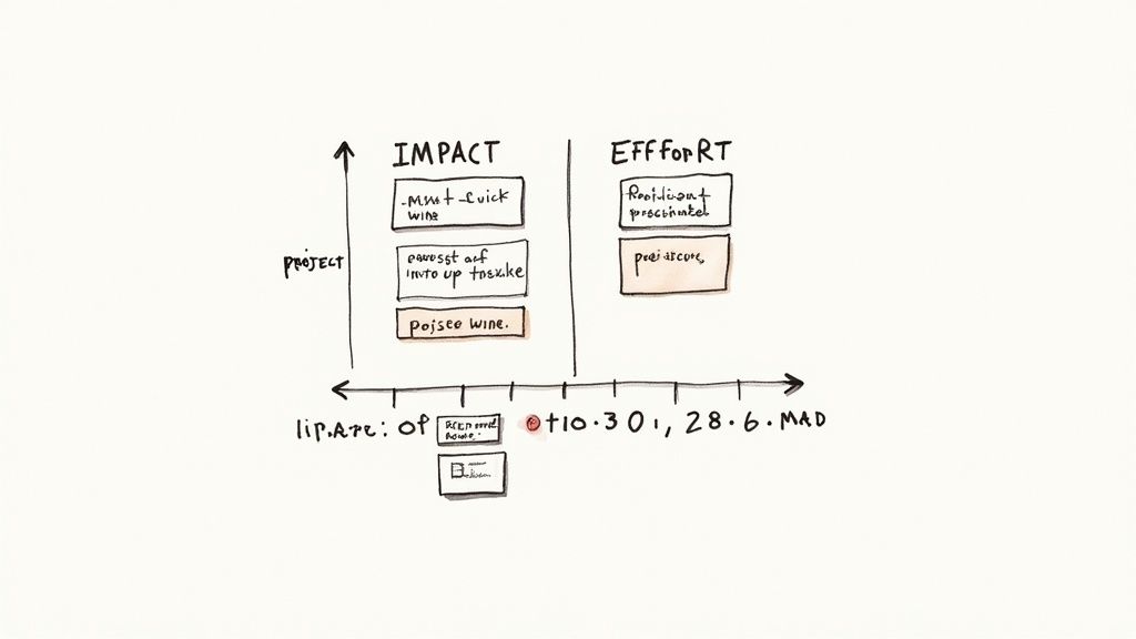
Prioritizing with the Impact Effort Matrix
Let's be realistic: your list of issues could be dozens of items long. They'll range from tiny text changes to a complete overhaul of your main navigation. If you try to tackle everything at once, you’re setting yourself up for failure.
This is where ruthless prioritization comes in, and the impact/effort matrix is my go-to tool for the job. It's a simple but powerful way to cut through the noise.
The framework forces you to categorize every single issue by asking two critical questions:
- Impact: How much will fixing this actually improve the user experience and move the needle on our business goals?
- Effort: Realistically, how much time, money, and developer sanity will it take to implement this change?
Once you plot your findings, you get a crystal-clear view of your strategic opportunities.
| Priority Level | Category | Description & Practical Examples |
|---|---|---|
| P1 | Quick Wins (High Impact, Low Effort) | These are your gold mines and should be at the top of your list. Examples: Changing a confusing "Submit" button to "Get Free Trial," fixing a broken link in the checkout, or rewriting a mission-critical headline for clarity. |
| P2 | Major Projects (High Impact, High Effort) | These are the big, meaty initiatives that need proper planning. Examples: A full redesign of the mobile navigation, implementing a one-page checkout process, or rebuilding a sluggish product customization tool. |
| P3 | Fill-Ins (Low Impact, Low Effort) | I call these "nice-to-haves." Address them when you have a bit of downtime. Examples: Fixing minor typos on a blog post, tweaking icon alignment on a settings page, or standardizing button styles. |
| P4 | Reconsider (Low Impact, High Effort) | Avoid these like the plague. They drain resources for almost no tangible user benefit. Examples: Re-platforming your entire blog for a minor aesthetic gain. Only consider them if there's a compelling legal or branding reason. |
Using this matrix transforms a chaotic to-do list into a strategic roadmap. It helps you build momentum with quick, visible fixes while you thoughtfully plan for the bigger projects that will drive serious growth down the line.
Crafting a Compelling Report for Different Audiences
A one-size-fits-all report is a recipe for inaction. Your stakeholders all have different needs, care about different things, and speak different languages. The secret is to tailor your message to the room.
For Executives and Leadership:
They don’t have time for the nitty-gritty. They need the 30,000-foot view, focused squarely on business outcomes.
- Lead with the "So What?": Start with a sharp executive summary. Pinpoint the top 3 findings and connect them directly to revenue. Example: "Our confusing checkout process is costing us an estimated $15,000 per month."
- Show, Don't Just Tell: A simple chart visualizing the drop-off in your conversion funnel is infinitely more persuasive than a dense paragraph explaining it.
- Speak Their Language: Frame your recommendations in business terms. Don't say, "Improve button visibility." Instead, try, "A clearer CTA on the product page is projected to increase add-to-cart clicks by 15%, potentially adding $5,000 in monthly revenue."
For Developers and Designers:
Now you can get into the weeds. The team that's actually building the fixes needs specific, unambiguous, and actionable instructions.
- Be Prescriptive: Give them the exact copy, the hex codes for colors, the pixel values for spacing. Remove all guesswork.
- Use Annotated Screenshots: A picture really is worth a thousand words. Show them precisely where the problem is and mock up the solution visually.
- Bring the User into the Room: Include powerful user quotes or, even better, short video clips. Nothing motivates a developer more than hearing a user's genuine frustration. A clip of someone saying, "I literally can't find the checkout button!" is pure gold.
- Provide a Prototype for Complex Changes: If you're suggesting a whole new flow, show them how it should work. For something like a form overhaul, it's worth learning how to create wireframes to clearly map out the new layout and interactions.
Never present a problem without proposing a solution. The value of your audit isn’t just in finding what’s broken; it’s in laying out an evidence-backed path forward. Your report should build confidence and make it dead simple for everyone to see the next steps.
By separating your high-level summary from the detailed implementation guide, you make sure everyone gets exactly what they need in a format they can actually use. This small step dramatically increases the odds that your hard work will translate into a better experience for your users and better results for the business.
Common Questions About Website UX Audits
Even with the best plan, you're bound to have some questions when you dive into a UX audit. I get asked these all the time, so I've put together some quick, straightforward answers to the most common ones. This should help you tackle the process with a bit more confidence.
How Often Should I Run a UX Audit?
There's no single magic number, but a good rule of thumb is to conduct a full, comprehensive UX audit at least once a year. You should also absolutely do one before any major undertaking, like a complete website redesign or the launch of a significant new feature.
That said, for dynamic sites like high-traffic e-commerce stores or SaaS platforms, waiting a full year is too long. Practical advice: For these sites, consider smaller, more focused audits every quarter. For example, in Q1, audit the checkout flow. In Q2, audit the product discovery and search experience. This makes the process more manageable and iterative.
What’s the Difference Between a UX Audit and a UI Audit?
This is a great question, and it's easy to get them mixed up. While they're related, they focus on two very different aspects of a user's interaction with your site.
- A UX (User Experience) audit is all about the journey. It asks, "How easy and intuitive is it for someone to get done what they came here to do?" We're looking at things like the navigation flow, how information is organized, and whether the steps to complete a task make logical sense.
- A UI (User Interface) audit zooms in on the visuals and interactive elements. It asks, "Does the site look and feel cohesive, professional, and on-brand?" This is where you'd evaluate things like color palettes, typography, button styles, and the consistency of spacing and icons across all pages.
Here's a simple way to think about it: UX is the strategic layout of a grocery store that guides you from the entrance to the milk in the back corner without getting lost. UI is the clear, well-designed signage on each aisle that helps you spot the cereal. You really need both for a smooth shopping trip.
Can I Do a UX Audit Myself, or Do I Need to Hire an Expert?
You can absolutely get started on your own. By following a structured process, using proven methods like heuristic evaluation, and really digging into your analytics, you can uncover a ton of "low-hanging fruit." For example, you can easily spot if your contact form has too many fields or if a key button is broken on mobile. For a small business or a team on a tight budget, a DIY audit is a fantastic and valuable starting point.
However, bringing in an external expert or an agency offers one huge advantage: an unbiased perspective. They aren't emotionally attached to past design choices and can see problems that you and your team have become blind to over time. For example, you might think your industry jargon is clear, but an outsider will immediately flag it as confusing to new customers. For a major project, that expert objectivity often pays for itself.
What Is the Single Most Important Metric in a UX Audit?
If I had to pick just one, it would be the Conversion Rate. Why? Because it directly connects the quality of your user experience to a real business outcome. A "conversion" can be anything you define as a success—a product purchase, a newsletter sign-up, a demo request, you name it.
This single number tells you whether people are successfully completing the most important actions on your website. Other metrics like Task Success Rate, Time on Task, and Bounce Rate are all crucial, but they often serve to explain why the conversion rate is what it is. Here's a practical example: A high bounce rate on a landing page (a secondary metric) is a problem because it leads to a low conversion rate for demo requests (the primary metric). Fixing the user experience to lower the bounce rate directly serves the goal of increasing conversions.
At Pixel One, we transform audit findings into scalable, high-performing digital products. If you're ready to turn user insights into measurable growth, let's talk about building your next big idea.